Everything you need to know about Squarespace version 7.1
If you’ve been using Squarespace for some time now, you probably know the user interface of its 7.0 version like the back of your hand. After all, 7.0 has been there for you since 2014. It’s become second nature to embrace its strengths and work around the challenges it posed through the years.
That is, until Squarespace rolled out version 7.1 earlier this year. It still shares many features with its predecessor, but the update also implemented *crucial* changes to how stuff works in the platform.
This new system can get a bit confusing for someone who’s too familiar with the “usual” way of doing things. And often, learning something different from what we’re used to can also seem scary.
But read on and you’ll find out soon enough that using Squarespace 7.1 has its own perks, too.
All templates are structured the same way
In Squarespace 7.0, your template choice could heavily influence how your final website design could look like. That’s because every template family comes with a distinct set of features and style rules, like site layouts and navigation. You’d have to switch templates if the one you’re using turns out not to be a good fit for the specific look & feel you want. You’ll learn from my courses that my go-to template is Rally from the Brine family. But there are tons of other templates under more than 20 template families, and that can make for a serious case of decision paralysis.
That’s not the case for version 7.1.
In fact, you’d no longer see the switch template function here, since all of them—from Alameda to Zorayda—belong to a single template family with access to all the design features. Any template will be a good starting point to customize a website.
2. Page layouts are easier to organize
When it comes to adding and editing pages to the site, version 7.1 remains to be the convenient drag-and-drop builder that you love. You’ll still be able to work with blocks in the same way, so you can carry on selecting and moving them with ease.
But one thing that did change is the way you’re able to interact with the page content. In 7.1, you’ll be able to streamline your process by implementing changes to the entire page, header and footer included.
And if you’ve been frustrated about the limited options for some collection pages, you’d be pleased to know that 7.1 provides more flexible layouts. All 7.1 templates give you the freedom to add more sections (even on your footer) than previously possible. Plus, you can now add a banner image to any page by creating a section with a background image.
3. The new design panel is more universal
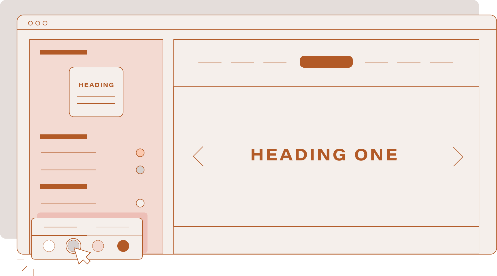
Squarespace 7.1 provides you another, more efficient way to make site-wide changes through global styles. Similar to page editing, you'll have greater control over multiple site elements without forgetting about any part of your site.
Think of the design panel as a useful way to implement your client’s brand book, all the way from the curated color palette and bespoke font packs to even your buttons and spacing.
On the other hand, section styles would allow you to zoom in on any part of the site that you’d want to stand out. Clicking the pencil icon will override your global styles only when necessary, unlike before when you’d have no choice but to toggle the settings one by one.
You wouldn’t be missing out on your options from 7.0, either. Your ability to edit your favicon, logo, checkout page, 404 page, custom CSS, and more will be here to stay. Overall, I’d say the global fonts & styles are my favorite features in 7.1.
4. Your e-commerce gets a huge upgrade
If you’re working with a Squarespace Commerce Plan, expect a total overhaul of your shop as you know it. The Product Collections 2.0 packs some serious punch with multiple store pages that can accommodate up to 10,000 products and 1,000 categories.
That’s not to say that you’ll need to set up an additional store page just yet. In version 7.1, you’ll be able to manually order both the products & categories in any way you like. Plus, you can nest categories and assign SEO-friendly URLs to create the system that ultimately works for you.
This new change is certainly something that larger merchants with a multitude of product offerings can look forward to.
5. Version 7.1 only gets better from here
Rest assured that Squarespace developers are working to build a better 7.1 interface, even as you’re reading this article. You can count on their team to always respond to feedback from users. It’s this back-and-forth communication with their web designers that helps address the problems for a more holistic experience.
No doubt, Squarespace 7.1 will be getting more support than 7.0 from here on out. That’s not to say that the founders are abandoning the older version altogether. Still, there’s one thing we can’t deny:
Whenever another new feature is just around the corner, you bet the new kid on the Squarespace block will be the first to see it.
Which features aren’t in 7.1 yet?
Squarespace 7.1 is still in development, so the platform is actively adding and improving its features. That being said, there are some functions that you can’t use in this version as of now.
For instance, you can’t use parallax scrolling to create an illusion of depth for your photos or videos. Version 7.1 also switches out gallery blocks in favor of gallery sections, which work a little differently. I wouldn’t say these are deal-breakers for me, but these are something you can keep in mind when you’re considering 7.1.
Should I switch from 7.0 to 7.1?
If you have an existing website in Squarespace 7.0, I’d say that switching to 7.1 doesn’t need to be high up on your list of priorities for now. Squarespace assures its users that despite launching the new version, they’ll be making 7.0 available indefinitely for everyone to enjoy.
What I do highly recommend is offering Squarespace 7.1 for building out new sites, since this is future-proof tech that would surely not miss out on new features.
Besides, I think your clients have a lot to gain from the more streamlined design & layout options, thanks to the global styles. They’ll be able to tweak their site on their own, even long after you’ve turned over the final output.
If you are looking for an easier way to learn and launch in Squarespace 7.1. Check out our new template.
Have you tried out Squarespace 7.1 yet? If your answer is yes, how did your experience go? Feel free to let me know what you think!


