Five unexpected features For Your Squarespace website (Plus 2 FREE courses)
Want your Squarespace website to stand out from the crowd? Here are some unique features and sections you can add with a little bit of code.
Thanks to its user-friendly interface, Squarespace is definitely a great website builder for designers and biz owners. You’d find it easy to drag and drop elements. Plus, you’d be able to see how your site looks like in real-time!
How do you make sure that your site won’t look too plain? Won’t your blog get mistaken for another one with the same template?
Luckily, it’s possible to make your own design stand out. As a website designer who’s been swearing by Squarespace for 5 years now, I can show you how to make the most out of its functions here in Squarestylist.
All it takes is an eye for aesthetic and little bit of code— no formal coding knowledge needed! So let’s jump into my five go-to custom features in Squarespace:
Stylish mobile navigation
If you’ve been itching to personalize your mobile menu, then you’re in luck. I can teach you how to place it front and center through this modernized mobile nav. You’ll be building all this with your own Adobe XD mockup and CSS elements blueprint too.
And the best part? I’m offering this resource to you for free! Get started by clicking the link to the Stylish Mobile Navigation course here.
Changing logos on specific pages
Do you need your logo to look a little different on another page? Maybe you’d like it to contrast with a dark banner or create something special for your landing page. Either way, it’s definitely easy for you to switch it up in Squarespace.
I’ll show you the quickest way to change your logo for both desktop and mobile view. And I’m giving this to you as another freebie! Woohoo! Just sign up and enroll in the free Change Logo course here.
Flexible mega menu
Want a lot more space than a navbar to show what you’ve got? You probably have a mega menu in mind. Believe it or not, it’s totally possible on Squarespace! Add any Squarespace block you need— summary block, newsletter block, subscribe forms, you name it.
The mega menu is just a hover away with the help of JavaScript and CSS. No wonder it’s the most popular course I have in Squarestylist so far! Check out my Flexible Mega Menu course and view the demo here.
Pop-out navigation
Here’s another navigation course for you, only this time it’s on desktop view. Making your main menu pop out with eye-catching visuals? All you need is a magical sprinkle of CSS and JavaScript animations.
Imagine all the things you can do with the building blocks of pop-out navigation! This hamburger menu is a special-use case that comes with the Flexible Mega Menu course here.
Fixed split section
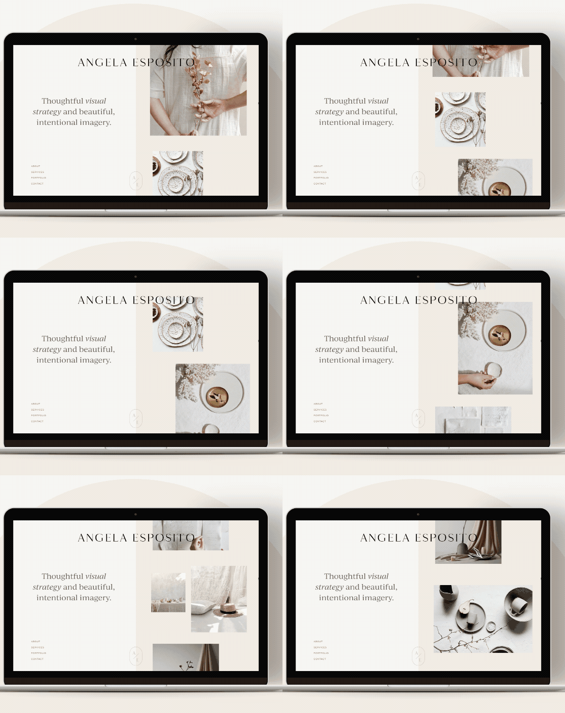
Last but not least, watch in awe as your half of your screen screen stays put while you scroll down the other side. That’s the fixed split section for you! It’s not hard to see why it’s another favorite custom element in Squarestylist.
Did you know that you can even add widescreen sections above and below your split sections? How about stacking multiple scrolling sections? Learn how to create all these and more in my Fixed Split Section course here.
All of my courses are compatible for both Squarespace 7.0 (Brine family template) and 7.1 (any template). On top of that, every purchase comes with a free 30-minute 1:1 consultation with me for any questions you might have.
So are you ready to break out of the usual Squarespace sections yet? Let me know which one was your favorite.
I’m excited to see what you’ll come up with!


