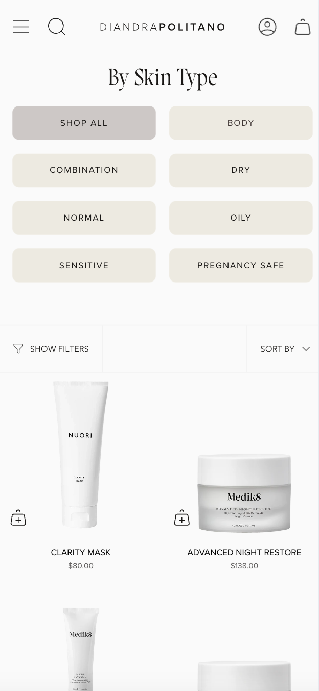
Diandrapolitano.com
by Sara Firth
Shopify
DIANDRAPOLITANO.COM
by Sara Firth of Luminary Lab
diandrapolitano.com
Designer Sara Firth of Luminary Lab
Platform Shopify
ProjecT TYPE Client Project
Category E-commerce
TeamWebsite Development / Sara Firth of Luminary Lab
Copywriter / The Good Ideas Co
STANDOUT TECHNIQUES
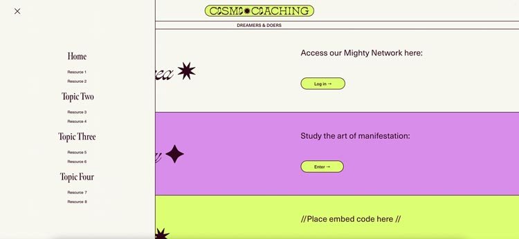
Mega Menu, Testimonial Slider
CLIENT TESTIMONIAL
“Looks so good SO fresh - love the brand links to the shop now too - sooo good! I think the button colours are better too. Thank you for everything.”
HOW STANDOUT PROGRAMS HELPED
“I have done both Standout Shopify and Standout Squarespace with Rache and it just wouldn't be possible without her! I have so much confidence going into a project knowing that I can execute what I am trying to achieve. Standout has helped me set the bar high and lets me bring a vision to life especially with incredible support from the team.”
– Sara Firth, Standout Squarespace and Standout Shopify member
Certified Standout Shopify
This website is proudly made with the techniques and support inside the Standout Shopify Program
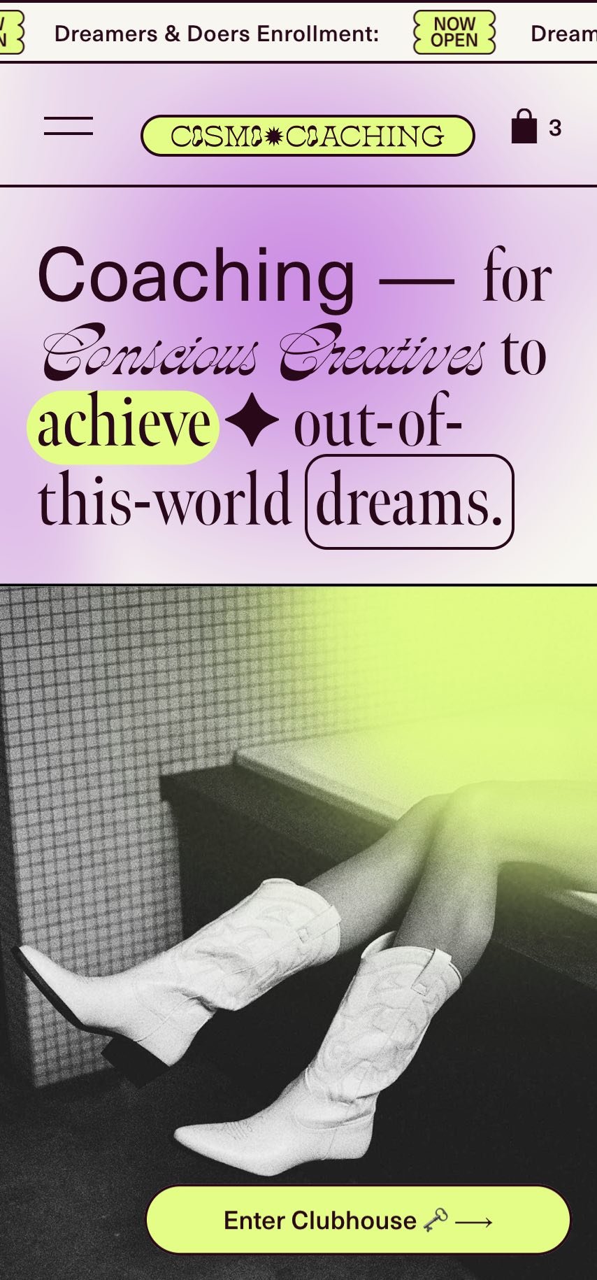
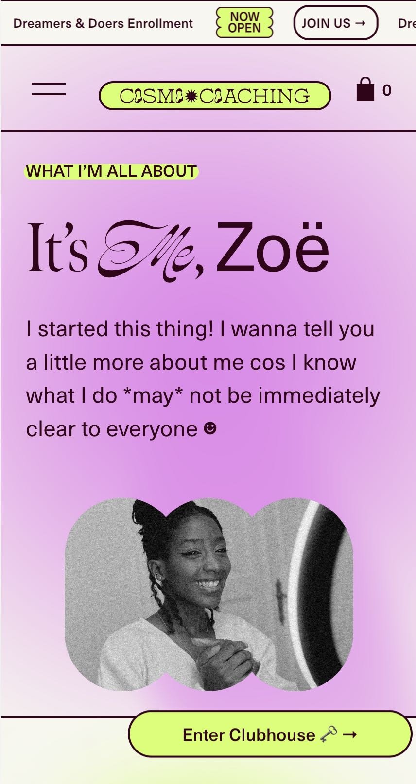
Cosmo Template
by Katie Zana
Squarespace
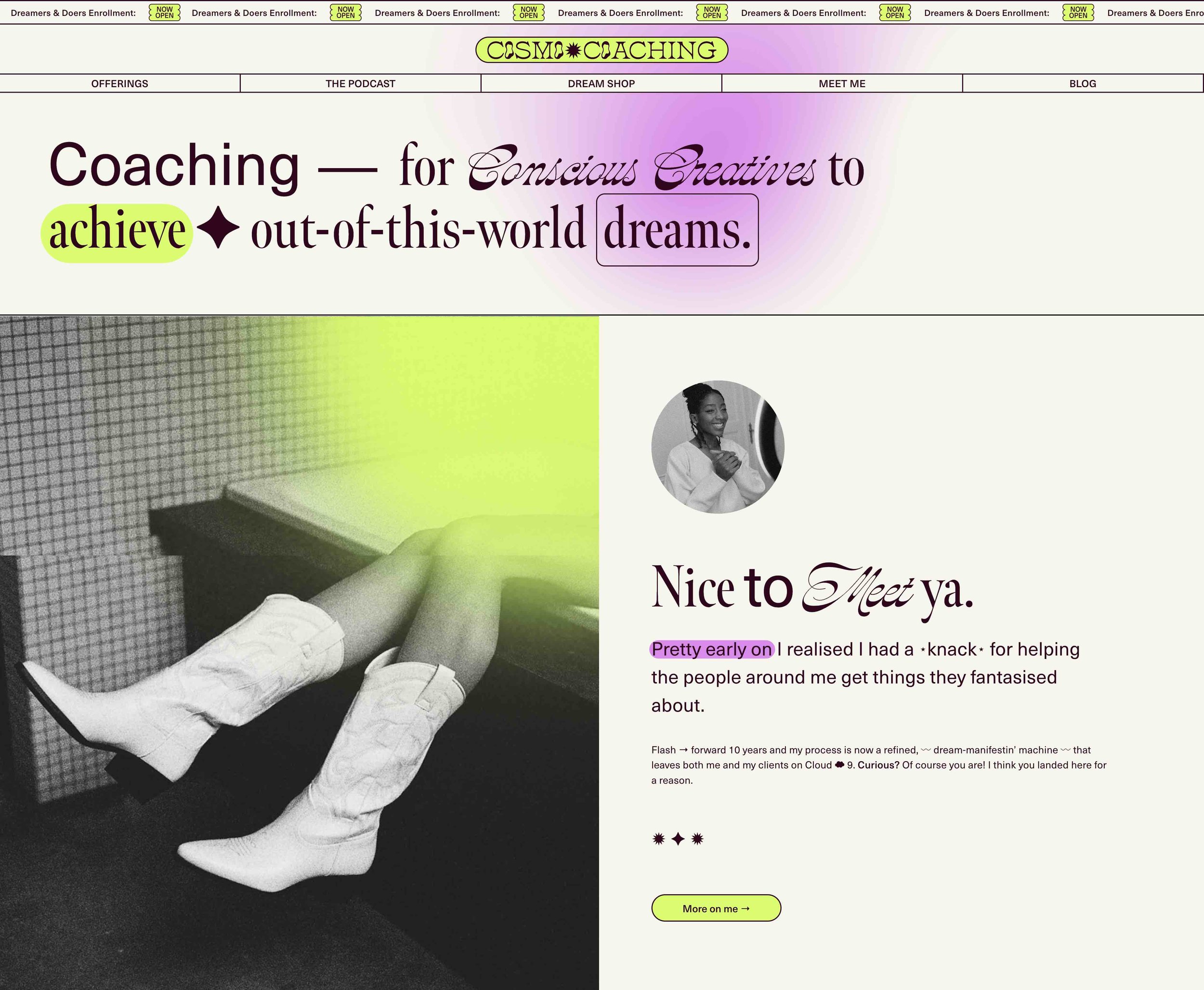
COSMO TEMPLATE
by Katie Zana of PEARLER
pearler.work
Designer Katie Zana of PEARLER
Platform Squarespace
ProjecT TYPE Template
CategoryPortfolio
Team
Website Design & Development / PEARLER
STANDOUT TECHNIQUES USED
Stacked cards, Lined navigation header, Fluid Split Sections, Scrolling Announcement Bar, Floating Fixed Button
CLIENT TESTIMONIALS
Absolutely love this template, so easy to use and Katie was so helpful and her videos regarding the template were very easy to understand and helpful too. Just love all the extra features this template gave my website to make it stand out!
Dropping by to say a bigger-than-words-can-say THANK YOU. You created a beautiful template that was simple for me to navigate as I made it my own. I appreciate all the work you do to make this process as easy as pie!
HOW STANDOUT PROGRAMS HELPED
“These features are so fun, but the important part is Rache's guidance to make it so that the codes are 'template-friendly' and so that the people who use COSMO for their own business don't actually need to touch the code at all.”
– Katie Zana, Standout Squarespace member
Certified Standout Squarespace
This website is proudly made with the techniques and support inside the Standout Squarespace Program
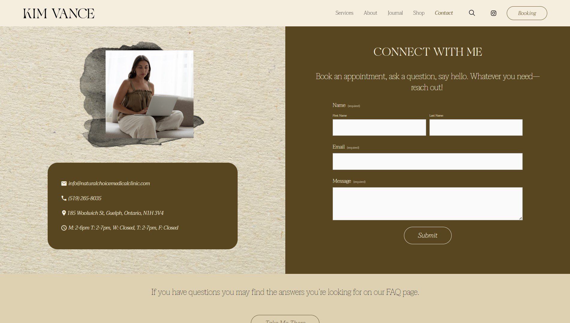
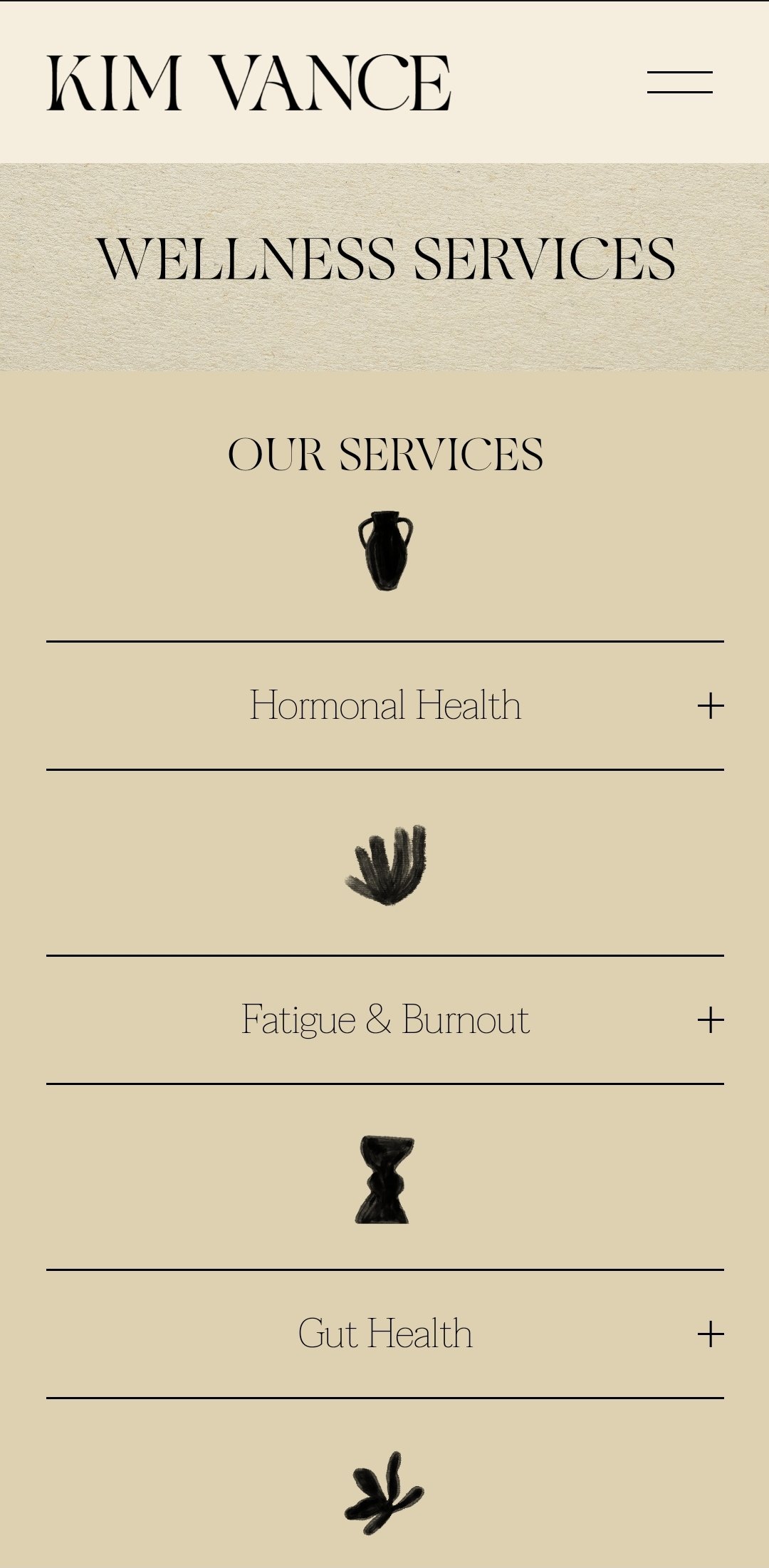
KIMVANCEND.CO
by Cecily Carlyle
Squarespace
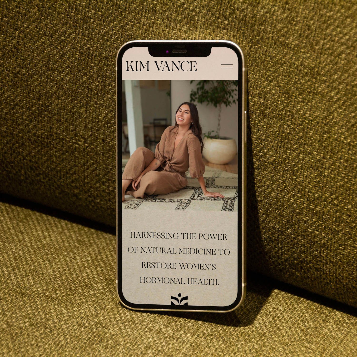
KIMVANCEND.CO
by Cecily Carlyle of CC RUTH
kimvancend.ca
Designer Cecily Carlyle of CC RUTH
Platform Squarespace
ProjecT TYPE Client Project
Category Brand Info
Team
Website Design & Development / Cecily Carlyle of CC RUTH
OUR FAVE STANDOUT TECHNIQUES
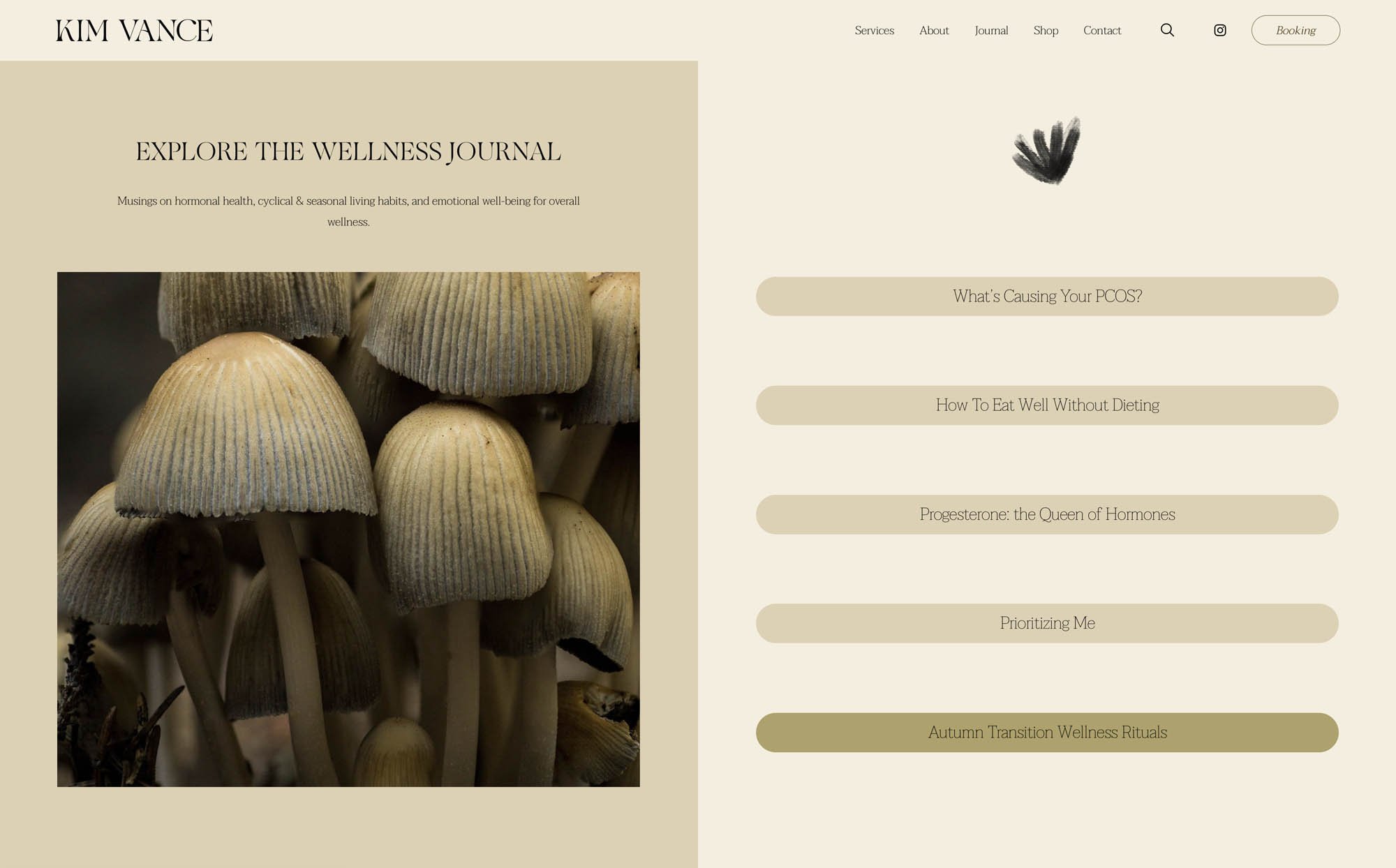
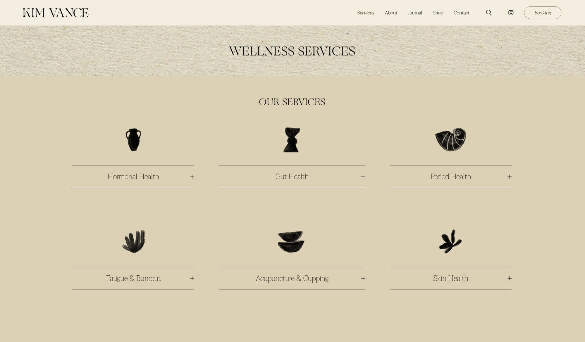
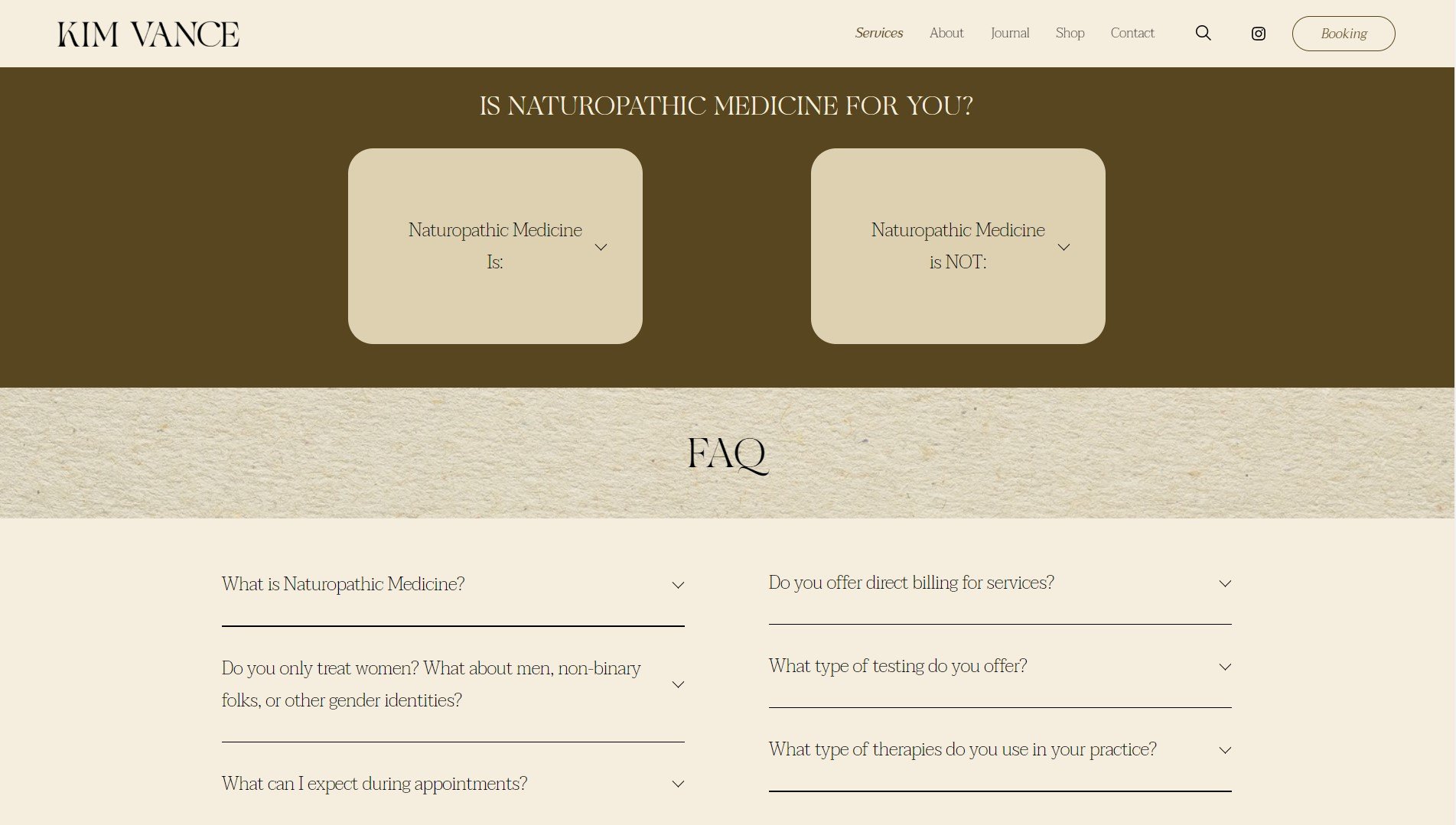
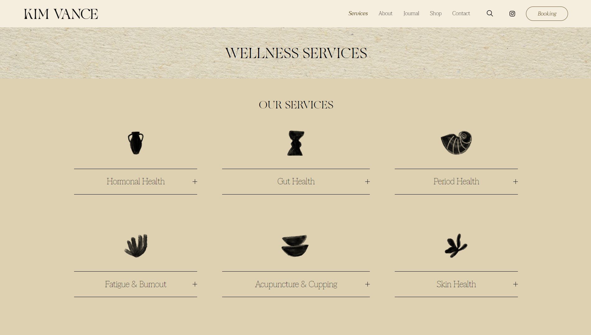
Fluid Tabs Grid, Stacked List Cards with offset
HOW STANDOUT PROGRAMS HELPED
Having and creating the foundational web strategy document provided in the program helped kickstart the project with a strong stylistic direction rooted in intention and purpose. By understanding the client's needs for maintaining and making future changes to the site, I ensured that I designed and built it using strategies from the workshops to make it easy for the client to update on their own.
Certified Standout Squarespace
This website is proudly made with the techniques and support inside the Standout Squarespace Program
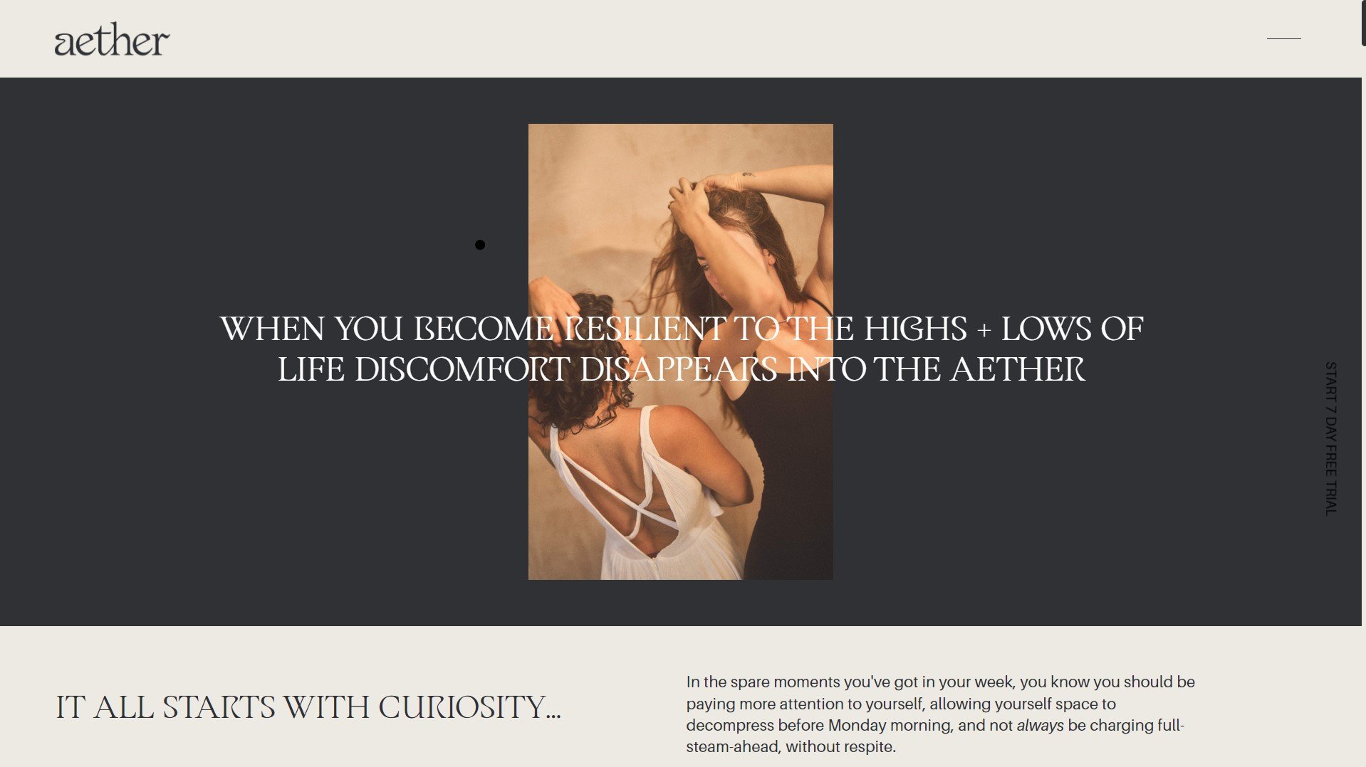
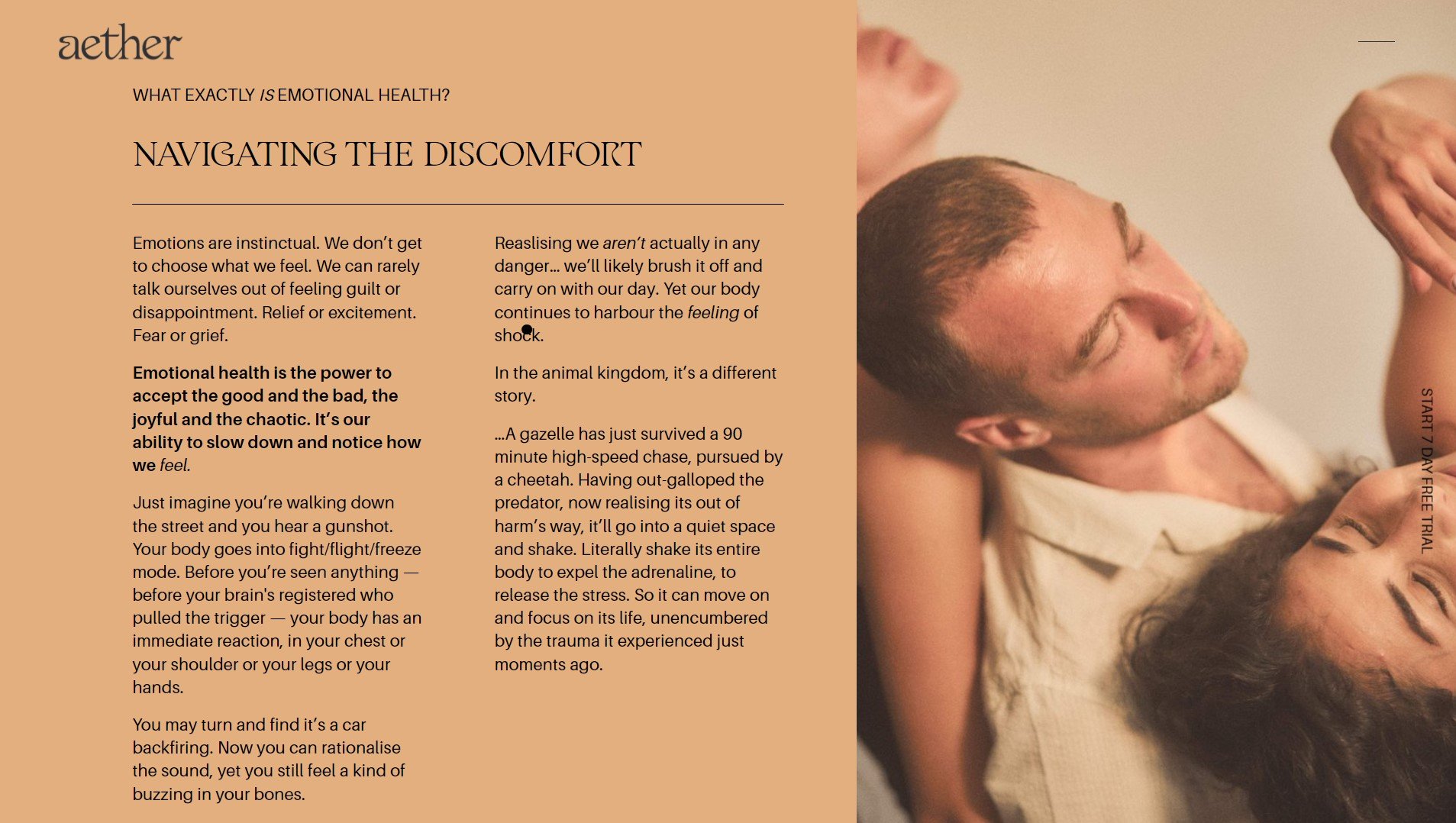
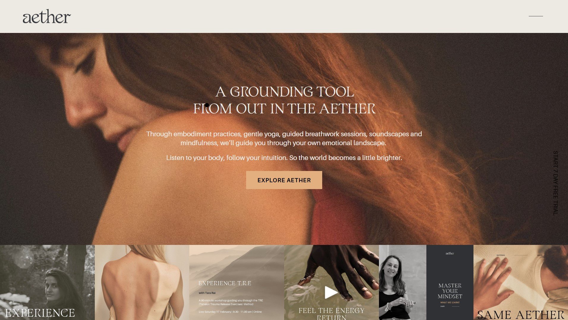
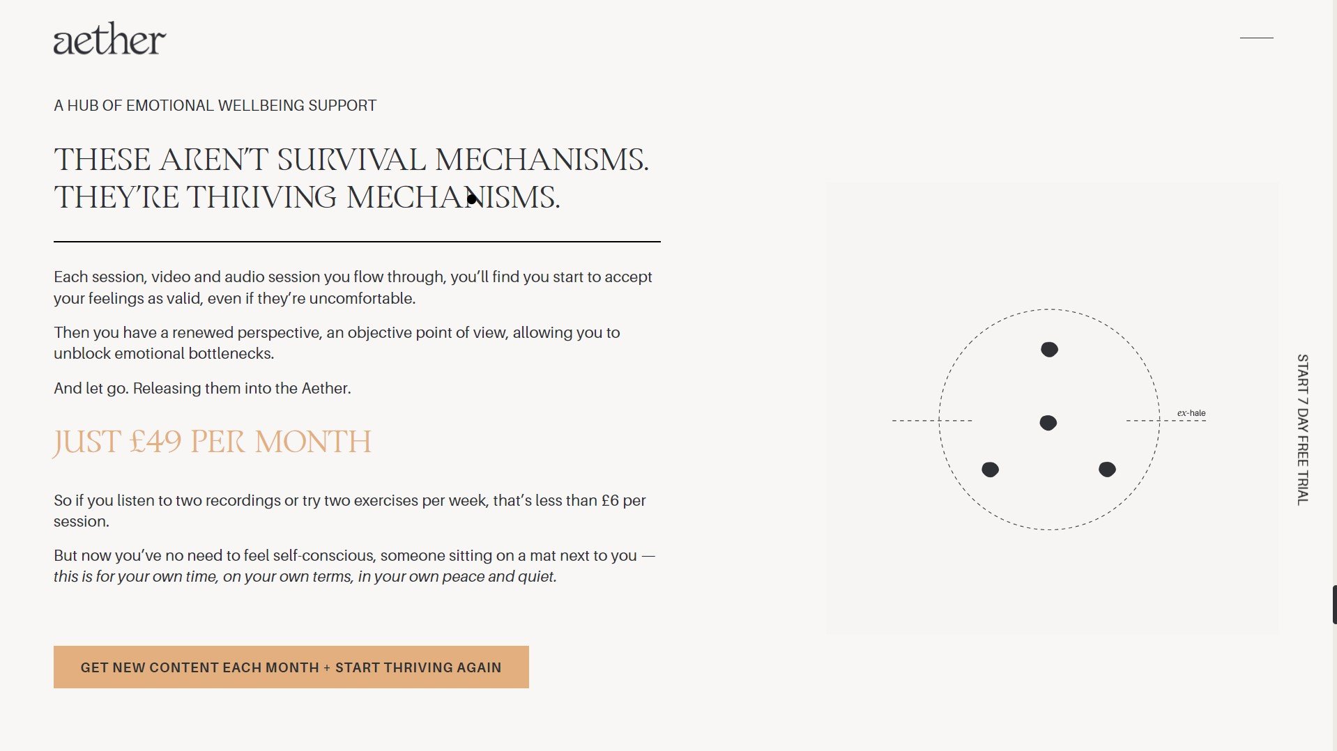
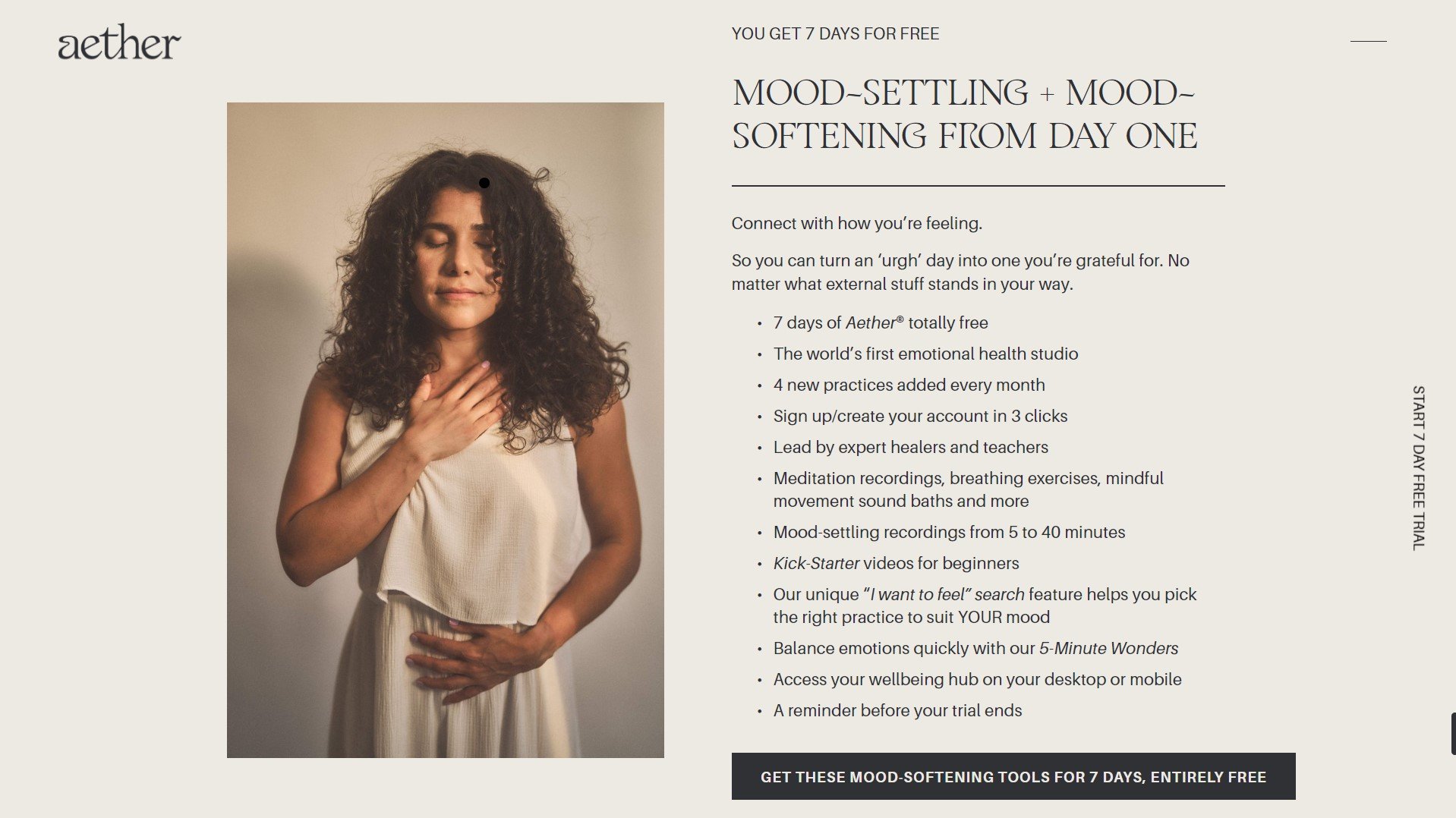
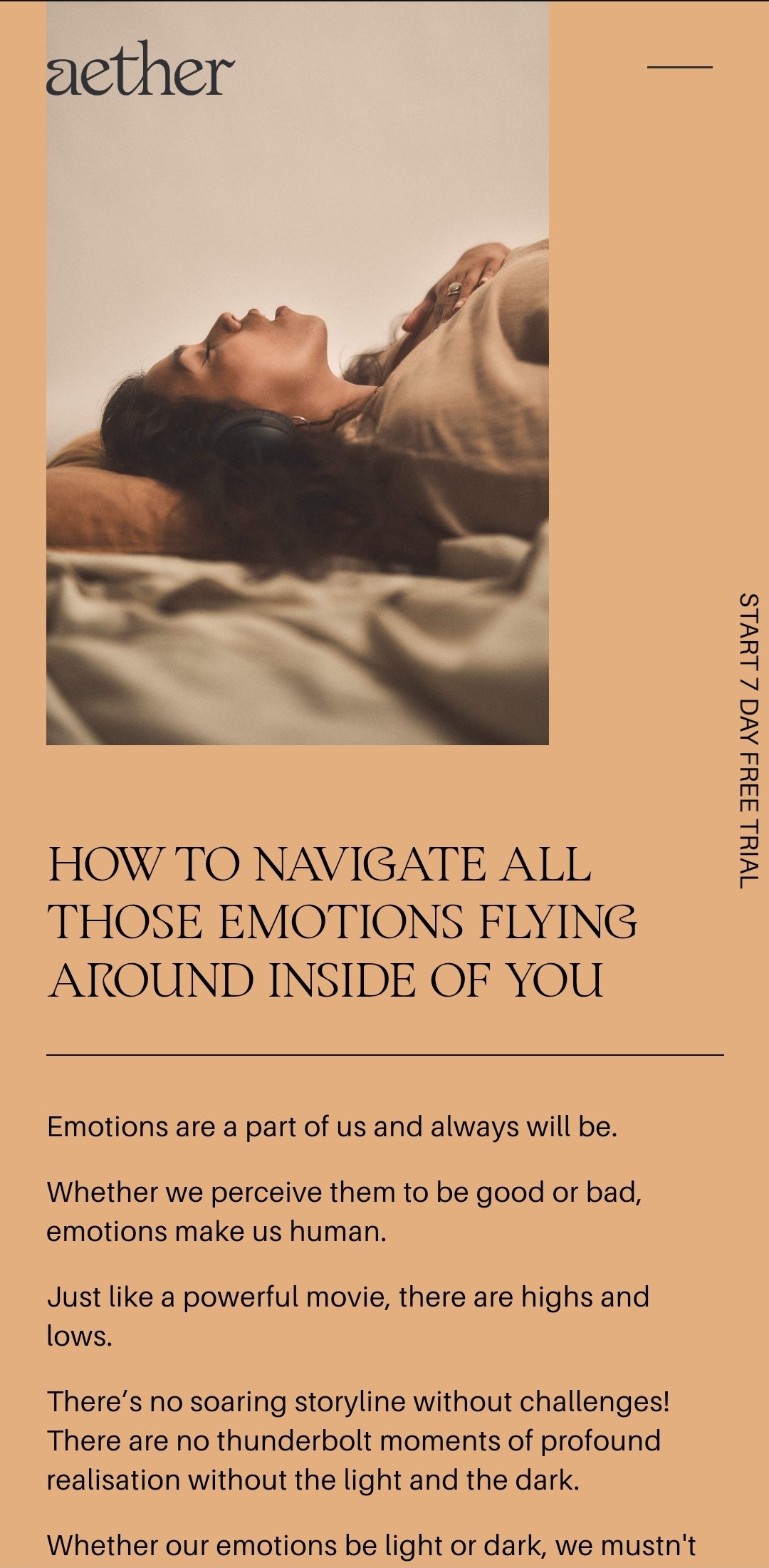
A-e-t-h-e-r.com
by Erin Fitzimmons
Squarespace
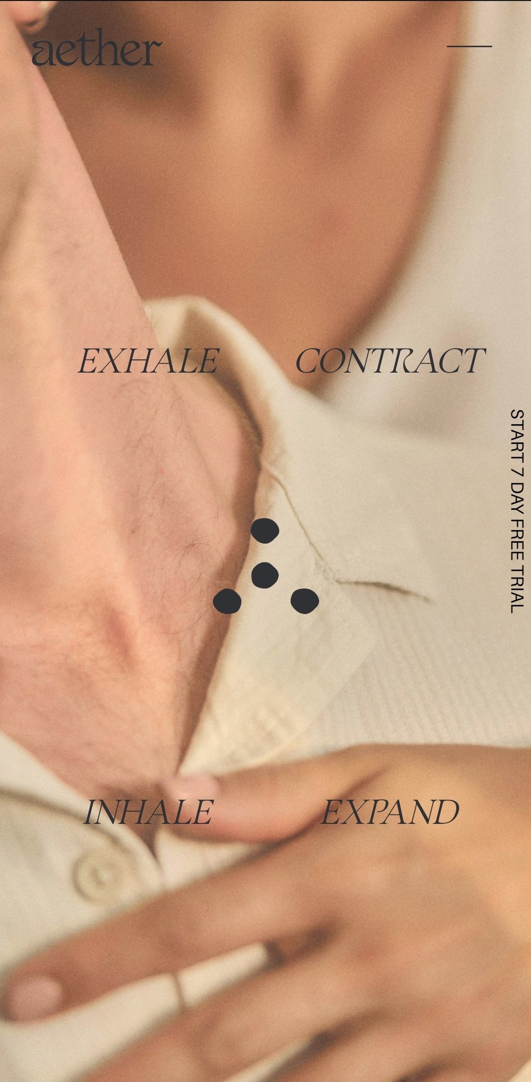
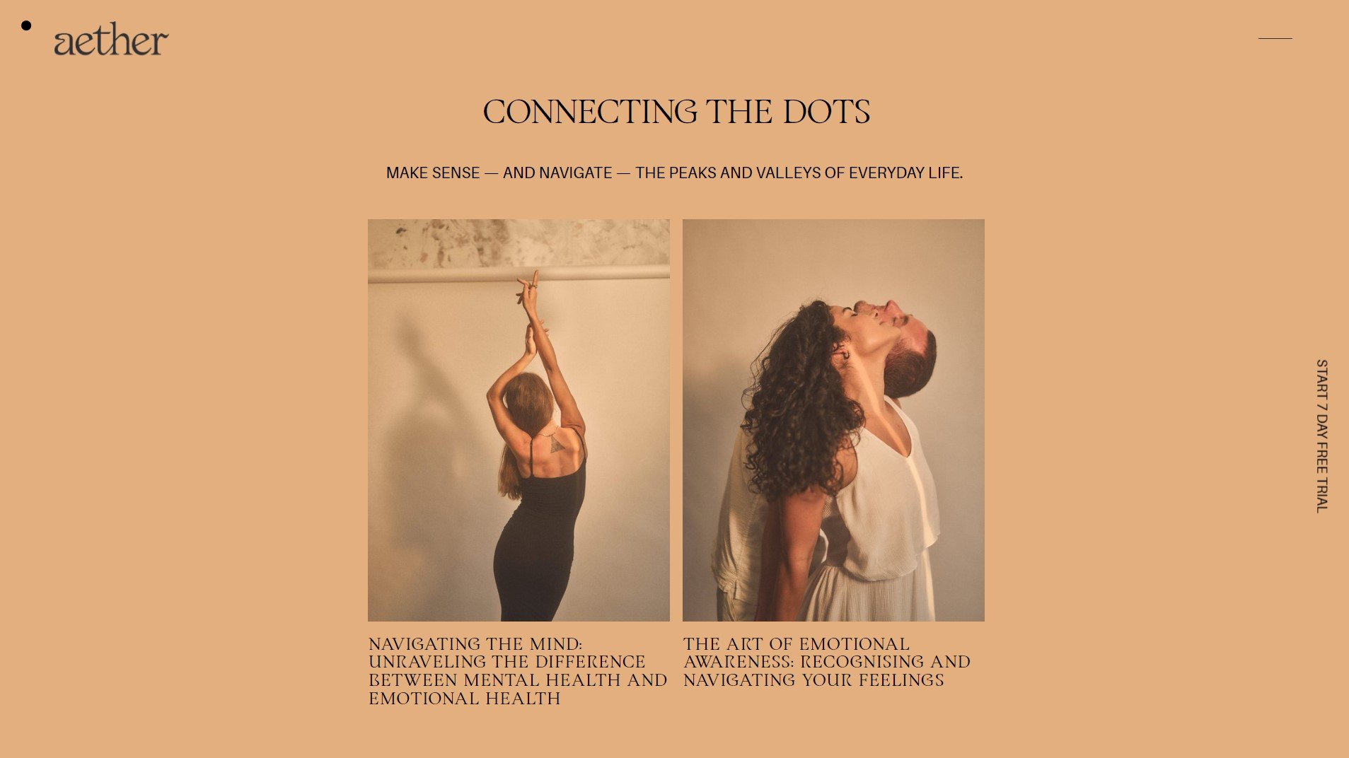
AETHER.COM
Designer Erin Fitzsimmons
Platform Squarespace
ProjecT TYPE Client Project
Category Brand Info
Team
Website Design
& Development / Erin Fitzimmons
OUR FAVE STANDOUT TECHNIQUES
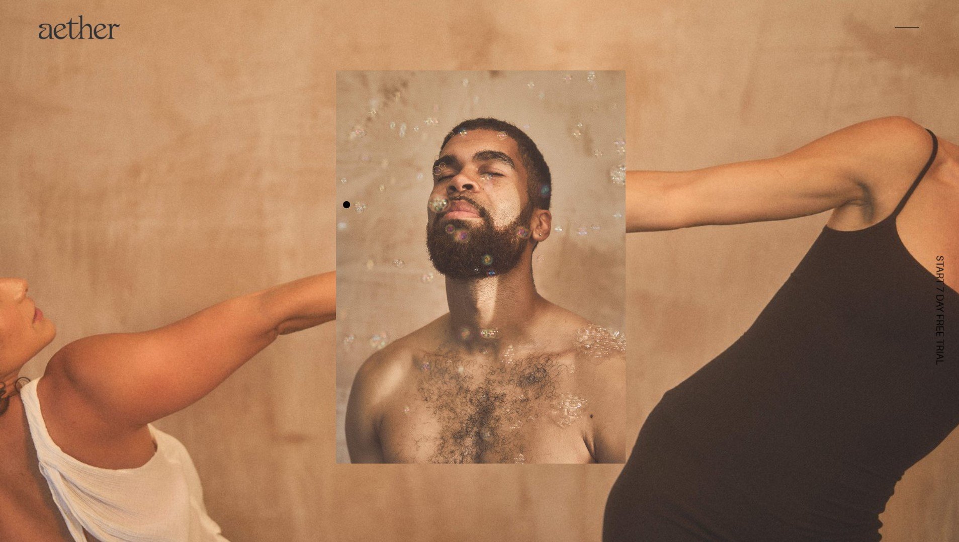
Sticky Gallery, Sticky and Transparent Sections, Menu Reveal
Certified Standout Squarespace
This website is proudly made with the techniques and support inside the Standout Squarespace Program
Erinparekh.com
by Bessie Anderson
Squarespace
ERINPAREKH.COM
by Bess Anderson
ERINPAREKH.COM
Designer Bess Anderson
Platform Squarespace
ProjecT TYPE Client Project
Category Business
TeamWeb Design & Development / Bessie Anderson
STANDOUT TECHNIQUE
Mega Menu
Rache’s Notes
You scroll through Erin Parekh’s online space and you feel cared for, understood, gratified. We ascribe it to her copy, the well-balanced colors, how pieces of information are neatly tucked and sectioned off into clear pages. You find exactly the help you need when you need it , and that just shows how much they care. I love that this care is nicely infused into their design and development.
My highlights are the sweet-colored pill-shaped categories for organizing blog posts (oftentimes overlooked but is a hallmark of any remarkable resource) and that stylish mega menu of course! Who doesn’t love it when function meets style?
– Rache of Squarestylist
Certified Standout Squarespace
This website is proudly made with the techniques and support inside the Standout Squarespace Program
Resetnutrition.co
by Meagan Harbott
Squarespace
RESETNUTRITION.CO
by Meagan Harbott of Meagan Harbott Design
RESETNUTRITION.CO
Designer Meagan Harbott of Meagan Harbott Design
Platform Squarespace
ProjecT TYPE Client website
Category Portfolio
TeamWeb Design & Development / Meagan Harbott of Meagan Harbott Design
STANDOUT TECHNIQUE
Styling Marquee Block, Blog Filters


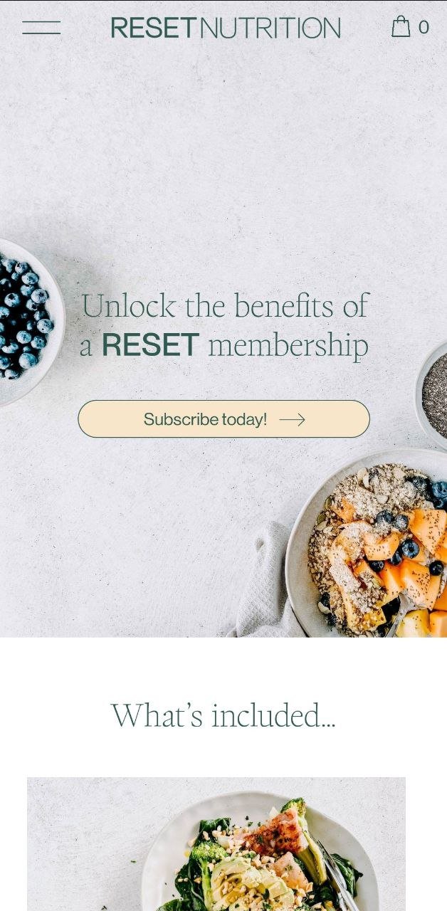
Wellness websites that shine are those that are far from complicated. Simple, clear and straightforward is what we always advice, which is why we love the one clear subscription call-to-action of Reset Nutrition. It’s a strategic format really—you scroll through the homepage and you find all inclusions, pricing, frequently asked questions. Their one main offering is crystal clear, so saying yes is almost a no-brainer.
We love a website that maximizes native Squarespace features, and for good reasons. Look out for key takeaways in blog posts highlighted with underlines and circles, take them with you in real life and get that much-needed reset at last.
– Rache of Squarestylist
Certified Standout Squarespace
This website is proudly made with the techniques and support inside the Standout Squarespace Program
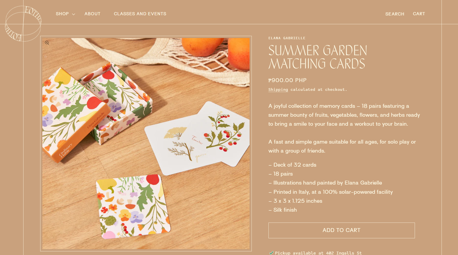
Eothencircle.com
by Erin Hammond
Shopify
EOTHENCIRCLE.COM
by Erin Hammond of Soirée Design Studio
EOTHENCIRCLE.COM
Designer Erin Hammond of Soirée Design Studio
Platform Shopify
ProjecT TYPE Client website
Category Portfolio
TeamWebsite Development / Soirée Studio
Brand Identity and Web Design / Nature
Photography / Hannah Thornhill & Cassie Arden
STANDOUT TECHNIQUE
Shop The Look, Esencia Theme
Ask me what I would consider an e-commerce experience that’s unique yet well-balanced, and I’d for sure mention Eothen Circle. They were clever to make their online space feel like an extension of their brick-and-mortars, adding prominent images of their storefronts and shelves and utilizing the Shop The Look Section Template so that on hover, selected products would pop-up and you could easily add to cart.
There are many details to love, but mine would be how the background color changes so subtly on scroll, or depending on the page. I’m immensely impressed how Erin transformed our Esencia theme to this beauty. It gives the site a different feel each time, which makes you want to stay a little longer.
– Rache of Squarestylist
Certified Standout Shopify
This website is proudly made with the techniques and support inside the Standout Shopify Program


