A-e-t-h-e-r.com
by Erin Fitzimmons
Squarespace
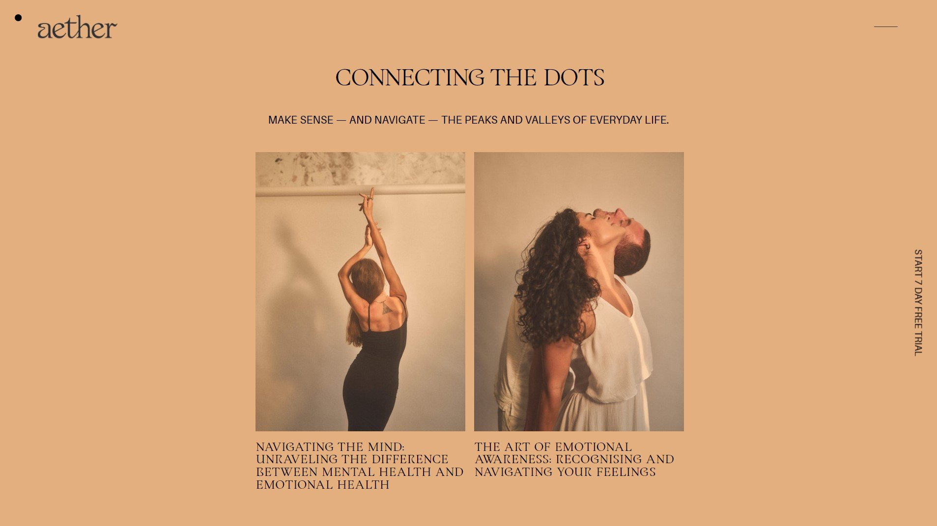
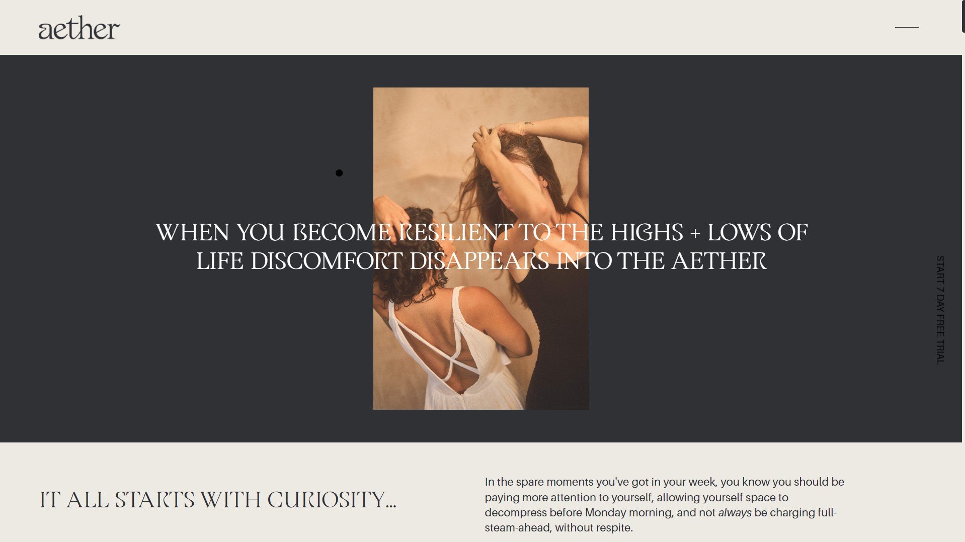
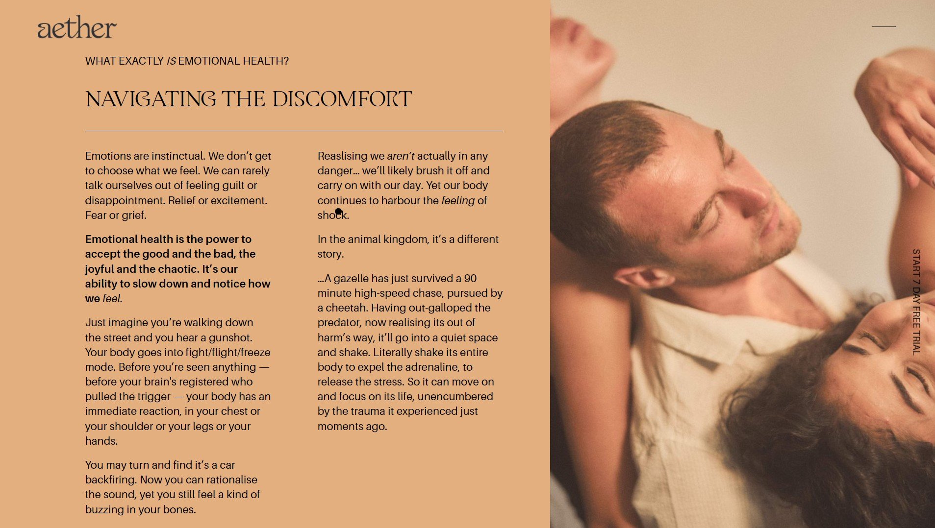
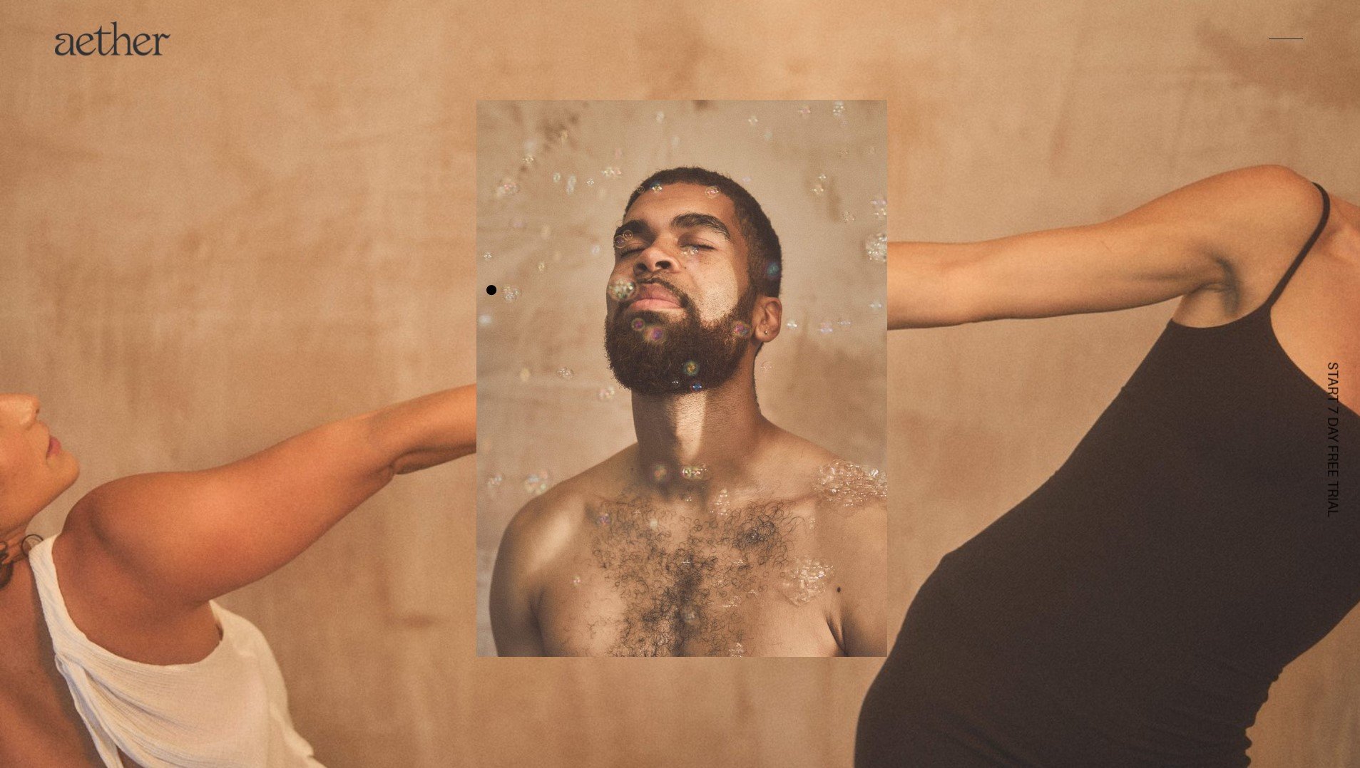
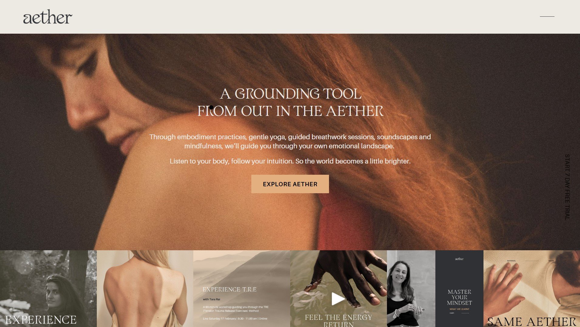
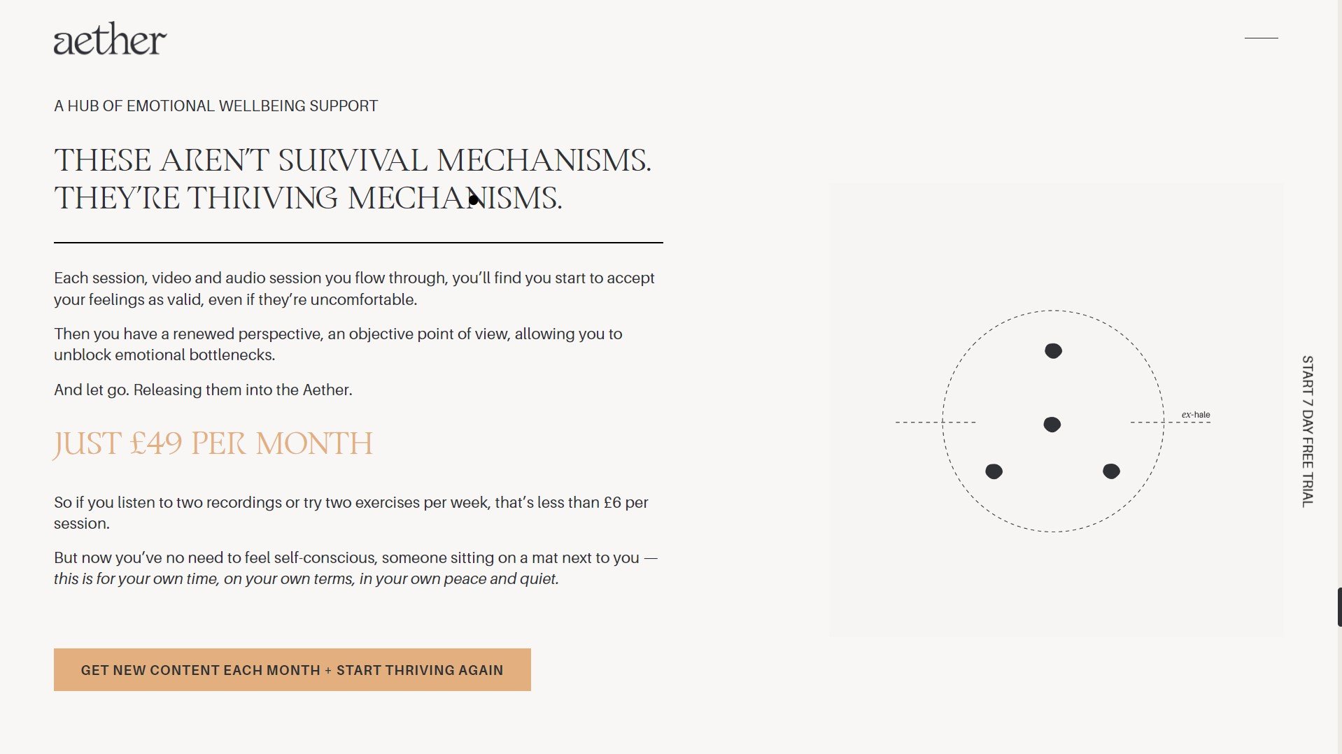
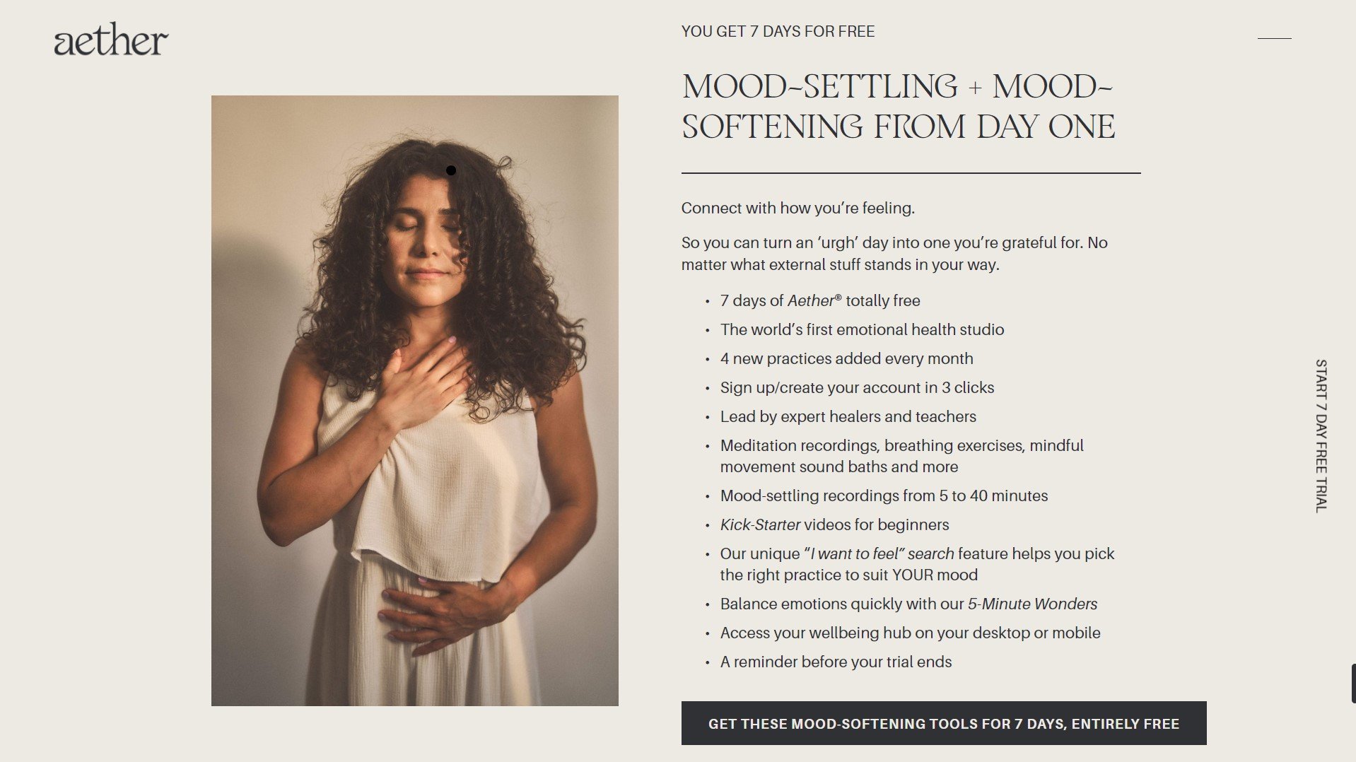
AETHER.COM
Designer Erin Fitzsimmons
Platform Squarespace
ProjecT TYPE Client Project
Category Brand Info
Team
Website Design
& Development / Erin Fitzimmons
OUR FAVE STANDOUT TECHNIQUES
Sticky Gallery, Sticky and Transparent Sections, Menu Reveal
Certified Standout Squarespace
This website is proudly made with the techniques and support inside the Standout Squarespace Program
Erinparekh.com
by Bessie Anderson
Squarespace
ERINPAREKH.COM
by Bess Anderson
ERINPAREKH.COM
Designer Bess Anderson
Platform Squarespace
ProjecT TYPE Client Project
Category Business
TeamWeb Design & Development / Bessie Anderson
STANDOUT TECHNIQUE
Mega Menu
Rache’s Notes
You scroll through Erin Parekh’s online space and you feel cared for, understood, gratified. We ascribe it to her copy, the well-balanced colors, how pieces of information are neatly tucked and sectioned off into clear pages. You find exactly the help you need when you need it , and that just shows how much they care. I love that this care is nicely infused into their design and development.
My highlights are the sweet-colored pill-shaped categories for organizing blog posts (oftentimes overlooked but is a hallmark of any remarkable resource) and that stylish mega menu of course! Who doesn’t love it when function meets style?
– Rache of Squarestylist
Certified Standout Squarespace
This website is proudly made with the techniques and support inside the Standout Squarespace Program
Resetnutrition.co
by Meagan Harbott
Squarespace
RESETNUTRITION.CO
by Meagan Harbott of Meagan Harbott Design
RESETNUTRITION.CO
Designer Meagan Harbott of Meagan Harbott Design
Platform Squarespace
ProjecT TYPE Client website
Category Portfolio
TeamWeb Design & Development / Meagan Harbott of Meagan Harbott Design
STANDOUT TECHNIQUE
Styling Marquee Block, Blog Filters


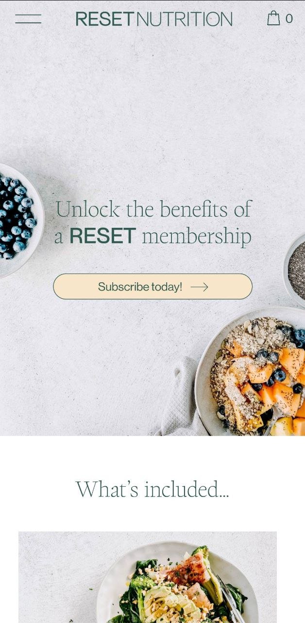
Wellness websites that shine are those that are far from complicated. Simple, clear and straightforward is what we always advice, which is why we love the one clear subscription call-to-action of Reset Nutrition. It’s a strategic format really—you scroll through the homepage and you find all inclusions, pricing, frequently asked questions. Their one main offering is crystal clear, so saying yes is almost a no-brainer.
We love a website that maximizes native Squarespace features, and for good reasons. Look out for key takeaways in blog posts highlighted with underlines and circles, take them with you in real life and get that much-needed reset at last.
– Rache of Squarestylist
Certified Standout Squarespace
This website is proudly made with the techniques and support inside the Standout Squarespace Program


