Notion Project Tracker and Designer Portral
In this video, I'm sharing a walkthrough of my Notion Project Tracker and Client Portal. The Project Tracker immensely helps me in keeping track of my branding and web design projects. While the Client Portal serves as a central place where I communicate with clients.
Notion for designers: project tracker and client portal
a.
Business
b.
Video Walkthrough
INTRO
In this video, I'm sharing a walkthrough of my Notion Project Tracker and Client Portal. The Project Tracker immensely helps me in keeping track of my branding and web design projects. While the Client Portal serves as a central place where I communicate with clients.
Timestamped Overview
2:39 Key Features of Notion Project Tracker and Client Portal for Brand and Web Designers
5:45 How to share the Client Portal with clients
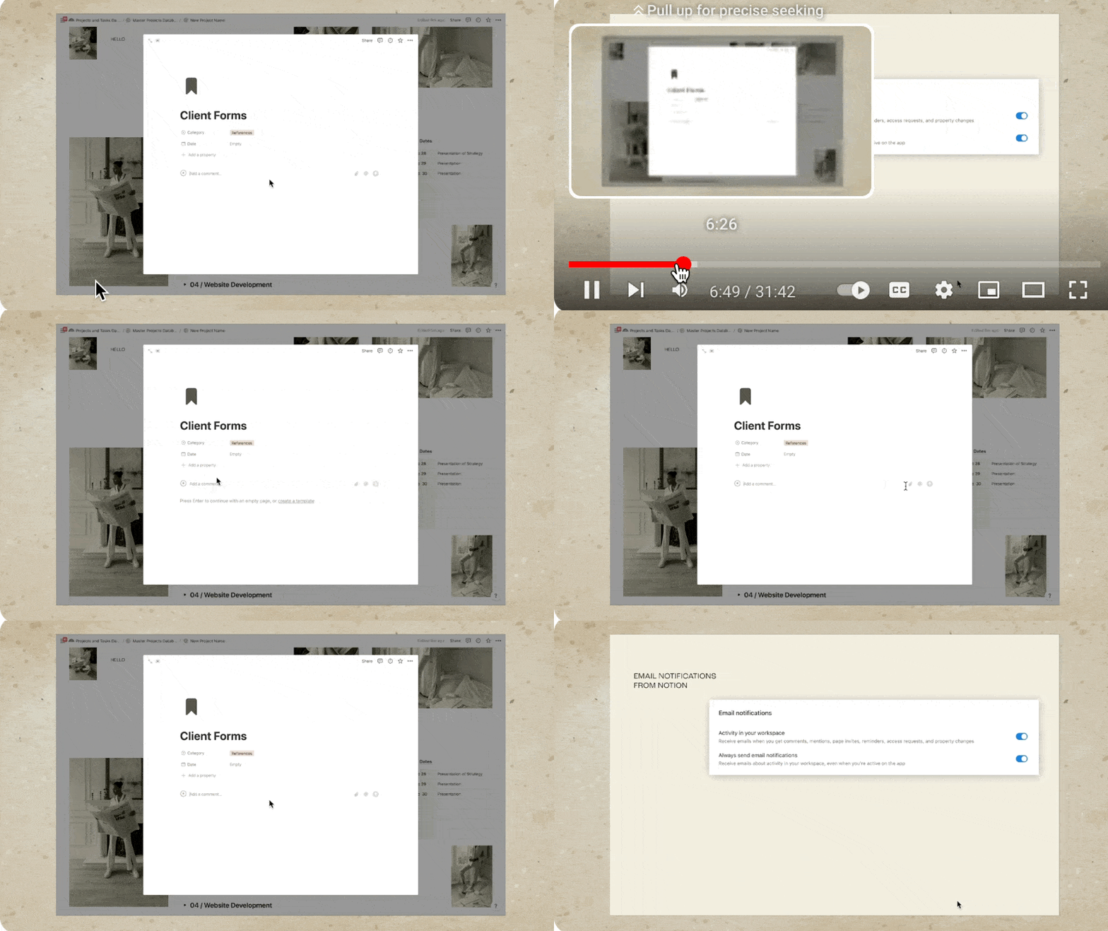
6:43 How to make sure that clients receive notifications in Notion
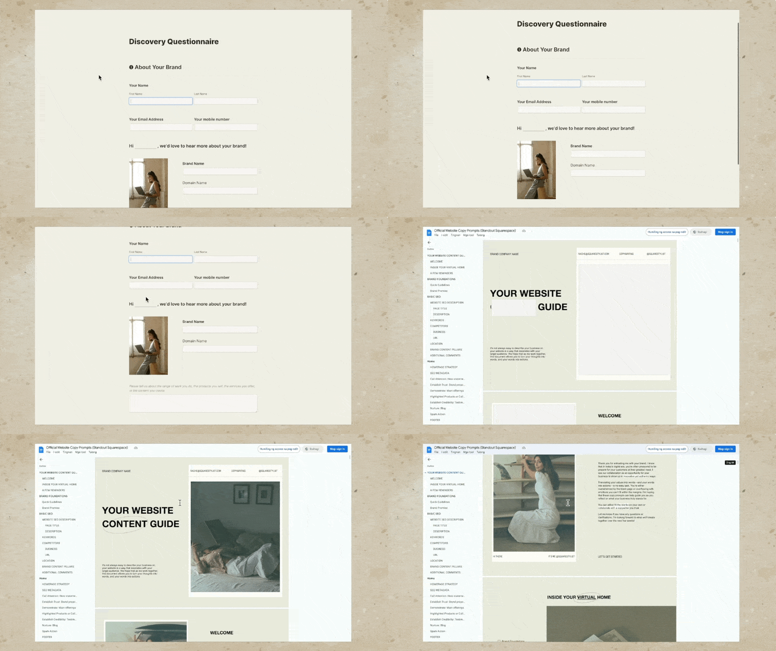
9:54 How to share questionnaires and content guide for clients to complete
11:04 How to consolidate view of all tasks across projects
14:05 How to use an customize the Notion Template from Squarestylist
21:18 How to add Notion buttons that opens a specific page
22:41 How to set automatic reminders for clients
28:00 Setting up dependencies in Notion so schedules automatically move depending on schedule
I know, I know, you've probably watched a lot of Notion setups and tours by now, but do you know you can take your Notion client portal from this to this?
Hi, I'm Rache from Square Stylist, and today we'll personalize your Notion project dashboard in a simple and stylish way without overwhelming you or your clients.
Why Notion?
There are no shortages of client portals available online. There are a lot of off-the-shelf options, like Dubsado or Honeybook, but they are less flexible in terms of design. On the other hand, you can go with Notion, an all-in-one workspace with building blocks for limitless possibilities. But if you've used it before, you know that Notion can get out of hand real quick. Just take a look at my project dashboard from last year.
Issues with My Previous Dashboard
This portal is pretty comprehensive, but there were a few drawbacks:
Overwhelming Layout: Clients found that there was too much to take in all at once, and they needed to click through too many pages to navigate.
Ordinary Design: If your Notion client portal ends up looking like every other template, it kind of defeats the purpose of going for Notion's versatile platform, doesn't it?
Confusing Questionnaires: Since clients were given full edit access on the Notion page, they tended to delete the entire questions by mistake.
Scattered Tasks: Getting a high-level overview of all tasks was difficult due to permission issues, and we had to create a separate calendar per project, making it hard to merge calendars and obtain a clearer view of tasks needed across projects.
Redesigned Notion Project Dashboard
With all that in mind, I went back to the drawing board and redesigned my entire Notion project dashboard while also incorporating new Notion features. This time, I made sure to feature checklists of what clients need to know. They can access only relevant information at a glance. Not to mention the overall look and feel is more on-brand, thanks to a few design choices I've made by playing around with the settings.
Key Features of Our Notion Project Tracker
Client Portal Layout
First, we have a simple yet stylish and inspiring layout for the client portal. You may easily swap the images to match your own brand. Our Notion client portal template looks great in both light mode and dark mode. We share this dashboard with a client so they know exactly what to expect in the course of our collaboration. But we also want this to be an engaging space for them to look forward to and to be excited about.
Checklist Format
In this client portal, we adopted a new checklist format, laying out what the client can expect from us and what we expect from them at every project phase.
To make it easy to digest, I used toggles and checkboxes highlighting how each phase is dependent on both client and designer inputs.
Previously, I used a Kanban board format, which you'll find in most Notion client portal templates as well. But while this Kanban board view makes sense to me, some clients and designers brought up that this Kanban view looks overwhelming for the following reasons:
Clients get confused about which card to click and where to add their feedback.
It takes a few clicks and navigating to get to a certain document.
They get overwhelmed seeing other tasks that are not relevant to them.
Laying out the stages and tasks in a checklist format while highlighting key dates makes it less overwhelming. We also have a project status block that highlights the most important task at the moment. For example, if we just initiated the project, then most likely we'll be asking for the client's answers to our questionnaires or our content guide. Hence the call to action here is to view the client forms, and if they click on it, they will be automatically led to that particular document where they can click the link to answer the questionnaire as well as provide the content.
Centralized Feedback and Conversations
We made client feedback and conversations more centralized and straightforward. When we book a new project, all we need to do is click this "Add a Project" button, and all the content of the project client portal template will be automatically generated. We simply need to populate this with details that are particular to this project, such as the project name, dates, and references.
We share this Notion client portal with a client so we can communicate right in Notion. All we need to do is share this entire dashboard but make sure that when we invite them, we only give them "can comment" permission.
This way, the client won't be able to mistakenly delete any of the elements within our portal, but they can view any of our presentations or briefs or videos and questionnaires and then comment right in the comment section of that Notion page, giving us context on what the conversation is about.
Robust Comment Features
Notion's comment features are actually quite robust because we can easily attach files. We may use the Mention option to notify our clients via email, and we may also add reminders. Contrary to popular misconceptions, Notion's email notifications are actually quite reliable. But it's important to make sure that in the welcome video where we introduce our Notion client portal to our client, we remind the client to ensure that under Settings, the option to always send email notifications is toggled on.
In the same video, we encourage them to always tag us or mention us in the comments when they leave feedback. Because every time we tag our clients, or every time they tag us, we receive these email notifications. To trigger reminders to someone else like the client, we simply need to mention them again, followed by the reminder.
Project Vault
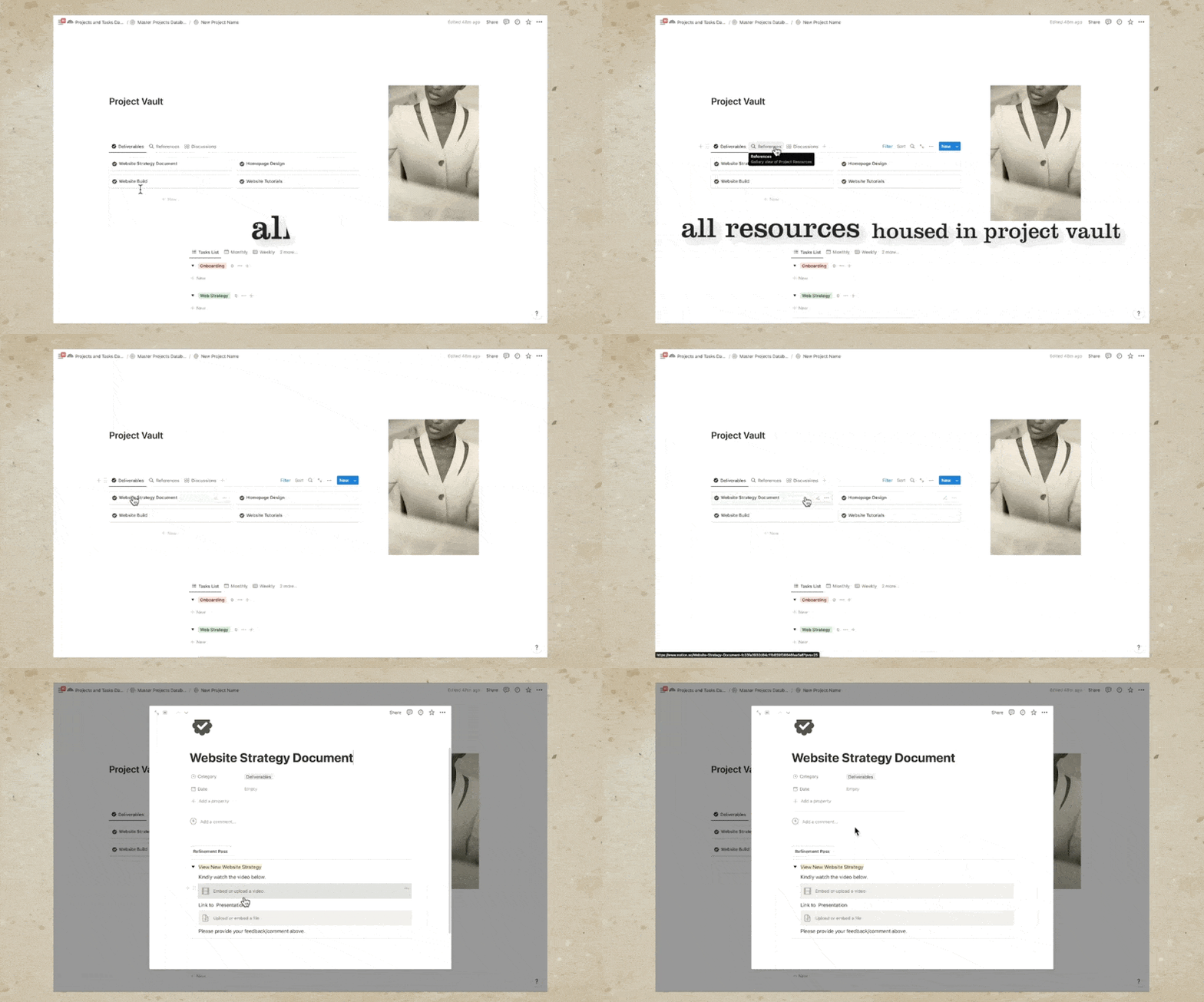
We are able to house all important deliverables, references, and discussions in our project vault. For example, all our deliverables and conversations are accessible by clicking these cards. For example, under Website Strategy Document, this is where we embed the video and the link to the presentation, and this is where we invite our clients to share their comments. The same is true when we are presenting other deliverables such as homepage design.
For example, we can add the video to walk them through our design for the homepage and an option for them to view the design. Our clients can approve the designs via the comments or, if you'd like to formalize it, they can signify their approval by signing a sign-off or approval form where they can affix their signature and submit this so we can finalize this specific phase of the project.
We also use the Project Vault to house all references such as contract invoices, brand guidelines, and more. Feel free to add more references so you won't find it hard to find relevant files for a particular project. We may also house relevant links and inspirations here so it's easy to find them. Personally, I love adding my checklists under References because my web development process involves a lot of tasks, and to make sure that I am as accurate and thorough as possible, I have a comprehensive checklist of all the steps involved in my website design and development process.
Client Questionnaires
I used to use Notion to create questionnaires, but recently I started adapting other software. For example, for my questionnaire, I use this form so the client can easily submit it without mistakenly editing the questions. For my copy prompts where I ask the clients to provide the copy for their project, I use Google Docs, and this is a preview of my Google Docs content guide.
In this video, you'll learn that you can have access to this Notion client portal template and dashboard. However, the template won't include my client forms and my process checklist, but if you wish to have access to these, I share these forms and checklists within my flagship programs Standout Squarespace and Standout Shopify. The links are in the description below, or you may subscribe to this channel. Because I'll keep creating videos about these form builders and checklists that I create.
Notion's New Project and Sprint Features
Another key feature of this designer project tracker is that it is now powered by Notion's new project and sprint features. We are now able to consolidate all tasks across projects in just a single view. Notice how we have a project dashboard at the top, where we have different views of how our projects are overlapping or where in the process these projects are. We also have the option to view all projects.
This project dashboard is typical to most Notion client portal templates. But what's new with our designer project tracker is that we now have a master tasks dashboard reflecting what's due today, what's due next week. We also have a calendar view of the tasks due across multiple projects. And if we'd like to just view the tasks for a certain project only, then we have a filter right here. For example, if I only want to see the tasks for our essential project, then I can choose this filter, and it will only show the tasks for our essential project.
And if you have advanced project management needs, there is an option for you to add more properties to each task and even adapt sprints because this is now powered by the new Sprint feature of Notion.
In my previous project dashboard, and this is also what you'll find in most Notion templates, we had to click through each project before we were able to view the tasks that are due for each project. This consolidated view of all tasks across multiple projects is now possible because this list of tasks that we'll find when we open any of our client portals, at the very bottom, you'll find a list of the tasks related to this particular project only.
It's important to remember that this table or database is not visible to the client. This is only visible to us, the owner of the Notion workspace. We may also collaborate with our team members using this database. We don't need to hesitate because the notes and details right here won't be visible to our clients. Clients don't need access to all of these tasks and steps. What they actually just need is a simple and straightforward view of the current project status. Hence, this checklist format is more than sufficient.
Setting Up Your Own Notion Project Tracker
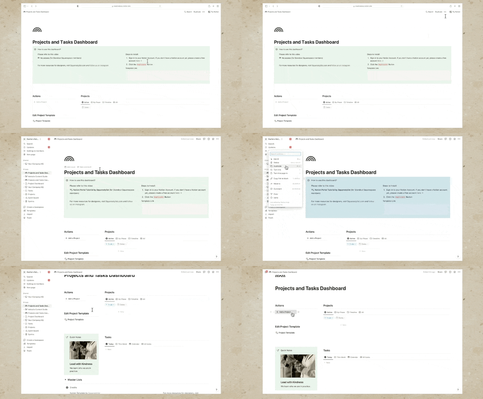
Let's walk through how you can set up something similar for your studio, step by step. I have great news for you, because you don't have to build this designer project tracker and client portal from scratch. Using the link in the description below, you'll have access to this exact Notion template. The template link will lead you to this screen.
Steps to Install the Template
1. Sign in to your Notion account: If you don't have a Notion account yet, don't worry, you may create a free account using the link provided here.
2. Duplicate the template: Click the "Duplicate" button at the top right corner.This will now be duplicated to your own Notion account, and you may now edit it to your heart's content.
You may change the title, remove the call-out for the instructions, and start editing the project template. This template contains the default content when we hit the "Add a project" button, so it's best to customize it based on how you typically run your projects. For example, if you'd like to change the images, simply click the ellipses icon and hit the replace button.
Welcome Video
I recommend creating a welcome video walking the client through how we can make use of this client portal. First, remind them that they would need to set their notifications to always receive emails.
They can do so under Settings and Members, My Notifications, and toggle on the option to always send email notifications. In that welcome video, let them know that we will guide them on how to provide feedback to our presentations. It's as simple as clicking this button and adding a comment right here. Just make sure that they mention us every time they comment.
In the video, I also mentioned that if they have any general questions that are not related to the presentation that we are currently reviewing, they may simply toggle on this chat button and hit the "Send Message" option.
You may use the same welcome video across all your clients. Hence, we're adding that welcome video in our template. To add that welcome video, simply toggle on this "How to use this dashboard" and paste the video link right here. Alternatively, you may hit forward slash on your keyboard, start typing Video, and then this is where you'll add any YouTube or Vimeo links. You may choose to edit parts of this template.
Again, this will be applied to succeeding projects that you'll create using this project tracker.
Process Steps
At the moment, I added stages of my process from onboarding up until offboarding. But if you have any other main phases of your project, feel free to just add a process step by clicking this button. For example, if you have a brand strategy happening after onboarding, then this will be our brand strategy phase, and we can simply move this using the six-dot icon to the proper place within your process.
We may also make changes to this Project Vault content, keeping in mind that whatever we add here will be applied across all projects. This task list must be kept empty while we're editing the template. We will populate it when we are editing the client-specific project dashboard.
Creating New Project
Once you're happy with the content of our project template, we may now use it as a template for our succeeding projects. Once a client books, that means they have signed the contract and paid the initial invoice. I create a project for them in this dashboard by hitting the "Add a Project" button.
Once we hit the button, all we need to do is change the new project name placeholder with the name of the project. For example, Project Solena. Then we can populate the dates for this project. For example, it's from August 1 until August 31. So we can include the end date by toggling this option on so we can choose this end date of August 31 by hitting Shift. Notice how our default project template content has been automatically added.
Finalizing the Portal
Our dashboard is best viewed on full screen. Hence, I click this "open in full page" icon. We may now populate this portal with the details that are specific to this project. For example, you can mention the name of the client here. Also, we need to make sure that the buttons are led to the correct pages. The welcome video is automatically led to a page for the video. The chat is also automatically led to the discussions page. The button to view client forms is also automatically connected to our client forms references. So we can just add the links to our client forms, both the questionnaire and the content guide. At any point in our project, we will also change the content of this project status block.
For example, if it is our time to present the website strategy, once we're ready with the website strategy, we can let the client know that the website strategy is ready for review. We also need to make sure that we update this call to action. Right now it says view client forms.
We then have to change this to view website strategy, and we also have to make sure this leads to the correct reference file. So instead of client forms, we'd need to select the website strategy document because this is our presentation at the moment. If I hit Share for this website strategy document, I can copy the link, and that is the link that we will indicate when we click this page option. I'll paste that link, and it will then confirm that we are connecting this button to the website strategy document.
Adding Custom Buttons
If you'd like to create your own buttons, it's quite easy to add by hitting forward slash on your keyboard, start typing button, and then, for example, this button is to view other guides. Then I can add a step, and that is to open a page. Similar to what we did earlier, we can just use any reference, copy the link, paste that right here when we select a page, and then we are able to use this button to open any references inside this client portal.
Customizing Tasks
Feel free to change the placeholder tasks that I added to each of these phases. We may also indicate some reminders. For example, if I need to remind a client about a date, I can just mention them anywhere and then follow it with a date. We can do that by hitting the add symbol and start choosing a date. Then just change this date to the relevant date and ensure that the reminder is toggled on on the day of the event or one day before the event. Typically, though, I prefer minimizing the number of reminders.
So whenever I present a website strategy or homepage design, for example, I simply add the reminder within the comment thread. For example, I'll say, "Hi @name of the client," and then I'll just let them know that this strategy is ready. Of course, feel free to add more details, but within the same line, we can add a date, and they will be automatically reminded on the date that we indicate right here as long as their name and the date are within the same comment.
Sharing the Dashboard
Once I've tracked all the buttons and details specific to this client, I share this dashboard with the client by using the Share button. I add their name or email address, and I make sure that this permission is set to "can comment" only. I hit Invite, and you may also add a message to give them more context about what this invitation is about. They will be receiving an email on how to create a Notion account and access this dashboard.
Managing Tasks
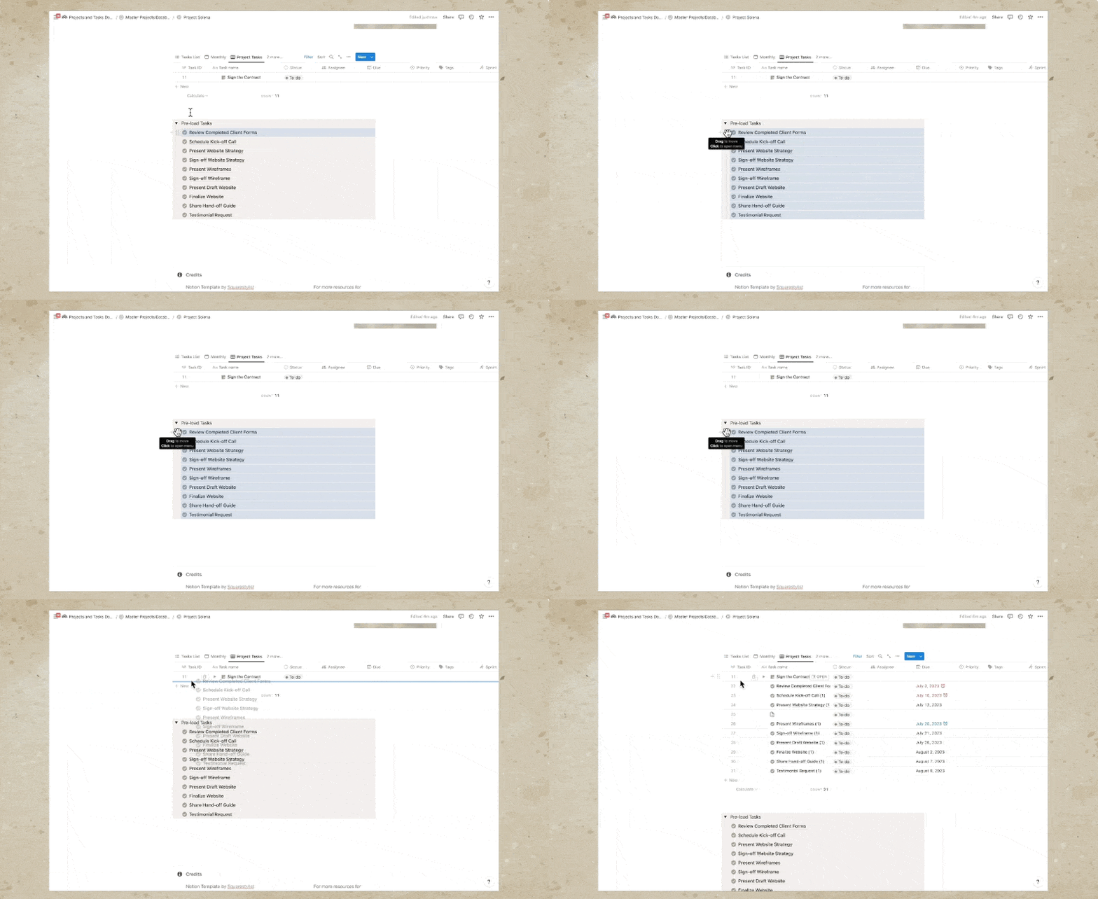
Now we'll proceed with the task list at the bottom of our client portal. Again, I'd like to remind you that this task list is not visible to the client. We may now start adding the tasks that are related to each of these phases by hitting this button to add new tasks. For example, if under onboarding, we need to send the invoice or sign the contract, we can add that right here and add the due date. Alternatively, you may use preloaded tasks at the bottom based on typical steps involved in a design project, but first you’ll have to hit the option to use the Project Tasks View.
Then we can preload this task by making sure that we select the first task, hold Shift on my keyboard, and select the other tasks using the arrow-down key on my keyboard as well. We'll copy all these tasks to this table by grabbing the six-dot icon while all of them are selected and holding the option key on our keyboard (or Alt key on Windows). I'll hold my option key and drag that to this database, and this is how we'll preload the tasks to this table.
Once these tasks are preloaded, we can switch back to the TASKS LIST and make changes to each of these tasks. Notice that there is a parenthesis "one" automatically added to each because we've copied it from our main tasks, but we can easily remove it. We may also edit each of these tasks, change the due date, change the week number, and of course, make changes to these properties and values. For example, if you have more phases than what I've initially added right here, we may add more phases or stages to your process. Simply add another one, for example, "brand design," and we may change its color using this ellipses icon. And of course, you have the option to add more properties.
Since this list of tasks is not visible to the client, I add personal notes right here, some things to remind myself regarding this particular task. If the tasks are not arranged chronologically, you may hit this option to sort. We can sort by due date and make sure that this is ascending. We also have the option to view this database in multiple ways, any way that makes sense to you and that will help you be productive.
Again, this is not visible to the client. So we have a monthly view, and we also have a weekly one. Notice that these weeks are week numbers that I manually added. These are not connected to the weeks of our calendar, but I like categorizing my tasks based on the week numbers because I typically keep my design and development projects from anywhere between four to eight weeks. Then I like assigning the week number for each task.
Timeline View and Dependencies
We also have a timeline view, which is particularly helpful if you'd like to set up dependencies. Dependencies are when we connect one task to the other, especially if a task is highly dependent on a preceding task. For example, we won't be able to schedule any kickoff call if the client forms haven't been completed. So I most of the time set up the dependencies for each of these by connecting them. For example, if we move the deadline of one task, there will be a red visual indicator that there have been changes in the schedule.
There is a cool feature where if we click this dependencies option, we have these options to shift and maintain time between tasks. That means all the other dates will move depending on the movement of the blocker or the essential task. Notice if I choose this option to shift and maintain time between tasks, if I try to move the due date of one task, then all the other dependent tasks will also move in terms of schedule.
Task Reflection Across Projects
Now what's beautiful with this project template is that all the tasks that we added in this project, Project Solena, will also be reflected in our tasks list. Notice how under Project Solena, we have all these tasks. If we create a new project by hitting this "Add a Project" button, for instance, I can name this Project Linea and assign a different icon so it's visually distinct. I can use this orange color. If I add tasks to this project, again using our preloaded tasks, notice that when we view this in our Tasks Dashboard, all the projects for Project Linea and Project Solena are distinct from each other. We can also see that under our calendar view. If you'd like to reflect the project property here, we can use this Properties option and ensure that the project name is shown in the calendar as well, or any views that you'd like.
In this Tasks Dashboard, I also use the same project tracker to manage my personal projects. I love working on personal projects, for example, a Squarespace or Shopify template. Once I've checked all the buttons and details that are specific to this client, I share this dashboard with the client by using the Share button. I add their name or email address and ensure that this permission is set to "can comment" only. I hit Invite, and you may also add a message to give them more context about what this invitation is about. They will receive an email on how to create a Notion account and access this dashboard.
Conclusion
Hope you found this resource helpful. If you'd like to learn more about Notion or other tools for web designers, please subscribe below or check out our courses, Standout Squarespace and Standout Shopify. The links are in the description below. See you in the next video.


