Squarespace Courses: Ultimate Guide
In August 2023, Squarespace finally launched a native feature that allows us to create and sell online courses.
SQUARESPACE COURSES: Your complete guide
a.
Squarespace
b.
Video Walkthrough
Introduction
In this comprehensive video, you'll:
Learn the key highlights of this new Squarespace Courses feature e.g bundling, high-level video protection, progress bars, unlimited courses and more!
Watch a demo of how to create, host, and sell courses on Squarespace
Preview the student experience from purchase to course access
Be informed on website plans, add-ons, transaction fees and current limitations of this Courses feature
Learn how Squarespace compares with other popular course platforms such as Kajabi, Teachable, Thinkific, Podia, Thrivecart and Teachery
Why I decided to migrate all my courses to Squarespace after trying almost all course platforms and after years of using Teachable.
Timestamped Overview
0:45 Key features of Squarespace Courses
4:46 How to create the Course Content
10:43 How to customize the Course Overview page
12:15 Setting-up the pricing plans
17:05 How to make sign-up buttons available on the sales page and start selling courses
19:18 A Preview of the student experience in Squarespace courses including order notifications
20:08 How students access multiple courses
20:38 How to determine the correct product type: Digital Downloads or Courses or Member Sites?
24:36 Choosing the right website plan and digital product add-on
27:39 How Squarespace Courses compares with other course platforms such as Kajabi, Teachable and Thinkific
29:44 Current limitations of Squarespace Courses
33:00 Key Advantages of Squarespace Courses
Resources
Squarespace has finally launched an official feature that allows us to host and sell courses and memberships. This feature is packed with sought-after functionalities such as product bundling, progress tracking, and secured video hosting. In this video, I'd like to walk you through the highlights of this new Course and Memberships feature, share some key considerations, and explain how it compares with other learning management software.
Key Considerations Before the Launch of Squarespace Courses
Limitations of Member Areas
Before the launch of Squarespace courses, we had another way of creating paywalled or gated content using member areas. Using Member Areas, we had to do a lot of workarounds to host courses within Squarespace. However, there were some key limitations that prevented me from migrating my own courses to Squarespace:
We were limited to ten member areas only, which was restrictive for course creators with more than ten courses.
There was no course progress indicator, so students couldn't keep track of the lessons they had already completed.
There was no high-level video protection, which meant knowledgeable users could easily grab and download the video embed codes.
Video Protection Challenges
This limitation is not unique to Squarespace, though, because if you're simply hosting your videos on YouTube, even though they're unlisted, or if you're using Loom.com or the basic version of Vimeo, your videos are not highly protected. However, if you're using learning management systems such as Teachable or Kajabi, that means if you upload your videos through their video storage, your videos are highly protected. This high level of video protection is also present in higher plans of Vimeo.
No Bundling Options
Another limitation of Squarespace member areas was that there was no way for us to create bundles. For example, if you have three courses and you would like to sell them as a bundle, that was not possible.
The New Squarespace Courses Feature
Addressing Previous Limitations
Now, the great news is, with the launch of the new Squarespace courses, these main limitations have been addressed:
We can host and sell unlimited courses or gated content.
We have a built-in course progress indicator and side navigation.
The videos uploaded to Squarespace now have a high level of protection that's at par with the protection of videos in other learning management systems.
We can sell bundles and offer our courses in multiple pricing plans.
These improvements now make Squarespace a viable course platform option. There are a lot of features that other course platforms offer that are not yet available in Squarespace. But then I'd say there are aspects of Squarespace which make it superior to other course platforms, which is why I am migrating all my courses to Squarespace. Just imagine combining these powerful course features with the ease, simplicity, and beauty that naturally come with every Squarespace website. We can even apply simple code snippets to customize each course experience.
Ease of Use and Design Freedom
We won't be able to easily add these content-rich, beautiful, and branded layouts using any other course platform, even if we pay $400 monthly.
I've been running my education business for years now, and I've tried almost all course platforms. So I've weighed all the pros and cons and decided that I'll switch to Squarespace courses, and I'll get to the details in a while. For now, let me show how easy it is to add courses to your existing site.
Adding Courses to Your Existing Site
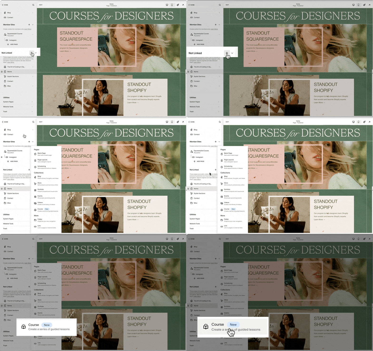
If you are on a business plan or above, then when you click this plus icon, whether in the Linked or Not Linked section of your navigation, this new course collection should show up. Clicking this collection option will prompt us to choose from any of these premade layouts.
You can choose any, and this will automatically generate a Course Collection page at the top of your Not Linked section. Note that this icon is an open book, so we can proceed with naming our course. I'll name it my course.
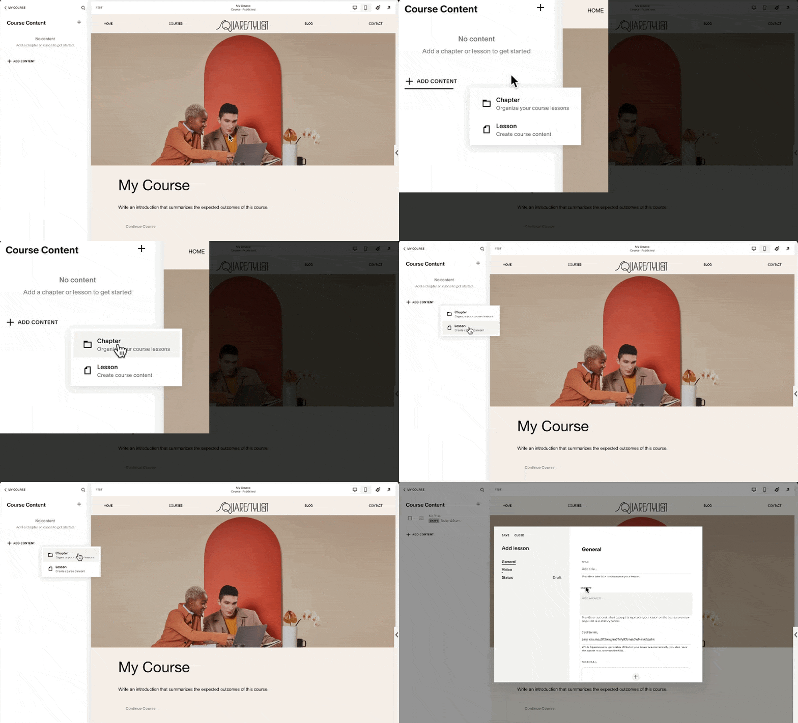
When we click this Collection page, we'll see three menu items: Pricing Plans, Course Overview, and Course Content. For now, let's look into Course Content. This is where we add the content of our course or organize them into chapters or units.
If we click on any of the lessons, we'll find that the editing experience is quite similar to portfolio items. That's because we can easily add any section, be it a fluid section, gallery section, or list section. We have a lot of design freedom regarding what content we can add to each lesson. I believe this ability to easily add content and beautifully lay them out in each lesson is what sets Squarespace apart from other platforms.
I can even save a section from another page on my site and easily pull it to be added to any of the lessons of this course. And I'm telling you, after trying almost all course platforms, creating something like this in popular learning management systems is close to impossible, even if you pay $400 per month.
Video Customization Options
And because Squarespace acknowledges the fact that not all lessons may be video-based, if we go and edit the video at the top of this lesson, there is an option to toggle it off.
If you choose to show the lesson video, you may upload it directly to Squarespace, and as I mentioned, it has a high level of asset protection.
If you are hosting your video elsewhere, for example, Vimeo, then you can just simply add the link from here, and it will automatically pull the video. But make sure that you have the correct settings in Vimeo to ensure that the video is protected. Alternatively, you may also hide this lesson video and just add a section within the video block. You can easily pull the Vimeo or YouTube video while the student is viewing the lesson.
They can also access this pull-out menu, and this is how they can navigate to other lessons of the course.
From the side navigation, they can also click this progress circle, and it'll automatically adjust their progress indicator for this course.
The students may also click the Complete and Continue button at the bottom or top of the lesson, and the progress percentage will be updated too.
Managing Course Content
To add our course content, we start by deleting the placeholder content that was automatically generated. We can do so by clicking this ellipsis and clicking this Delete option.
Note that when we delete the entire chapter, all the lessons under it will also be deleted, and this cannot be undone. We don't have a backup of these, so we have to be careful. But because these are just placeholder content, we can proceed with deleting them all.
When we click this Add Content option, we have the option to either add a chapter or add a lesson. Note that we can definitely have a course without a chapter. So if you have a short course only, you can definitely just use lessons.
But if you'd like to organize your content into chapters or units, then you can use this chapter similarly to how we will use a folder to organize our content. Simply drag the lesson to the applicable chapter, and then we'll notice that the status of the lesson is still on draft. It won't show up in our course until we click Edit Lesson and set the status to published.
We'll notice that we also have the option to set the status to scheduled. This is applicable if you'd like to drip content based on dates. When we click the lesson item and click Edit at the top left of our screen, we now have the option to add any sort of sections applicable for this lesson. You may add more resources, more information, or highlight some key resources indicated or mentioned in the video.
Styling and Layout Options
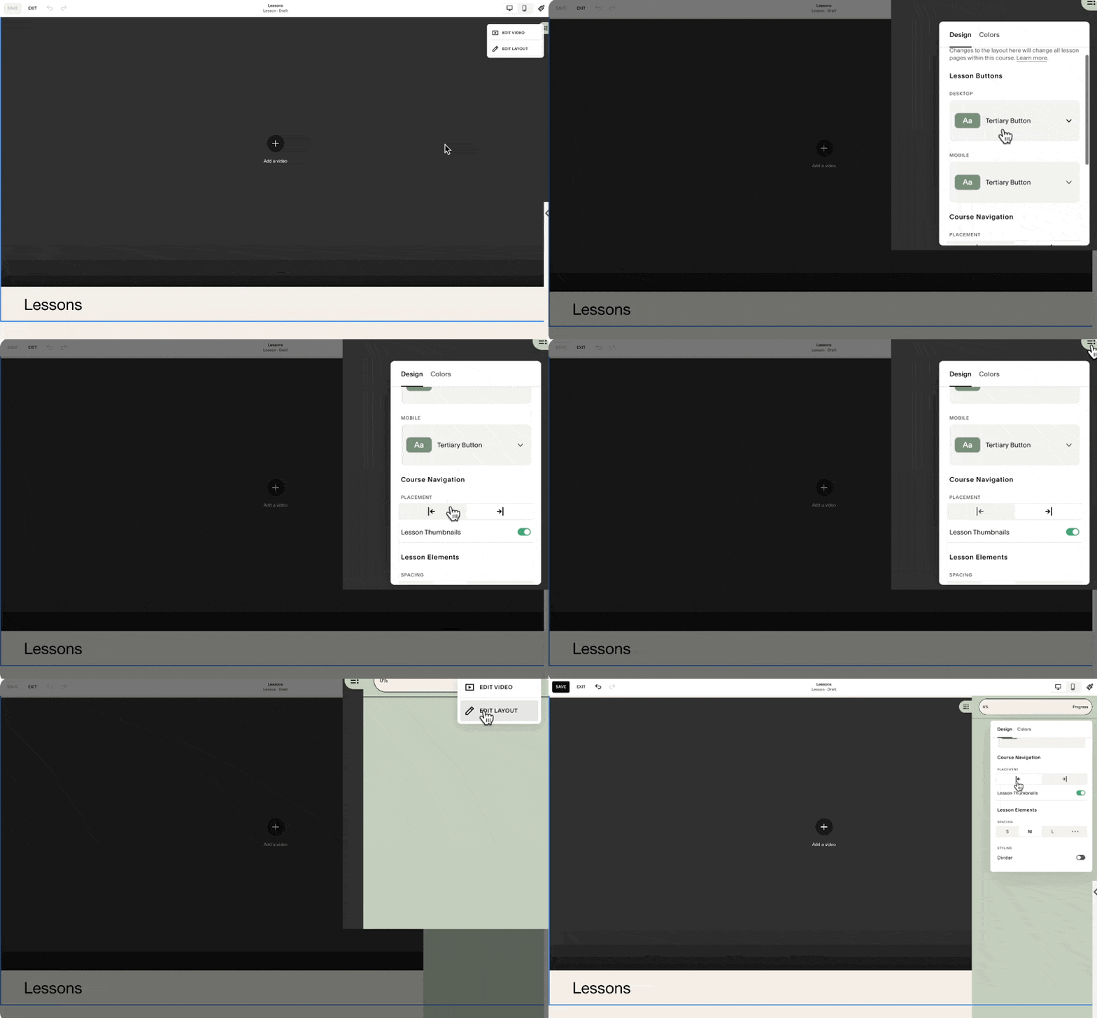
Under Edit Layout, we have styling options right here. We can also change the placement of our course navigation.
At the moment, the sidebar is aligned to the right, but we also have the option to align it to the left.
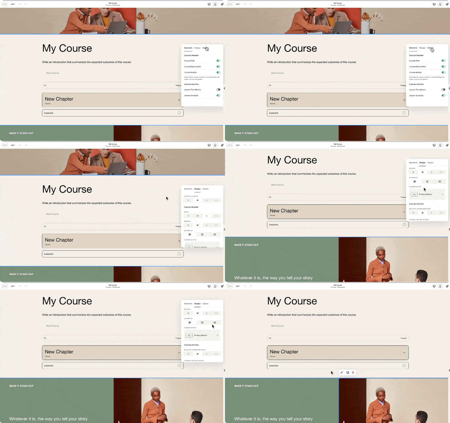
Note that we may add up to 250 lessons per course, and I personally think that's more than enough. Whatever lessons or chapters we add to the course content will be automatically reflected in the course overview. Notice in this section the new chapter and lesson that I added are reflected.
This course overview page may also house as many sections as you need. But of course, what we'd like to highlight are the course chapters and lessons. Because in some courses, you might want to send the students to this page so that they would have a better idea of the syllabus and the topics included in the course.
In this course overview section, when we click Edit Layout, we have the option to show or hide content, change the colors, and change some of the designs. I recommend you take time exploring how changing these settings will affect this section.
For the rest of the page, we can simply add sections the way we would on other pages. This course collection that we just created will have a dedicated URL. If you click this gear setting, you'll find that our custom URL is my course. You may change it as needed. And because we haven't added any pricing plans, this course collection will be available by visiting this URL. In my case, that's squarestylist.com/my-course.
Configuring Pricing Plans
However, if you'd like your course content to be gated, meaning you require the user to sign in with their account before accessing the course content, that's the time we will configure the pricing plans. To create a pricing plan, we simply click this button, and there will be an option for us to add a name, description, and benefits. Personally, I don't use this, but I just plug in the correct information. But when I am adding it to the sales page, I don't show this information.
What I show is the pricing of the course and the applicable products included. We may offer the course in multiple pricing plans. It can be a fixed amount, split into payments, accessed through a subscription, or it can be a free course. For example, we may sell this course for $1,000 single payment or add an option to purchase it in a more accessible pricing plan of four payments of $250.
This is a preview of how these single payment and split payment options will show up on the homepage.
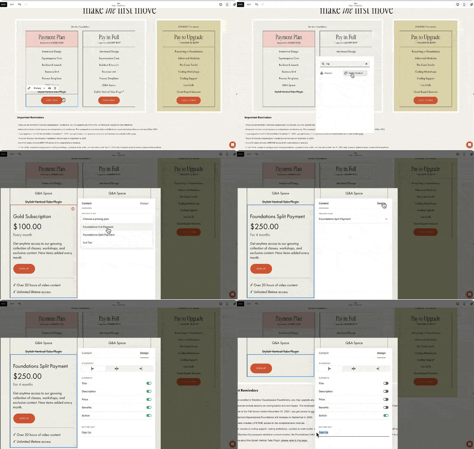
I personally don't find these toggles intuitive. What I typically do is have a specific button for each pricing plan. In my course, Standout Squarespace Foundations, I have this pricing plan section with options for four payments of $250, a pay-in-full option at $997, and a packaged option that bundles my foundations lessons and my advanced lessons. I'd like to demonstrate how I would set it up in Squarespace courses.
For clarity, I'll name this course as Foundations. Then I'll create this pricing plan to refer to my $997 single payment option. Under included products within this pricing plan, I can bundle another course, member area, or video collection here so that when a user avails of this pricing option, they will have access to the main course and a bonus course. For example, I'll add the Art of Coding in Squarespace as a bonus course. When I hit save, we'll have our first pricing plan. We can actually add up to 500 pricing plans per website.
For this course, I need another pricing option, which is the split payment of four payments of $250. I'll create a new pricing plan, still for the foundations course, and change this to a fixed amount tail, with the payment set to four payments of $250 for four months.
For this pricing plan, I can add another bonus course or make that exclusive to those who pay in full. Notice the error here because we have the same name for the pricing tier. So I should name this differently, like Foundations Split Payment.
Referring back to the pricing plans on my site, we have the payment plan option, the pay-in-full option, and now the bundled option. For this, I'll create a new pricing plan called Full Tier, a one-time payment of $2797. This will include all that's in the foundations lesson, the bonus lesson about the art of coding in Squarespace, and the advanced lesson of my Standout Squarespace program. Once created, we have all the pricing plans we need for our sales page.
Implementing Pricing Plans on the Sales Page
Now, to make these pricing plans available on our sales page, I'll demonstrate by accessing my saved section. I'll replace the button leading to Thrivecart with a digital product block. By searching for and adding the digital product block, we'll be asked to choose from the pricing plans we've created. I'll select the Foundations Split Payment plan, then adjust the design settings to match my desired layout. I'll do the same for the other pricing plans, ensuring consistency in presentation.
Student Checkout Experience
When students visit the sales page, they can sign up by clicking the digital product block button, creating an account, or signing into an existing one. After the user signs in or creates an account, they will be led to the checkout page to make the purchase. After a successful purchase, the user will receive an email based on the settings under Customer Notifications Digital Products. The account pop-out menu will show up, where they can view the purchased courses, update their profile, and access other purchases within the site. That's how straightforward the process is from creating to selling courses on Squarespace.
Considerations Before You Start
Product Types
Since the launch of Courses, there are now two main categories of products you can sell on Squarespace:
Store Products: Allow multiple items to be added to the cart, including physical products, services, gift cards, and downloads. Downloads are part of store products, allowing users to automatically download ebooks, PDFs, or audio files.
Digital Products: Customers cannot purchase multiple courses or digital products in one checkout, as each pricing plan has a dedicated checkout page.
Website Plan
Squarespace makes it easy to get started with selling courses or digital products if the website is on at least the business plan. However, there is a 9% transaction fee on top of the payment processor fees, and video storage is limited to 30 minutes.
This setup is designed to help people start selling courses. If you're starting out, you can host videos on platforms like YouTube or Vimeo and embed them in Squarespace to avoid the 30-minute limit. However, if you wish to scale, consider the digital product add-on to increase video storage and reduce transaction fees.
Plan Options
To summarize plan options:
On a typical website plan, either business or commerce, there's no add-on fee, but a 9% transaction fee per digital product sold, and video storage is limited to 30 minutes.
To extend video storage and reduce transaction fees, consider subscribing to the digital product add-on.
Here are the add-on fees per month if paid annually, increasing if paid monthly. The Pro add-on is $149 per month, a significant investment, but for course creators with high sales volumes, it makes sense to invest in a tier with 0% transaction fees.
Comparison with Other Course Platforms
Comparing with other course platforms, Squarespace's pricing is quite reasonable. For instance, Kajabi charges a premium for removing branding and adding custom code, and there are limits on the number of active customers. While Kajabi offers many features that Squarespace does not, not all education businesses need those features.
Teachable's Pro Plan, which I currently use, has a maximum of 50 published products, potentially limiting for some creators. Thinkific's Grow Plan is most comparable with Squarespace, as it allows removing Thinkific branding.
Conclusion
Each platform has its pros and cons, and it boils down to your specific needs. Do you value delightful editing and branded experiences, or are affiliate programs and bulk enrollments more important? For me, design is crucial, so I use workarounds for automations to benefit from the beautifully branded and content-rich experience now possible with Squarespace Courses.
I hope this walkthrough of Squarespace Courses has been helpful. I know you might have more questions, like how to migrate from another platform to Squarespace Courses or how to configure advanced automations. I've devised workarounds to address these needs, and I'd love to hear via the comments which topic you'd like me to tackle next. While I may not be able to respond to all comments, I offer personalized coaching and support within my program, Standout Squarespace. So if you'd like personalized support, check out Standout Squarespace.


