
( RESOURCES ) Browse through our collection of tips & tricks for Squarespace, Shopify, web design, and business. It’s a digital trove of creative ideas right at your fingertips.


How I Built a Profitable Business Selling Website Templates—And How You Can Too
Have you ever wondered if selling website templates could be a legit source of income—even without coding skills or a design degree?
How I Built a Profitable Business Selling Website Templates—And How You Can Too
a.
Squarespace
b.
Selling Squarespace Templates
Have you ever wondered if selling website templates could be a legit source of income—even without coding skills or a design degree? Trust me, you're more than ready to get started. I know because I began with zero experience, no formal background, and just a vision.
I'm Rache, the self-taught designer and developer behind Squarestylist, and through my programs Standout Squarespace and Standout Shopify, I’ve mentored hundreds of creative entrepreneurs looking to build profitable design businesses.
Let me take you through how I went from launching a single Squarespace template to creating a full-fledged business—and how you can do the same.
Why Website Templates Are the Perfect Starting Point
Selling templates isn’t just about passive income—it’s about freedom, creativity, and building your personal brand. Here’s why templates might just be your new favorite creative outlet:
A Creative Playground
Back when I worked with corporate clients, I felt creatively boxed in. Templates became my escape—a space where I could refine my style without client restrictions.
Portfolio Gold
Those template demos? They became my most powerful portfolio pieces. I no longer had to showcase work that didn’t reflect my true style. Instead, I attracted clients who loved my aesthetic.
Confidence to Charge More
In 2019, I was charging $800 per project. After launching my first template shop and building a solid passive income stream, I grew my packages to $5,000 and later to $12,000. Templates gave me the confidence and leverage to raise my rates.
Ready to Dive In? Here’s the Process:
I’ve broken down the journey into four main steps:
1. Ideation: Pick Your Platform & Specialty
Start with a platform you're comfortable with. If you’re unsure, I highly recommend Squarespace for its intuitive design and ease of use—for both creators and clients. If you’re leaning toward e-commerce, Shopify is the gold standard, though it requires more technical knowledge.
Then, define your specialty. Don’t be discouraged by a “saturated” market—there’s room for you. Consider:
What are you naturally good at?
What do you want to be known for?
What communities or industries do you understand deeply?
Real-world examples:
Melissa, a therapist, created Squarespace templates for therapists.
Kia built an editorial, edgy collection that reflects her unique aesthetic.
2. Build: Keep It Specific, Simple & Scalable
Focus on 3–6 key features per template. These should be reusable, adaptable, and easy for clients to update. Examples might include:
Testimonial sliders
Galleries that serve multiple functions
Blog and services menus
Tip: Use a fictional brand (e.g. "Thrive Wellness") and tools like Copy Spark to generate placeholder content before designing. This makes layout creation a breeze.
For design elements like fonts and images, use royalty-free assets (e.g. Unsplash or Pexels) and built-in fonts for base templates. You can still showcase the template with mockup brands and creative styling—just clearly note that these are not included in the final purchase.
For more advanced design, yes—code is optional, but can set your shop apart and allow for higher pricing. Just ensure that any custom features carry over when duplicating the site for customers.
3. Sell: Set Up Shop & Deliver Smoothly
Your sales page should:
Highlight your template’s key features
Demonstrate adaptability to various branding styles
For Squarespace, templates are usually delivered 24–72 hours post-purchase. Automating this process with tools like Airtable can make delivery seamless—even while you’re asleep or on vacation.
On Shopify, deliver your theme as a downloadable zip file. Simple and straightforward.
Don’t forget post-purchase touchpoints: Set up an automated email sequence with support info and next steps.
4. Support: Set Boundaries & Provide Resources
This part can be the trickiest. A few key pointers:
Define support duration (e.g. 90 days)
Clarify what’s included—and what’s not
Offer general tutorials that apply to all templates
I also built an AI-powered support tool so customers can get answers instantly without needing to email. Smart, right?
Beyond DIY: Other Ways to Sell Templates
Not every customer wants to DIY. Here are some service options:
Template Installation – Just install the demo on their existing site.
Template Restyle/Remix – Help them apply their branding; charge $1,500+.
Design Intensives/One Week Website – Fast-track services using a template as a base.
One of my students, Julie from Studio Volha, runs a one-week website experience based entirely on her own template collection.
Want to Launch Fast? I’ve Got a Class for That
If you’re ready to launch your Squarespace template shop, check out my class: Selling Squarespace Templates
It’s a done-for-you system that includes:
A real-world template
The AI-powered Template Wizard
Automated delivery setup
One-click sales page template
Licensing and shop policy templates
Or if Shopify is more your vibe, check out my Standout Shopify program instead.
Final Thoughts
If this breakdown made you realize that selling website templates is doable, then my job is done. I truly believe there’s something in your vision the world needs to see.

Everything You Need to Build a Successful Squarespace Web Design Business
While many know Standout Squarespace for teaching custom coding techniques, in this post I want to highlight the comprehensive business resources that make our program the complete package for web designers.
Everything You Need to Build a Successful Squarespace Web Design Business
a.
Squarespace
b.
Standout Squarespace
Are you looking to kickstart or level up your Squarespace web design business? Whether you're just starting out or refining your client process, our Standout Squarespace program is designed to support you every step of the way—not just in design and development, but in building a thriving business.
Let me take you through what makes this program special.
Two Levels to Fit Your Journey: Foundations and Advanced
The program is split into two levels: Foundations and Advanced. You can begin with the Foundations tier, which teaches you how to professionally build Squarespace websites—no code required (yet!). Once you're ready to push your skills further, you can upgrade to the Advanced lessons.
What’s Inside the Foundations Tier?
The Foundations tier is your go-to if you're looking for business tools and resources. It’s packed with templates, checklists, guides, and scripts that support the entire project journey—from inquiry to launch.
We even have a dedicated page just for Foundations because there’s so much packed in that we couldn’t fit everything on the main sales page.
Templates, Scripts, and Client Tools That Actually Work
We’ve got everything you need to streamline your client process:
Process Templates & Checklists
Discovery Questionnaire – Interactive and dynamic
Welcome Guide Kits – Available in XD, Figma, or adaptable to your preferred tool
Copy Prompts & Website Copy Guide – Available as form templates or Google Docs
Discovery Call Scripts
Email Scripts for Pitching, Onboarding, and Client Management
Our goal is to make every step smooth—not just for you but for your clients too.
A Step-by-Step Curriculum You Can Follow
Inside the module lessons, you'll learn to deliver full Squarespace projects end-to-end:
Start with Design Strategy
Follow the Standout Checklist to ensure nothing gets missed
Learn about Development using Squarespace’s built-in tools
Master SEO, accessibility, and performance through dedicated checklists
Build real projects: homepage, about, portfolio, shop, even courses and digital products
We walk you through the basics and beyond, making sure each lesson is interactive and actionable.
Real Practice, Real Projects
Throughout the program, you’ll work on hands-on projects and get to follow along with video lessons. You can watch how we build each section—or try it yourself first and then compare.
This isn't surface-level knowledge. These are best practices built from years of client work and real-life Squarespace projects.
Business Tools That Help You Thrive
In the business-focused section, you'll learn:
Strategic Pricing – How to price with purpose
Marketing Your Services – Build authority with digital products and free content
Client Experience – From onboarding to offboarding, we’ve got guides for it all
Plus, we guide you in using your product suite as part of your portfolio. It’s a smart way to show your expertise while growing your reach.
An Engaged, Supportive Community
You won’t be doing this alone. Our Standout Squarespace community is where you can:
Ask questions
Connect with other designers
Join live practice threads
Get support from mentors and me personally
Whether it's troubleshooting, pricing advice, or client communication tips—we’re here to help.
Ready to Learn Code?
Once you're confident with the no-code tools, you can level up by upgrading to the full version of the program. Everything you paid for the Foundations tier will be credited toward the upgrade—so there’s no risk in starting small.
The Advanced tier introduces coding in Squarespace, taught in a smart, accessible way. You’ll unlock endless possibilities to create custom, in-demand website features.
Check out our Showcase page to see what’s possible. Every site featured there was built by our students using the techniques and support we provide.
An Invitation
Whether you’re just starting your web design journey or looking to streamline and scale your process, Standout Squarespace offers the structure, tools, and support to help you succeed.
Still got questions? I’m here to help—just reach out!

Introducing Montage: Where Creative Code Meets Seamless Design
The unveiling of Montage, our new Squarespace Master Template combining our community’s most loved creative code solutions into one cohesive foundation.
The unveiling of Montage, our new Squarespace Master Template combining our community’s most loved creative code solutions into one cohesive foundation.
LAUNCHING THE MONTAGE MASTER TEMPLATE
a.
Squarespace
b.
Master Template
There's something poetic about the word "Montage" — a technique of combining various elements to create something entirely new. It perfectly captures what we've been quietly crafting behind the scenes: a Squarespace Master Template that brings together our most beloved creative code solutions into one cohesive foundation.
As I reflect on the years of teaching web design and watching our community grow, I've noticed how certain creative components have become essential tools in our students' workflows—features they reach for in their client projects time and time again. These are the components that make websites feel both familiar and surprising, the ones that turn a simple scroll into an engaging journey.
This observation led to some questions: What if we could weave all these favorite elements into one thoughtfully crafted template?
That's how Montage was born—not just as a plain-and-straight Squarespace template, but as a canvas for possibility.
A Foundation for Creative Freedom
Every exceptional experience starts with a blueprint. What makes Montage special isn't just its collection of hand-coded section templates or its sophisticated modular design—it's how these elements come together to give you creative freedom while maintaining the structure, as well as the flexibility, needed for professional results.
Beyond the Expected
What brings me joy about Montage is seeing how it reduces friction in the design process. Our community members often share how having these sought-after features readily available—from dynamic navigation options to engaging content displays—allows them to focus more on crafting unique experiences for their clients rather than rebuilding common elements from scratch.
The template brings together accessibility, performance, and creative possibility in a way that feels natural. It truly feels like having a well-organized creative toolkit where everything works together seamlessly.
The Standout community well knows how I deeply value performance, especially for a Master Template such as Montage so I made sure it is value-packed yet immensely lightweight. To illustrate: Montage features 27 creative components as of writing, including Tabs, Lists, Sliders, Carousels, Blog Layouts and Styled Texts. With so many moving parts, some may wonder how these many coded features affect your site’s loading time. You’ll be happy to note that any and all creative components that have not been activated, especially those written with Javascript, will be offloaded from your website and won’t affect site loading.
A Familiar Echo
Montage's approach mirrors what we've seen work beautifully with Esencia, our well-celebrated Shopify theme. I smile when I think of the feedback from our community. As Rebekah from Studio Kanuka shared, "I have loved using Esencia theme in a variety of projects. When I have a tight timeline or budget, I feel confident using Esencia since I am now very familiar with it and can offer unique layouts and features easily and the websites are all so unique!"
Kotryna from Studio Heavenly echoed this sentiment perfectly: "The Esencia Theme alone is pure gold! Not to mention Rache's ongoing support and tutorials. I understand Shopify much better, making something way more custom for clients."
Can you imagine feeling this same way about your Squarespace builds?
Join our Standout Squarespace
As we officially launch Montage on March 24, 2025, it represents more than just a template — it's a reflection of our community's journey and creative needs. Available exclusively to our Standout Squarespace members, Montage gives you the tools to build stunning, bespoke websites in half the time without compromising on quality or creativity.
In web design, as in life, sometimes the most beautiful creations come from thoughtfully combining existing elements in new ways. That's the essence of Montage, and that's what we hope this template helps you achieve in your own creative journey.
Whether you're building your first professional website or your hundredth, Montage is designed to be that reliable foundation that lets your creativity shine through while positioning you as a bona-fide Squarespace design expert. After all, isn't that what great web design is all about?

Add Custom CSS to Squarespace Easily with Selector Helper extension

Styling your Squarespace website just got faster and easier with the Squarespace Selector Helper, a brand-new Chrome extension.
Add Custom CSS to Squarespace Easily with Selector Helper extension
a.
Squarespace
b.
Video
Styling your Squarespace website just got faster and easier with the Squarestylist Selector Helper, a brand-new Chrome extension. This tool is designed to save you time and effort by instantly suggesting the CSS selectors you need to style your Squarespace site to your heart’s content.
Why This Tool is a Game-Changer
Squarespace already offers powerful design options that allow us to tweak colors, layouts, and styles, but sometimes they just don’t cut it for achieving a specific look. That’s when a little touch of code magic becomes invaluable. And here’s the best part: you don’t need to be a coding wizard to use this tool. The Squarestylist Selector Helper makes coding in Squarespace surprisingly simple, even if you’re brand new to it.
What’s a Selector Anyway?
Before we dive in, let’s cover the basics. A CSS rule has two parts:
Selectors: These identify the elements you want to style.
Declarations: These are the styling rules inside curly braces (e.g., color, size, rotation).
The tricky part? Finding the right selector. It often involves opening Chrome's Inspector tool and hunting through the code — a process that it is worth learning but can be time-consuming. That’s exactly why I developed this extension. With it, you can simply click an element, and it will suggest selectors for you.
Getting Started: How to Use the Selector Helper
Install the Extension:
Head to the Chrome Web Store and search for "Square Stylist Selector Helper."
Click "Add to Chrome" and follow any prompts.
Pin It for Easy Access:
After installation, pin the extension to your toolbar so it’s always handy.
Exit Edit Mode in Squarespace:
Copy your site’s URL, paste it into a new tab, and add
/?noredirectat the end. This will let you preview your site without the editing interface.
Click to Get Selectors:
Open the extension, click on any element, and voilà—it suggests the selectors you need.
Some Use Cases
This tool opens a world of customization possibilities. Here are just a few examples:

Rotate Elements:
Squarespace doesn’t have a built-in way to rotate an image block, but with this extension, it’s simple. Select the image, copy the block ID selector, and add a CSS rule like
transform: rotate(15deg);.
Style Specific Sections:
Want changes to apply only to one section? Wrap your CSS rule in a section-specific selector provided by the tool. For instance, this is handy for tweaking the aspect ratio of portrait videos or customizing the appearance of text blocks.
Control Granular Details:
Adjust the color of an accordion title or add a background to a carousel description. Just click the element, grab the selector, and make your changes.
What makes this tool unique is how it suggests selectors for every type of element—blocks, sections, and even smaller, harder-to-reach elements like container wrappers. It previews the elements affected by each selector, so you can confidently pick the right one. It’s smart, intuitive, and incredibly time-saving.
Advanced Tips and Tricks
Use Block IDs for Precision: These unique identifiers ensure your styles don’t accidentally affect other elements on the site.
Class Selectors for Multiple Elements: When you need to apply the same style to several elements, this is a more efficient option.
Section Selectors for Localized Customization: Restrict changes to a specific section to keep everything else intact.
Why You’ll Love It
This tool isn’t just for quick fixes. It’s designed to help you create smarter, more sustainable customizations. If you save sections to your Squarespace catalog or create templates to sell, these selector-based customizations will carry over seamlessly. It’s a total game-changer for anyone looking to work smarter, not harder.
Ready to Learn More?
If you’re interested in diving deeper into Squarespace customizations, check out my Standout Squarespace course. I teach all about using smart selectors to streamline your workflow and create reusable, beautifully coded designs.
With the Squarestylist Selector Helper, the possibilities are endless. Download it today and start transforming your Squarespace website like a pro.

Add multiple fonts in one line - Squarespace Tutorial
Here's how to achieve this elegant effect using just one line of CSS code.
One simple yet effective technique is using different font styles within a single line of text. Here's how to achieve this elegant effect using just one line of CSS code.
Add Multiple fonts in one line
a.
Squarespace
b.
Video
Adding visual interest to your Squarespace website doesn't always require complex design solutions. One simple yet effective technique is using different font styles within a single line of text. Here's how to achieve this elegant effect using just one line of CSS code.
The Technique
The method involves utilizing Squarespace's miscellaneous font settings and applying a custom CSS code that activates when text is italicized. The beauty of this approach is its simplicity - once set up, you won't need to touch the code again to make changes.
Step-by-Step Guide
Set Your Miscellaneous Font
Navigate to Font Settings
Locate the Miscellaneous font section
Choose your desired font and properties
Add the CSS Code
Go to Website Tools
Open the Custom CSS panel
Add the provided code
This code will target italicized portions of H1, H2, and H3 elements
h1 em, h2 em, h3 em {
font-family:var( --meta-font-font-family);}Apply the Style
Simply select any word or phrase
Apply italic formatting
Watch as your miscellaneous font properties automatically activate
Pro Tips
Change typefaces anytime through style settings without modifying code
Apply this to multiple headings (H1, H2, H3)
Use it strategically for emphasis or visual hierarchy
Want More?
Looking to level up your Squarespace design skills? Check out our Standout Squarespace course for comprehensive design strategies. For those interested in using custom fonts beyond Squarespace's standard options, I've developed a specialized tool to streamline the process. Checkout Custom Fontwiz →

How to Optimize and Resize Images for Web
Pixresize is a clean, straightforward tool to compress and resize images for optimized use in websites.

Pixresize is a clean, straightforward tool that I developed to compress and resize images for optimized use in websites.
How to Optimize and Resize Images for Web
a.
Design
b.
Article
The #1 reason websites are slow
Here's a startling fact that changed how I approach web design forever: 72% of visitors won't return to a website after a single slow-loading experience. As someone who's built countless websites for clients, this statistic hit close to home. But what surprised me most wasn't the number itself—it was discovering that the culprit behind slow websites often isn't complex code or server issues.
It's something far more basic: unoptimized images.
I learned this lesson the hard way during a routine SEO audit of my own website. What I found made my heart sink: hundreds of massive 6MB images quietly sabotaging our site speed. But this discovery led me to create something that would help not just my team, but designers everywhere.
When Photoshop Isn't the Answer
If you've taken any of my courses or followed my design tutorials, you've probably heard me recommend Adobe Photoshop Scripts for image optimization. It's powerful, reliable, and gets the job done beautifully. But here's where things got interesting.
My sister, who helps manage our website content, doesn't have access to Adobe Photoshop. When she tried using online alternatives, she kept running into problems that probably sound familiar:
Sketchy websites plastered with aggressive ads
Confusing download buttons that felt like navigating a minefield
Legitimate concerns about file security and privacy
This wasn't just a problem for my team — it's something I've heard from countless designers working with clients who need to update their own websites. We needed a better solution.
Introducing Pixresize: Simple, Secure, and Free
That's why I built Pixresize—a clean, straightforward tool designed specifically for designers and their clients. No sign-ups required. No monthly subscriptions. No sketchy ads.
Just like Squarespace puts sophisticated design capabilities in everyone's hands, Pixresize makes image optimization accessible to all. Here's what makes it different:
Built for Real-World Design Workflows
The interface is intentionally minimal, focusing on what matters most:
Drag-and-drop multiple images at once
Set custom dimensions that work for your platform. For Squarespace, I recommend width setting of 1500px and Quality level of 60 -90. For Shopify, the width setting can be up to 4000px but consider converting PNG images to JPG.
Maintain aspect ratios automatically
Download your optimized images instantly
Easily batch rename the images by indicating the file prefix
Security First, Always
Remember those concerns about file security? Pixresize processes everything right in your browser. Your images never touch our servers — ensuring complete privacy and security for you and your clients.
No signups or ads
The best part? You can share this tool with anyone on your team or any client who needs to update their website. No need to worry about software licenses or complicated tutorials. If they can drag and drop, they can use Pix Resize.
Ready to Try It Out?
Visit Pixresize and give it a try. It's completely free, with no sign-up required. Just drag your images, set your preferences, and download your optimized files.
Looking for more tools to streamline your web design workflow? Check out our full toolkit for designers and website owners →. We're constantly adding new resources to help make web design more accessible and efficient for everyone.
Remember: your website's first impression matters. Don't let unoptimized images cost you visitors. Take control of your site's performance today with Pix Resize.

How to Add a Custom Cursor to your Squarespace website
A step-by-step tutorial on how to add stylish cursors to your Squarespace website

Learn how to add a custom cursor to your Squarespace website! In this tutorial, I'll show you step-by-step how to implement this popular design feature while maintaining great user experience.
How to Add a Custom cursor to your squarespace website
a.
Squarespace
b.
Video
Introduction
I'm always looking for ways to add unique touches to Squarespace sites without compromising user experience. One of the most requested features from our community is adding a custom cursor—that little pointer that follows your mouse movement around the screen. Today, I'll walk you through how to implement this creative detail while keeping your site professional and user-friendly.
Why Consider a Custom Cursor?
Before we dive into the technical details, let's address the elephant in the room: should you even use a custom cursor? While it can add a distinctive touch to your site's personality, it's essential to approach this feature thoughtfully. Custom cursors work best when they:
Enhance your brand's visual identity
Don't interfere with basic navigation
Maintain accessibility standards
Complement your overall design aesthetic
Technical Requirements First
To ensure your custom cursor looks crisp and professional, here are the key specifications:
Maximum size: 128 pixels (width or height)
Recommended size: 30-50 pixels
Preferred format: SVG for optimal clarity
Alternative format: PNG with transparency
Pro tip: If you're working with existing graphics, you can use our Pixresize tool to adjust your cursor image to the correct specifications. Simply upload your image, set the width to 50px (or your preferred size under 128px), and export as PNG with 100% quality to maintain transparency.
Step-by-Step Implementation
Step One: Upload Your Cursor Image
Create a temporary page in your not-linked section
Add a file upload via the hyperlink tool
Upload your cursor image
Save and grab the file path URL
Step Two: Add Custom CSS
Access your Custom CSS panel (quick tip: use the forward slash key and type "CSS")
Paste the code below, insert your file path URL between the quotation marks and save your changes
body:not(.sqs-edit-mode-active) {
  cursor:url(" "), auto;
}
Step 3: Custom Hover State (Optional)
Want a different cursor when hovering over links?
Upload a second cursor image
Add the hover-specific code snippet below
Insert the second file path URL.
body:not(.sqs-edit-mode-active) {
  a:hover, button:hover {
    cursor:url(""), pointer;
  }
}Important Considerations
While custom cursors can add flair to your site, here are some professional guidelines to keep in mind:
Accessibility First The default code maintains the standard pointer cursor for clickable elements, ensuring users can easily identify interactive elements. If you opt for a custom hover cursor, ensure it clearly indicates clickable areas.
Testing Period Note that custom graphics might not display during your trial period, but they'll appear once you've subscribed to a paid Squarespace plan.
User Experience As with any custom feature, consider your audience. The cursor should enhance, not hinder, the browsing experience. When in doubt, err on the side of subtlety.
Custom cursors can be a fantastic way to showcase your brand's creativity, but they should be implemented with intention. Remember, the goal is to enhance your site's personality while maintaining its professionalism and usability.

Which website builder ranks best in accessibility?
Which website builder is the most accessible right out of the box? And how can we actually test if a website is accessible? This comprehensive review will help guide your choice.

Which website builder ranks best in accessibility?
We tested your go-to web design platforms so you don't have to. Get the full report to see how they compare.
Which website builder ranks best in accessibility?
To build a website is to create a welcoming space where visitors can engage with our brand. You'd likely keep in mind a few things: design, function, and ease of use. This way, anyone can enter and feel that their needs are catered to within your digital presence.
But not all needs are created equal. There are people with disabilities who require specific accommodations so they too can fully interact with the websites we create. Do we also make space for them in our web designs?
Certainly you'd want to serve as many users as possible, regardless of their ability. This is what we call accessibility, a principle that starts with choosing the right tools to prioritize usability.
We know you're committed to building inclusive websites that provide a meaningful experience to people of all abilities. That's why we decided to evaluate how popular website builders—Shopify, Showit, Squarespace, Webflow, and Wix—perform in terms of accessibility.
Why is accessibility important?
The World Health Organization (WHO) estimates that around 16% of the world's population—around 1.3 billion people—live with significant disability. In the US alone, that's more than 1 in 4 adults who need assistance in terms of cognition, mobility, hearing, vision, self-care, or independent living.
Amber Hinds, founder of accessibility-driven Equalize Digital, advocates strongly for their inclusion in digital spaces as in physical spaces.
"Accessibility at a baseline is about ensuring everybody can use the web and anyone can become a customer of your business or reader of your web content," she emphasizes in our interview.

From an entrepreneurial perspective, accessibility standards seem to fade in the background of more pressing concerns such as operations, marketing, or sales. But Amber believes that accessibility has broader implications that align with business goals. For one, merely ensuring that website elements like images and headers are properly tagged will also be beneficial to SEO. And besides, would clients want to miss out on a relatively sizable chunk of target customers?
She still finds, though, that the best way to widespread adoption of accessibility is to ensure they're already baked into the website builders we use:
"Having a builder or a toolset that you use when you're building websites for your clients that supports accessibility is good because you may be building this website and potentially handing it off to someone who [may be] good at using Microsoft Word, but that's about it." —Amber Hinds
This is ultimately what pushed Equalize Digital to assess the performance of WordPress builders—and inspired me to conduct a similar test on other platforms.
What were the considerations for this accessibility test?
Some aspects of accessibility rely on the platform or structure, others on the content or design. Since this is a comparability study of website builders, it was not feasible to test each template or every component. We also can't account for other factors like font pairings, color palette, or custom code, which depend on input and may be prone to user error.
Instead, Amber wants to focus on how platforms are providing guardrails with baseline features: "In what areas are certain builders stepping up and guiding users a little bit more?" You'd be surprised to hear that not all options consider accessibility by design, if at all.

We built test sites using the documentation and best practices of website builders to figure out what accessibility features they have by default. Even then, we know that these may not offer enough information to set up inclusive websites for non-technical users.
A keyboard and multiple screen readers (e.g. Mac VoiceOver, Windows Narrator) simulate common use cases for mobility and vision issues, among others.
"This is a snapshot. I think it's a really good snapshot," Amber remarks. "I think it shows a lot of variety, provides some really good patterns."
We focused on Website Code Architecture
Our study focused on the code architecture of the platforms. While content quality, assigning header tags, color contrast, and visual design are crucial for accessibility, these can be mostly controlled by the website creators.
Hence, our test focused on areas where platforms have most control — how their ready-made components are built and how their platform generates the underlying code structure.
For example, the DOM order, ARIA labels, and semantic structure are built into the platform's base architecture and gaps in these aspects persist regardless of how carefully a website creator follows content creation best practices and accessibility guidelines.
Amber thoroughly spent approximately 2-3 hours per platform to complete the accessibility audit matrix. You may view this along with her accessibility test videos.

What accessibility categories are we looking into?
Our accessibility study evaluates each website builder based on a rigorous set of criteria — it can get a pass, fail, concern, or not applicable (N/A) for every item. Their overall accessibility score reflects the percentage passed among the applicable measures.
We're generally testing the functionality and code architecture of ready-made components in five broad categories:
Headers
Starting from the top, we'd want to make a great first impression for visitors landing on our website. Can we use our keyboard to navigate through the menu? This could indicate that the focus feature is available for people who cannot use a mouse or trackpad. If there are issues, it might be helpful to inspect the code to see whether the items are properly tagged.
Users shouldn't be forced to tab through every dropdown item; in fact, we're looking for a hidden function called skip links which gives us an option to jump to the main content.
Text
Written content has to be indexed with a page language and flow smoothly without overlapping with other elements, even when zoomed in. Another crucial issue that gets overlooked most of the time? Underlined links—Amber stresses this as an easy fix to benefit users who may be color-blind.
Media
This time we're paying attention to images and videos on the platform. Does the website allow you to zoom in on pictures to see the details? How easy would it be for you to set up alt text? It's useful for screen readers and search engines alike.
Videos also have to function with proper keyboard navigation, regardless if they are directly hosted or embedded. There needs to be an easy way to pause any clip that's on autoplay.
Carousels & accordions
These two components need to be handled with care in terms of keyboard navigation.
Like videos, carousels must have a pause button for autoplay—or better yet, autoplay can be turned off by default. Your tab key has to be able to flip through the slides, with screen readers being able to glean content from each one.
As for accordions, we'd want to check if we can tab through the sections and expand them using the return (enter) or space key.
Forms
If there's one other crucial feature you need to look out for, it's your website's default form. Correct field grouping and labeling can allow for efficient autocompletion (e.g. name, address, email). Required fields must be marked prominently so people can't miss them. It's also better to use clear and concise descriptions for user input rather than inserting placeholder text.
Any screen reader should be able to read out comprehensive error or success messages after every form submission, so even those with impaired vision can get helpful feedback.
So which platforms performed well in accessibility?
No website builder is perfect, but some options are still better than others. Here's how a handful of popular platforms fared in a series of independent accessibility checks:

We're generally testing the functionality of default templates in five broad categories:
1. Shopify
The platform's default Dawn Theme shines in its emphasis on multi-national benchmarks for e-commerce websites. It's an undeniable well-rounder in our spreadsheets with the highest spikes in carousels and accordions, text, and media components. No wonder it's one of the most widely used base templates by expert designers and developers; even my Esencia theme in Standout Shopify is no exception.
"It makes sense that Shopify is putting a lot of effort into accessibility because a lot of the laws… [are] very focused on e-commerce," Amber explains. She does, however, think that they can still improve in terms of error descriptions and success messages for their forms.
2. Squarespace
The major 7.1 update to the platform furnishes all new websites with the same base template, so we can safely place the recent Fluid Engine in second rank. Squarespace did well with accordions just like Shopify, and it particularly excelled in its default forms. However, there are a few concerns in navigating carousels, zoom, and focus indicators via keyboard.
Squarespace remains to be a well-performing choice for accessibility, especially for service-based businesses that do not need the commercial bells and whistles of Shopify.
3. Webflow
This website builder is known for its relatively steep learning curve, and the same can be said of its settings for accessibility. Even we had to dig deeper into its documentation to look for setting up the site for success, with mixed results.
A lot of these functions are left to the expert developer's discretion which can quickly get overwhelming for beginners. The extensive customization does make it possible to facilitate an accessible Webflow site—so long as you know what you're aiming for, at least.
4. Wix
Following closely behind is another user-friendly favorite that places accessibility front and center among its infrastructure fundamentals. This drag-and-drop builder is more forgiving to its first-time users than Webflow, but its open-ended approach to inclusive design can make accessibility seem like an add-on rather than a requirement. Users would still need to make manual adjustments to accommodate disabled audiences.
5. Showit
Out of all builders we surveyed, this may be the one that shocked us the most. Showit seems to have relegated accessibility to the back burner, with Amber noting the disjointed keyboard navigation as its fatal flaw.
Not only do the components fail to work as expected; some of these features, such as skip links or logical tab sequences, are missing altogether. "You'd go from the logo to the right side of the navigation menu and work backwards, and dropdown menus wouldn't appear in the expected order," Amber reports in astonishment. "This kind of implementation can cause users to simply leave the website."
The issues identified - such as reversed DOM order, improper semantic structure, and fundamental navigation problems - stem from core architectural decisions in how the platform generates and structures its code. This means that even experienced developers may find it challenging to implement accessibility improvements even through custom code solutions.

How do you convince clients to prioritize website accessibility?
For some clients, design standards that uphold accessibility may come across as unnecessary constraints to their creative freedom. It may not be enough to simply remind them of existing laws and possible repercussions for non-compliance.
Amber takes one approach that works best for her: showing clients a few examples of renowned websites that are both accessible and aspirational.
"I like to try and find [enterprises] or larger companies in the same industry, because while it is common to have template-based builds to have a lot of animations in them… you can show [your clients] that [companies] don't do this," she elaborates.
Gently guiding them towards these best practices can help handle pushback against smaller design details, like underlining links or toning down saturation.
Can I use accessibility overlays instead?
You may have heard of accessibility overlays, third-party extensions that offer overarching solutions for technical gaps in accessibility. For a monthly subscription of $50 or more depending on page views, they appear to single-handedly shoulder the responsibility of complying with website regulations and shield you from potential lawsuits.
If it sounds too good to be true, that's because it is. "I have seen some instances where overlays have improved something," Amber concedes, before adding, "But I have also seen a lot of instances where they can add problems."
Overlays just end up sweeping your website's accessibility issues under the rug rather than addressing them on a structural level. They even add another layer of JavaScript code to the browser, which could significantly slow down website speed.
Take it from the page visitors who are most impacted by these problems:
"A lot of people with disabilities do not like overlays, particularly people who are blind, because if an overlay recognizes that they are using a screen reader, it will modify the website in a way that is not helpful." —Amber Hinds
At the end of the day, it pays more to invest on a holistic accessibility audit from the very beginning—an initial fix that can last indefinitely—rather than spend on a subscription that turns into an expensive mistake in the long run.
How could I best approach web accessibility?
Whichever platform you choose, adopting a proactive stance in accessibility during design and development can help launch your website without a hitch.
Amber recommends web designers to conduct an initial round of automated testing. It's perfectly alright to use third-party tools (e.g. WAVE, Headings Map, taba11y, Landmark Navigation, Google Lighthouse) to flag any possible issues you might miss; just keep in mind that this is merely a precursor to your subsequent manual checks.
After addressing the glaring issues, engage in user testing with disabled individuals when possible. This is the single best way to gather and implement feedback more effectively: by communicating with people who will benefit from these accommodations.
Of course, accessibility is a constant work in progress. We must continue to monitor the overall user experience and educate ourselves on the topic. The Web Content Accessibility Guidelines (WCAG) and A11Y Collective provide a good starting point for actionable advice. Not to mention, Equalize Digital hosts a bimonthly WordPress Accessibility Meetup to discuss platform-agnostic concepts; feel free to join their Facebook group here.
If you ever find an issue that you can't solve on your own, you can report whatever needs fixing in the website builder. Then again, Amber admits this isn't always an effective course of action. "The reality is, sometimes you just have to change your tool," she concludes.
How does WordPress compare in terms of accessibility?
The accessibility of a WordPress site highly depends on the page builder being used. In fact, this comparative study of website builders was inspired by Amber Hinds' comprehensive analysis of WordPress page builders' accessibility, which revealed significant variations in accessibility compliance between different WordPress page builders.
For more detailed information about WordPress page builders' accessibility performance, we recommend checking out Amber's in-depth video and analysis at her blog.

Shop our Creative Components Library
Our collection of ready-to-use plugins for Squarespace and Shopify
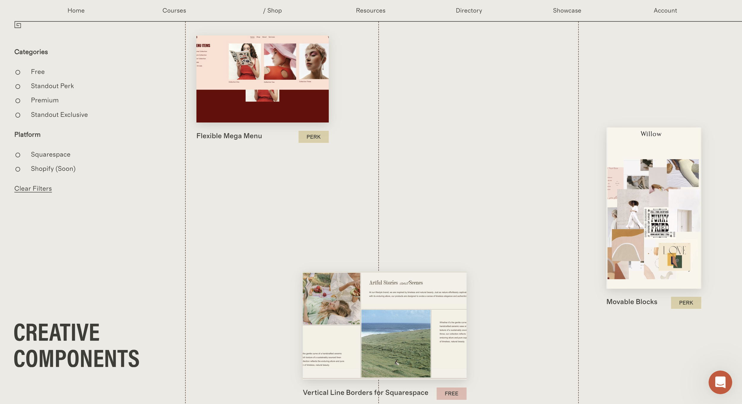
Welcome to our Creative Components Library—a revival of our popular Stylish Sections shop from 2020. This blog post guides you through our various shop offerings (Free, Perk, Premium, and Exclusives) and shares our vision for the shop's future growth.
Shop our creative components
a.
Squarespace & Shopify
b.
Creative Components Library
From Stylish Sections to Creative Components
Many of you might remember our original Stylish Sections shop. It was an overwhelming success back in 2020—a tipping point that completely changed the trajectory of my life and career. Not only did it help my young business thrive, but it also showed me something important: people want to create more unique and stylish websites, ones that didn’t look like at all like templates.
This insight prompted me to develop my flagship course, Standout Squarespace. Our team decided it would be best to temporarily close the shop to focus on building a solid course guiding you on how to design and code stunning websites without limitations. Now, we're thrilled to bring back our shop, new and improved, by popular demand!
What's New in the Creative Components Shop?
Our new Creative Components shop reflects everything we've learned from you and our experiences in web design education. Here's what you can look forward to:
A wider range of components for multiple use-cases, no matter the industry
Improved customization options to perfectly match your brand
Regular updates and new additions to keep your websites fresh and on-trend
Seamless compatibility with the latest Squarespace and Shopify features
Creative Components offers: Free, Perk and Premium
This shop serves different purposes in our offer suite, so I'd like to walk you through what this means for you, especially if you’re a Standout Squarespace or Standout Shopify member:
First, we have Free components. These are just free code snippets that I share primarily on YouTube or on our blog.
There's our Standout Perk category, which include code techniques from our Code Toolkit (free for all Standout members) but are now available as one-off components via our shop. I’ve also improved our classic components such as the Mega Menu, Movable Blocks et al.
Lastly, we've added Premium components which are not included as part of the Standout program but active Standout members can purchase them at a discounted rate of 30% off. This is an evergreen discount available to you as long as you are an active Standout member.
You will notice there are code snippets that we call Standout Exclusives. These are coding techniques available in our Code Toolkit but that are not sold as separate one-off products on our shop. The only way to access and use these components is by enrolling in any one of our flagship courses, Standout Squarespace or Standout Shopify.
Why We're Excited (And Special Offers for you to be excited about too!)
This shop is more than just a collection of beautiful design elements. It's a toolbox that empowers you to create websites that truly stand out. Whether you're a seasoned pro or just starting out, our components will help you take your projects to the next level.
Do visit the shop every so often as we’ll be filling up this library of components gradually the next coming months—I can’t wait for you to scroll through hundreds of hand-coded possibilities to incorporate in your next build.
Here's to creating stunning websites together,
Rache

How to add Video Carousel to Squarespace
Easy, code-friendly way to add a custom, branded scroll-to-top button to your Squarespace site.
Learn how to add a beautiful video carousel to your Squarespace site! In this quick preview, I'll show you how to install our video carousel component that works seamlessly with Squarespace's native video blocks.
How to Add Video carousel to squarespace
a.
Squarespace
b.
Video
Hi there! In this guide, I’ll walk you through how to install our Video Carousel for Squarespace component. This versatile tool is a paid feature, but if you’re part of my Standout Squarespace Program, you get free and unlimited access for all your websites. If you’re looking for free components, visit our shop at squarestylist.com/shop—many come with video walkthroughs for easy setup.
Here’s how to set up the video carousel and make the most of it:
Step 1: Use the Classic Editor
First, ensure you’re using Squarespace’s Classic Editor. You can add video blocks within this editor, which will be the foundation for your carousel.
Tip: I recommend adding videos in three columns for easier previews.
If you’re uploading custom videos, optimize them before uploading. Tools like Veed Compressor are excellent for reducing video sizes by 60–80% without losing quality.
Step 2: Add Video Blocks
With the image in place, we’ll add some code to bring it to life.
Insert your video blocks as needed.
You can use videos from platforms like Pexels, which are web-optimized.
For custom videos, compress them using tools like Veed Compressor (it’s free and user-friendly).

Step 3: Customize Video Settings
Squarespace’s native settings for video blocks work seamlessly with the carousel. Adjust these to suit your needs:
Mute, autoplay, or loop videos.
Decide whether to hide or show player controls.
Accessibility Tip: If autoplaying videos, ensure users can pause or play them easily for compliance.
Step 4: Add the Carousel Code
The last step involves some simple coding:
Copy the code snippet provided in the documentation.
Paste it into Squarespace’s Code Injection area (accessible via the Search icon).
Once pasted, the video blocks transform into a stunning carousel automatically.
This component is perfect for designers and business owners who want to elevate their Squarespace sites. Here’s why:
Purchase it for standalone use or access it as part of the Standout Squarespace Program for unlimited installations.
The program also includes my Personal Code Toolkit, featuring hundreds of plugins, techniques, and workshops to supercharge your Squarespace projects.
Final Thoughts
Installing the Video Carousel is simple, effective, and a game-changer for your Squarespace site. If you’re a website designer managing multiple sites, the Standout Squarespace Program is a no-brainer for maximizing your resources.
Explore the possibilities and create something extraordinary with your next project!
Ready to get started? Check out our shop or join the Standout Squarespace Program today.

How to Add a Custom Back to Top Button in Squarespace
Easy, code-friendly way to add a custom, branded scroll-to-top button to your Squarespace site.

Easy, code-friendly way to add a custom, branded scroll-to-top button to your Squarespace site. With just a few steps, you can give users a quick way to return back to the top of the page, improving navigation and enhancing user experience.
How to Add a Custom Back to top Button in Squarespace
a.
Squarespace
b.
Video
Introduction
In this guide, we’ll dive into an easy, code-friendly way to add a custom, branded scroll-to-top button to your Squarespace site. With just a few steps, you can give users a quick way to return to the top of the page, improving navigation and enhancing user experience. Let’s get started!
Why Add a Scroll-to-Top Button?
Adding a scroll-to-top button is an excellent way to provide users with an effortless way to navigate back up without excessive scrolling. This is especially helpful on longer pages. Plus, with custom graphics and branding, you can keep your design both functional and visually appealing.
Step 1: Adding Your Button Graphic to the Footer
Go to the Footer Section
Scroll down to the footer of your page. We’ll add an image here, which will act as our scroll-to-top button once we apply some coding tweaks.Insert a Placeholder Image
In the footer, add a small image anywhere—it will be hidden later. Make sure it doesn’t interfere with existing content, so resize it if necessary.Select Your Custom Graphic
From your image library, pick a graphic that aligns with your site’s branding. For this tutorial, I pre-uploaded a scroll-to-top graphic designed to match my branding. Choose something that suits your style!Add Alt Text for Accessibility
For accessibility, label the alt text as “Scroll to Top.”Link the Image to the Top of the Page
Set the image link to#top. To ensure it opens in the same tab, turn off the “Open in New Tab” toggle.Positioning
For a standard placement, drag the image to the bottom-right corner of the footer.Save Your Changes
Step 2: Adding the Code
With the image in place, we’ll add some code to bring it to life.
Open the Code Injection Section
From your main menu, search for “Code” to access the Code Injection area.Paste the Provided Script
Copy the script provided in this resource and paste it into the footer section of the Code Injection panel. This script controls the button’s visibility, ensuring it only appears once the user scrolls.
<script>

document.addEventListener('DOMContentLoaded',()=>{const body=document.body,link=document.querySelector('footer a[href="#top"]'),footer=link?.closest('.fe-block');footer?.classList.add('scroll-to-top');const toggle=()=>window.scrollY>200?body.classList.add('is-scrolled'):body.classList.remove('is-scrolled');window.addEventListener('scroll',toggle);toggle()});

</script>3. Add Custom CSS
To access the Custom CSS panel, type “CSS” in the search bar or use the forward-slash (/) shortcut. If you have existing CSS, add the new code at the bottom. This CSS code will style and position the scroll-to-top button, setting dimensions and placement on the screen.
html{scroll-behavior:smooth}.fe-block.scroll-to-top{opacity:0;transition:.5s}.fe-block.scroll-to-top a{display:none}@media screen and (min-width:768px){body.is-scrolled .fe-block.scroll-to-top{opacity:1}body.is-scrolled .fe-block.scroll-to-top a{display:block}body:not(.sqs-edit-mode-active):not(.header--menu-open) .fe-block.scroll-to-top{position:fixed;grid-area:unset!important;bottom:0;right:0}body:not(.sqs-edit-mode-active):not(.header--menu-open) #footer-sections{z-index:11}}

.fe-block.scroll-to-top {
  right:2vw !important;
  bottom:2vw !important;
  width:100px;
  height:100px;
}
Step 3: Customize the Look and Position
Change the Button’s Dimensions
Adjust the width and height properties as desired. The default is set to 100 pixels, but feel free to tweak it based on your design.
Refine Positioning
The right and bottom CSS declarations control the button’s distance from the screen’s edges. Play around with these values to position the button exactly where you want.

How to Create a Fixed Split Screen Layout in Squarespace
Learn how to create a split screen layout in Squarespace with sticky scrolling elements - no coding required!
Creating a split-screen layout with sticky and scrolling elements in Squarespace just got easier! Thanks to the new Fluid Engine, you can now design this layout by maximizing built-in features, including the pinning function. Here's a step-by-step guide to help you achieve this fixed split section in Squarespace effect without any coding.
How to Create a Fixed Split Screen Layout in Squarespace
a.
Squarespace
b.
Video
Introduction
Creating a split-screen layout with sticky and scrolling elements in Squarespace just got easier! Thanks to the new Fluid Engine, you can now design this layout by maximizing built-in features, including the pinning function. Here's a step-by-step guide to help you achieve this fixed split section in Squarespace effect without any coding.
Split-screen designs are visually engaging especially for creatively presenting galleries and lists. Previously, this required extensive coding, but with Squarespace 7.1 and Fluid Engine, we can make it happen through the interface itself. Let’s dive into how to build this from scratch.
Step 1: Setting Up the Section and Grid
Add a Blank Section: Begin by adding a new section to your page. Choose the blank section to have full control over element placement.
Activate the Grid: For easy alignment, press the
Gkey to display the grid. This will help visualize where your elements will sit on the screen.Adjust Padding and Rows:
Turn off full-screen padding by deselecting the “Fill Screen” option in the section settings.
Adjust the row height to fit more elements as you progress.
Set the horizontal gap to zero to center-align your shape blocks later.
Step 2: Adding Blocks for the Left Screen
Image Block: Upload and insert your main image on the left side. If you've pre-uploaded assets, just select the image from your library.
Text Block: Anchor your left side with a text block. Drag it flush to the edge for a true split-screen look.
Style the Text Block:
Add padding around the text to keep it visually balanced across devices.
Align the text vertically to the center of the block for a cohesive appearance.
Vertical Centering: Center-align the text by using the layout options to ensure it remains in

Step 3: Building the Right Side and Adding Decorative Elements
Shape Blocks: To create a colored background or decorative elements:
Insert a shape block and adjust its opacity and padding. Use overlapping elements for added visual depth.Make Adjustments: You may copy-paste additional elements by pressing
Command+CandCommand+Vto fill out the section.
Step 4: Implementing the Sticky Effect
Pin Text and Images: Select the element you want to stay fixed and click the pin icon.
For Centered Sticky Elements, choose the center option to keep the element at the screen's center as you scroll. For Top-Aligned Sticky Elements, pin at the top if you want images or text to remain at the top.Add Offset (Optional): For breathing room, add a slight offset (e.g., 32 pixels) to prevent elements from sticking directly to the screen's edge.
Step 5: Mobile Layout Adjustments
Fluid Engine allows independent adjustments for mobile views, so your design doesn’t have to match the desktop layout.
Reposition Elements for Mobile: Adjust each block’s placement to ensure the layout is clean and functional on smaller screens.
Skip Sticky Elements on Mobile: To optimize space, avoid using the pinning feature on mobile. Sticky elements can crowd the limited space available.
For more design tools and inspiration, visit our Creative Components Library for free and premium assets. And if you’re interested in learning how to code on Squarespace, check out our course on becoming a sought-after Squarespace designer, Standout Squarespace.

Is coding hard?
Why I believe coding isn’t as complicated as people— and even some experts—claim it to be and 3 tips to simplify your learning process.
I hear this question a lot, and Mia recently asked me the same: Is coding hard?
So many people get overwhelmed just imagining how hard coding could be, they give up before even trying. I made this video in response to Mia’s questions, but also for those of you who may be struggling with similar doubts.
IS CoDING HARD?
People often hesitate to learn code because they feel it could be more than they can handle. There are many misconceptions about code after all, so some assume that perhaps coding is not for them. This is the hardest part of learning how to code I believe—overcoming these initial hesitations. It gets easier as soon as you decide to simply start.
How can we learn code the easy way?
1. Learn one website platform or coding language at a time.
Focus on mastering one website platform or coding language at a time rather than trying to learn everything at once. For example: it's beneficial to have a general understanding of various website builders, but becoming an expert in one platform is a much more effective strategy.
In my case, when I decided to move ahead with Squarespace as my main website builder, I invested a lot of time understanding its features, limitations, and possible solutions. That effort paid off in eventually being able to build efficiently and beautifully with the platform, developing unique troubleshooting techniques that I otherwise may not have discovered if I were caught up in working on multiple builders at a time.
2. Start simple and progress gradually.
This step-by-step approach allows you to build confidence having a thorough understanding of fundamental principles before learning more complex concepts. Essentially, our goal is to make sure we avoid any feelings of overwhelm or dread as you work your way into learning more advanced techniques.
And this is exactly how I set up my Standout Squarespace and Standout Shopify programs, starting off with foundational know-how on how the platforms work, best practices for modern websites as well as wireframing and typography tricks before easing into learning coding techniques, starting off with HTML and CSS, adding decorative elements with pseudo-elements and eventually incorporating animations.
3. Learn with a mentor and a community.
Seek out web designer & developer communities and consider meeting up with them in person to share experiences, ask questions, and learn from others. Why not reach out to your favorite design studio or an expert you admire for mentorship? Whatever the case, try not to learn code alone. It’s more satisfying growing in your craft alongside like-minds, and you’ll go much farther.
So, is coding REALLY hard?
No. Coding is not hard, but it does require hard work. By focusing on a specific website platform, learning progressively from the basics to more advanced concepts, and learning alongside a supportive community, you can break down the coding process and build your skills with more ease.
I want you to remember that every expert was once a beginner–this is my personal story as well. With consistent practice, a whole lot of patience and support from other experts, you too can unravel the craft of code and discover all that you can become and create with it.

An invitation to learn design and code with Standout Squarespace & Standout Shopify
I designed my web design & coding flagship programs Standout Squarespace and Standout Shopify with beginners in mind. As a self-taught website designer myself, I know how it feels to not know where to begin or move forward with my learning process whenever I got stuck.
I keep thinking back to the earlier days of my learning journey and how I would’ve preferred to learn code. For one, I would’ve avoided those many days of burnout had I learned all basic knowledge first before easing to more advanced concepts. It also would’ve been better if I reached out to a mentor or a learning group for more support, which makes all the difference if you ask me.
All of these things I wish I had access to when I was still starting out, I made sure to incorporate in the Standout courses—lessons laid out from essentials to more advanced coding techniques and an organized Knowledge Base with design inspiration, coding cheat sheets, plug-and-play code snippets and business resources to name a few.
Learn more about our design & code course for Squarespace & Shopify.

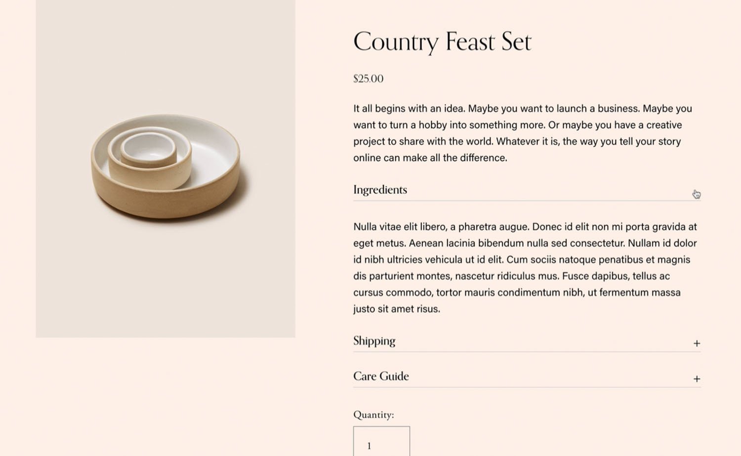
How to add accessible Accordions to Squarespace product pages
Add accordions to Squarespace product details page information area

Here’s how to add accordion menus to your Squarespace product detail pages.
How to add accessible Accordions to Squarespace product pages
a.
Squarespace
b.
Video
Introduction
Accordion menus are a great way to present product information in a clean, organized layout, letting customers view important details before they add items to their cart. Here’s how to add accordion menus to your Squarespace product detail pages.
Step 1: Start Adding Your Accordion Content
Go to Product Details
Begin by navigating to the product detail page where you want the accordion to appear. Look for the Description section—this is where you’ll add your accordion content.Create Accordion Titles
Start by entering the first title for your accordion menu. Make sure to format each title as Heading Four (H4) to ensure proper display and functionality.Add Content Under Each Title
After entering a title, press Enter and add the relevant text or details that you want to appear under that section. This will be the collapsible content associated with the title.Repeat for Additional Sections
Add any additional accordion sections by repeating the same process—enter the next title, format it as Heading Four, and add the relevant text beneath it. You can create as many accordion sections as you need.
Step 2: Adding Code for the Accordion Feature
Access the Accordion Code
We have a free accordion menu component available on our Creative Components page. Simply click the link provided in the video description to access it, and copy the code needed for your accordion.
Insert Code into Footer Injection Area
Go to the Injection Area in Squarespace. To find it, click the search icon and type “injection.”
In the footer injection area, paste the copied accordion code.
Apply Custom CSS
Copy the custom CSS provided on the Creative Components page.
Access the Custom CSS Area by searching for “CSS” in Squarespace.
Step 3: Save and Test Your Accordion Menus
Once the code is in place, save your changes and refresh the page to see the accordion menu in action. The titles should now expand and collapse as you click on them, neatly organizing the product information on your page.
Accessibility Features
These accordion menus are designed to be accessible for users who navigate with keyboards only. Customers can open and close each section using the Return key or Space bar, which is an essential feature for an inclusive web experience.
Additional Resources
If you’re interested in more stylish components or other solutions for your Squarespace or Shopify site, check out our Creative Components page for free resources. You can also subscribe to our channel to stay updated with new tutorials and resources.

How to Provide Squarespace Template Support
Introducing Template Wizard: AI-Powered Support for Squarespace Template Customers

Considering design intensives? Here's a good look at what they are, how they differ from templates or fully custom designs, and which clients need them.
How to provide squarespace template support
a.
Business
b.
Article
Introduction
Hi there! We've recently launched an exciting new workshop focused on selling Squarespace templates. This workshop is designed to teach you how to launch your very own Squarespace template shop using our proven systems.
The Template Wizard
One of the standout features of our workshop is the introduction of an AI-powered help center, which we call the Template Wizard. This innovative tool serves as an AI-powered knowledge base to support your template customers.
Addressing Common Concerns
We're aware that many Squarespace designers shy away from selling templates due to the daunting task of creating numerous tutorials for their customers. The Template Wizard is our solution to eliminate this barrier.
The Framework Behind Template Wizard
The Template Wizard is built on the principle that most templates function similarly, especially when you utilize the framework shared in our Selling Templates Masterclass.
Customer Experience After Purchase
Let's walk through what your customers will experience after purchasing a template:
They'll be directed to a password-protected page on your website.
This page link will be sent to them via email immediately after purchase (if you follow our automation process).
The page will outline clear steps for getting started with their new template.
Inside the Template Wizard
Here's a preview of what the Template Wizard looks like:
It's hosted on our website (you'll receive access details upon enrolling in the Selling Squarespace Templates course).
The information is thoughtfully organized to provide just the right amount of guidance without overwhelming your customers.
Key Features:
Getting Started Module:
Instructions on backing up sections before editing
Tips for previewing their website effectively
Customization Essentials:
Covers only the most crucial aspects of website customization
Keeps videos concise, as we've learned template customers prefer brevity
Squarespace Basics Module:
Available for those who need to brush up on fundamentals
Includes guidance on aspects like e-commerce or blogging that may not be covered by all templates
Automatic Updates:
We keep the videos current, updating them whenever Squarespace changes its interface
Searchable Content:
Customers can easily find specific information without watching entire videos
AI-Assisted Support
The most remarkable feature of the Template Wizard is its AI-assisted support:
Customers can ask questions using the "Ask" button.
Unlike general AI assistants, our Template Wizard only references information curated in its knowledge base.
It provides accurate, relevant answers without making up information.
Example:
When asked about setting up a newsletter block, the AI will:
Provide step-by-step instructions
Point to the primary resource (video)
Give the exact timestamp where the process is demonstrated
The Advantage Over Traditional Support
After years of selling Squarespace templates, we've realized:
Most customer questions are actually covered in existing tutorials.
Customers purchase templates to launch their sites quickly.
The Template Wizard helps them find answers fast, reducing the time you spend answering email queries.
Streamlined Support Process
In our template guides, we encourage customers to:
First, seek support via the Template Wizard
Only email for support with specific template-related questions that aren't addressed by the AI
By implementing the Template Wizard, you'll be able to provide efficient, 24/7 support to your template customers while freeing up your time to focus on creating and selling more templates.
Convinced that templates are the way to go?
You’ll want to check out my masterclass on this topic, Selling Squarespace Templates. It’s your short course on everything you need to know about template building, delivery, and support—along with a comprehensive template toolkit to get you started.

Five ways to Sell Templates to Small Audiences
Is Selling Squarespace Templates for you? Here are five ways creating and selling Squarespace Templates can benefit your studio.

Considering design intensives? Here's a good look at what they are, how they differ from templates or fully custom designs, and which clients need them.
FIVE WAYS TO to sell templates to small audiences
a.
Business
b.
Article

Introduction
Many designers believe that website templates are a brilliant source of passive income—at least if you could somehow manage to get a lot of eyes looking your way. To err on the side of caution, they tend to do one of two things: sell their templates on online marketplaces like Etsy or wait until they’ve amassed a sizeable audience before setting up shop.
It might surprise you that when I began Squarestylist I took neither of those options. In fact, I went ahead and launched my first template on my site with next to no followers on Instagram.
Success did not come to me spontaneously. It took months of building my audience before my templates transformed into a sustainable source of revenue on their own. Yet I found from experience that templates can support your studio in unexpected ways—ones that can work for you even while you’re still growing your reach.
Here are five interesting ideas to get the most out of your own website templates:
1. Treat templates as creative playgrounds
One upside to not having a massive following that awaits your designs at every turn is that you have space to explore what stirs your curiosity without fearing judgment. What are the colors, textures, patterns that excite you? Sketch your ideas on paper. Gather your visual inspirations on a moodboard. Or better yet, put them together in a template of your own.
Take a moment of introspection to reflect on your aesthetic skills and sensibilities so they lead you to the types of clients you want to serve—not the other way around.
Style is a design signature that you define over time the more you create, so continuous hands-on practice will only strengthen your distinct body of work. The more effort you put into this upfront, the better you will attract the attention of like-minded clientele in the future.
2. Showcase templates as portfolio pieces
Breaking into the web design industry can seem like a tangled mess of prerequisites: to get new clients, you need a portfolio; to build a portfolio, you need clients.
Like many designers before me I opted to offer my services at the lowest possible price. My first Squarespace site earned me $500. In retrospect, I shouldn’t have been surprised that this client referred me to more people who expected websites for free or cheap.
The truth is, building your portfolio is a steady act of building trust—trust that you are capable of performing the task expected of you as a professional without wasting someone’s time or resources. But there are other ways of earning that trust, especially ones that do not involve trading off your unpaid labor.
Upon promoting my templates as part of my personal project, I didn’t just get purchases from bootstrapped customers; I also received foot traffic from clients who wanted something special. Whenever I asked them for their website inspirations, they said the same thing: “I saw your template and knew that I wanted you to recreate that aesthetic for my brand.”
To their eyes, a live Squarespace demo was a more effective representation of what I can do for their business than static mockups or testimonials.
3. Utilize templates as robust foundation
Who says only your customers can use the templates you create?
A template isn’t just a digital offering for passive income; it can also be the starting point for your fully custom projects if you want it to be. Think of it as setting the tone in the staging process. Your personal template places your signature sections and go-to presets within arm’s reach so you don’t have to go through each and every toggle in the settings.
Not to mention it saves you from staring at a blank page in Figma and Squarespace alike, given that you’re just modifying a copy of your existing design prototype.
You’d be most familiar with the features and constraints of your own template—what you can and cannot change within the framework. This helps with managing client expectations all throughout. By the end of the project they’ll be delighted to receive a website that looks nothing like the template you started with, since it’s now made uniquely theirs.
Of course, you can always choose to designate your base template exclusively for internal use rather than making it available to the public.
4. Offer templates as accessible downsells
Every now and then you’d come across inquiries that do not yet have the financial capacity to work with you one-on-one. This can be a good sign that your studio is starting to gain traction in terms of audience. Instead of turning them down altogether or lowering your prices to accommodate, why not point them towards your template shop?
If they have more time than money on their hands, they’d appreciate you lending your expertise in a way that makes sense for their business.
There are more cost-efficient ways you can deliver templates to these types of prospects. For instance, you can offer template reskins then have their website ready by the end of the day (or week) via design intensives. Templates in this context grant you the flexibility to match your support with the investment they can readily commit.
5. Create templates for compelling collaborations
You may not realize it, but a website template is a digital product that lends itself to potential collaborations. Think back to your ideal client and the additional services they still need for their business to flourish. These are the service providers you’d want to keep tabs on.
The nature of your partnership would depend on their level of involvement with the project. Affiliate marketing and virtual events promote your templates to their audience in exchange for a cut of every sale. Co-creation invites them into the template design process to ensure it caters to their specific niche. Bundling features your website template alongside similar templates and guides for a more holistic service package. The choice is all yours.
Convinced that templates are the way to go?
You’ll want to check out my masterclass on this topic, Selling Squarespace Templates. It’s your short course on everything you need to know about template building, delivery, and support—along with a comprehensive template toolkit to get you started.

Add Custom Fonts to Squarespace: using our Magical Tool
The most efficient method to add your own custom fonts to squarespace. Meet the magical tool, CustomFontWiz
In this video, I introduce you to Custom Font Wiz, a magical tool I developed to make adding your own custom fonts to Squarespace faster and easier.
Add Custom Fonts to Squarespace
a.
Squarespace
b.
Video Walkthrough
Introduction
What if I told you that it's going to be a lot easier to install custom fonts to your Squarespace website? In this video, I introduce you to Custom Font Wiz, a magical tool I developed to make adding your own custom fonts to Squarespace faster and easier.
Whether you're customizing your own Squarespace website or you're a designer building sites for clients, CustomFont Wiz will be a huge time and energy saver. If you are selling Squarespace templates, you can now easily point your customers to this tutorial to make it easy for them to customize their templates.
Timestamped Overview
0:00 Introduction: Easier Custom Font Installation for Squarespace
0:08 Introducing the tool, CustomFontWiz
0:32 Benefits of using the magical tool for Designers and Template Sellers
2:14 Step-by-Step Guide: Adding custom fonts to squarespace
4:04 Which font format to use: woff2 vs woff vs otf
5:28 Importance of Font Licensing
6:45 Example of Using High-Quality Free Fonts
8:15 Uploading and Generating Font File Path
10:06 Applying Custom Fonts to Different Elements
11:56 Additional Tips for Efficient Custom Font Application
Why CustomFontWiz?
Squarespace has a wide selection of fonts available via the Site Styles panel, but there might also be fonts from great foundries you wish to install on your Squarespace website. What makes this tool magical is that it makes adding custom fonts to Squarespace incredibly easy and fast.
How to Use CustomFontWiz
Step 1: Fill Out the Form
All we need to do is fill out this form with the font details like font path and font name. Then we may choose to apply the font to the heading, the body, or the buttons and just choose the applicable font format.
Step 2: Copy and Paste the Code
Whatever code is generated in the right panel, we can easily copy and paste it into the custom CSS panel of our site. Upon saving, our custom font will now be applied throughout the instances of the element that we chose.


Step 3: Assigning Fonts to Elements
I assure you that this is the most efficient method out there because if we wish to use the same custom font on any other element of the website, all we need to do is head to the assign styles panel of our Squarespace site and choose the element where we wish to apply the custom font.
For example, if we want this custom font to be applied to the site navigation, I can choose the site navigation option under Assign Styles. If I choose the heading option, then our custom font will also be applied to this element.
Comparison with Existing Methods
You've probably watched countless tutorials on adding custom fonts, but these existing methods require writing new code. If you wish to install a custom font on specific elements, you'd have to spend time looking for the code and writing the code for every element where you wish to apply the custom font. This is why I developed this tool to make this process a lot easier.
Detailed Walkthrough of CustomFontWiz
Now allow me to walk you through the step-by-step process of how to use this tool. You can access the tool through this link.
1. Filling Out Font Details
Our first step is to fill out these details. The first field is where we'll supply the font file path, which is the link to our font file.
Check Font Licensing Details Before Using Custom Font
But make sure that before you use any custom fonts on your live Squarespace websites, you have the proper web license to use it. Note that the web license may be different from the desktop license, so if you obtained the desktop license, make sure that you also pay for the web license.
In some cases, font foundries also require annual payment for the font web licenses, so please make sure you check the fine print of any font that you use for your website.
There are also high-quality free fonts like these ones from Colletivo typefaces, and all they ask is for us to credit them when we use the fonts on our projects. There might be special cases, though, where this free license isn't applicable. So for every font that you use on websites, please make sure that you read the dedicated licensing pages.
Example: Using Messapia
For example, I'd like to use this one called Messapia by Luca Marsano.
When we click the download button for this font, the downloaded folder contains desktop and web fonts.
For our use case, we need the web font, and for web use, the most recommended format is woff2, but if it isn't available, then we can use woff.
The font format OTF or OpenType is typically used for desktop, but then there are fonts, especially those from independent foundries or from Creative Market, that are only available via this OpenType format. And while the woff2 and woff formats are more optimized for web use, we can still use the OTF format. But then please make sure that you have the web license to use the font.
Once we have the font file and the proper web license, we may now proceed with generating the file path.
3. Generating the File Path by Uploading the Font File
To do so, we go to the CSS panel. We can click the search icon and start searching for CSS. Click the Custom CSS option.
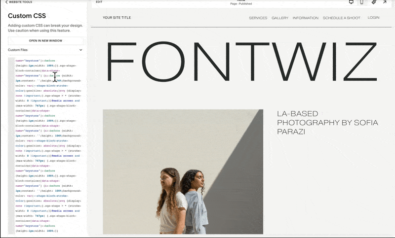
Should there be existing code in this panel, for example, this one, all we need to do is hit command arrow down on our keyboard or control arrow down if you are using a Mac computer. So that's command arrow down, and once we're at the very last line of the code, we hit enter thrice and this is where we can safely add any additional codes.
Don't worry about disrupting any codes because we will not save any changes that we'll do in this panel. We'll hit cancel in a while. We just need to upload the font via this custom files field.
So if I click this custom files dropdown, we will be prompted to add any images or fonts. We may use this plus button, or we may simply drag and drop the woff2 file. As I mentioned, because the woff2 file is the most optimized for the web, I am using it over the woff version.

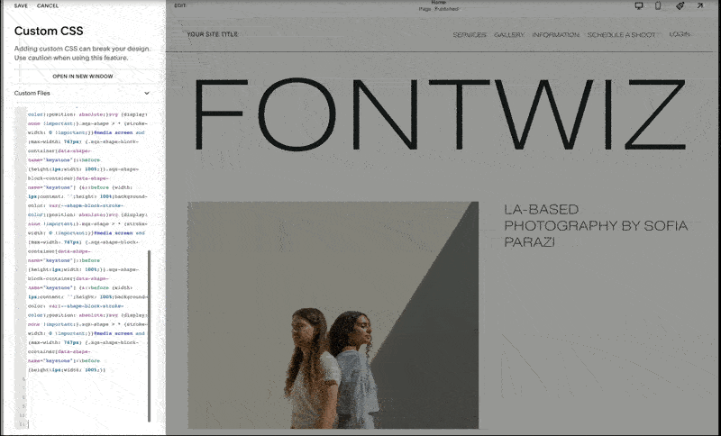
Once the font is uploaded, we may again place our cursor at the very end of our custom CSS panel, and once we click the custom files again and click the woff2 file that we just uploaded, notice how this custom file path is generated.
All we need to do is copy this link to our clipboard or our notes by hitting command c or control c, and then MAKE SURE TO HIT THE CANCEL BUTTON such that any of these changes will not be saved.
4. Applying the Font
Pasting the Code
The link that we copied is what we'll paste to our font file path field and then we can assign any font name for this one. Our font name is Messapia and the element where I wish to apply this font is the heading and the font format right here is woff2.

Once I click the generate code button, it will supply us with the code that we can copy and paste to the custom CSS panel. Notice as soon as I paste this set of codes, the heading instances are changed to our new font style, which is Messapia. It's that fast and easy, and we just need to repeat the same process if we wish to have custom fonts for our paragraphs and buttons.
Customizing Paragraphs and Buttons
For example, if I wish to use this custom font as our paragraph and button font, I generated the font file path once again and assigned the font name. This time I'd like to apply it to the body or the paragraph. And then again using the font format woff2.
Here’s an example using Absans as font for body and buttons

So when I generate the code for the Absans font targeting the body, and copy this, if I paste it right on Custom CSS, notice that our paragraph fonts are now using the Absans font. I try to minimize the number of custom fonts for each website because each font contributes to the loading time. So in this case, I'd like to use the body font as my button font as well.
So I'll only need to repeat the same process and choose buttons as the element, hit generate code and copy then paste the same on Custom CSS, this will then now allow me to apply this custom font Absans to our buttons, and this font will now be applied to all button styles, primary, secondary, and tertiary.
Important Notes
Placing FontWiz Codes at the Start
Here's an important note.
If your custom CSS panel has existing codes, it's best for us to ADD THE CODES GENERATED by the Fontwiz tool TO THE VERY FIRST LINES of the panel.
To do that, we need to place our cursor at the very beginning and then hit the return key or the enter key multiple times. Twenty should be enough. And then whatever code is generated by Fontwiz, we simply paste it right here at the very start.
And if we need to add more FontWiz codes, simply hit enter and again these will be added at the start before any of the existing codes. We'll then save these changes and notice that our custom fonts are now applied.


Accessing and Assigning Custom Fonts
As I mentioned, if we wish to access these custom fonts, all we need to do is head to our site styles panel and under fonts, we click assign styles. We may choose the element where we wish to apply the custom font to.
For example, if I wish the Site Title to adopt our custom font for the heading, I'll switch to the heading font.
Notice how our Messapia font was applied, and if I want our custom font for paragraph or body to be applied, then I choose paragraph.
Advanced Typography Options and Applying Different Type Systems
There are so many more possibilities with regard to typography on our Squarespace sites if we just add a little bit of code magic. For example, we may also apply a different font style within one line such as this one. All we need to do is hit this italicize option to apply this accent font. This is something that I'll discuss in an upcoming video, so please make sure to subscribe to our channel.
It's also possible for us to apply a different type system to a specific page of the site. For example, in this website, I have this type system on one page and when I switch to another page, I applied a different type system. This is possible via code and this is something that I discuss in detail in my signature program, Standout Squarespace. You may check out the description link below.
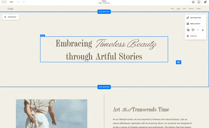
Sharing and Additional Resources
Lastly, there is an optional step in our CustomFontWiz tool, and that's to share and subscribe. I highly encourage you to share this tool with other Squarespace business owners and designers if you find this helpful. This tool is actually one of the many new resources that we are preparing for the revamp of our Selling Squarespace Templates course. This course was originally available only inside the Standout Squarespace program, but it will now be available as a standalone course. So if you'd like to join the waitlist, simply click this button and fill out the details.
I hope you find the CustomFontWiz tool handy, and if you have suggestions on how to improve this tool, please comment down below. To receive updates on future resources on Squarespace, Shopify, and running your design business, please subscribe to this channel.

Add Vertical Lines in Squarespace
Here’s the easiest way to add vertical lines to your Squarespace website.

I'm excited to show you the best and simplest method for adding vertical line borders to your Squarespace site. The best part? We're just using built-in blocks, making it a breeze for clients to edit
ADD Vertical Lines in Squarespace
a.
Squarespace
b.
Video Walkthrough
Introduction
I'm excited to show you the best and simplest method for adding vertical line borders to your Squarespace site. The best part? We're just using built-in blocks, making it a breeze for clients to edit. Changing the line color is hassle-free too – no need to touch any code! The color can be set right in the block settings. Plus, by combining this vertical border technique with built-in horizontal line blocks, you can effortlessly create a grid layout. And yes, it is using Squarespace's cutting-edge new Fluid Editor.
Timestamped Overview
00:00 Introduction by Rache from Squarestylist.
00:04 Overview of Adding vertical lines in Squarespace.
00:10 Adding a blank section and using the grid.
00:36 Using the shape block for vertical lines.
01:08 Adding custom CSS for shape transformation.
01:40 Changing the line color using stroke options.
02:01 Adding text and images to the layout.
02:20 Horizontal lines in mobile view.
02:55 Creating grid layouts with vertical and horizontal lines.
07:42 Conclusion and additional resources for learning.
Resources
Hi there, I'm Rache from Squarestylist. In this video, I'm going to walk you through how to easily add vertical lines to your Squarespace fluid sections. What's great is we can easily change the color of our vertical line without having to touch the code. And we can combine our vertical lines with our horizontal lines to create grid layouts like this.
Adding a Blank Section
Our first step is to add a blank section. When editing fluid sections, it's best to turn on the grid by hitting "G" on our keyboard.

Using the Shape Block
To add the vertical line, we'll use our shape block. So, I'll click this add block button and start typing shape.
I'll bring the shape right to the middle. We may adjust the height accordingly but make sure it spans two columns.
Configuring Shape Settings
We double-click the block to bring up the shape settings. I'm going to use a shape that's rarely used. In this case, it's keystone. Then, I'm going to add the code that targets this specific shape without affecting the other shape blocks within the site.
Simply paste the provided code to the end of your custom CSS panel. Please ensure that we add it after any existing code. Upon pasting, notice that our keystone shape turned into a vertical line.
This happened because I am simply targeting the keystone element.

Changing the Color
We can change the color of this line by toggling on this stroke option and changing it to any color of our choice. Now we can proceed with adding the other elements, like our image. I'll make sure to assign the correct number of columns to this image. You may use any of these design options for this use case. I'd love to use the fill one. Then we add the text to the other side.
Adding a Horizontal Line
If you wish to add a horizontal line between these two sections, we can use our section divider. Click edit section and toggle on this divider. You'll find the option to set it to this straight option and again change the color and thickness accordingly.
Mobile View Adjustments
You might be curious how this translates on mobile. When we click this mobile view option, we'll find that this shape or vertical line turns into a horizontal line on mobile.
We can place it anywhere within the mobile grid and change its size accordingly. I like making sure it occupies two rows and notice that it stacks perfectly on mobile view.

Creating a Grid Layout
To create this grid layout, we don't need to add any more code. All we need to do is position our vertical line and horizontal line anywhere within the grid. Let's demonstrate this by adding a new blank section. This grid layout is best done when the fill screen option is toggled off or if its value is really small, for example, five or six. Here we can extend the height of this section.
Copying Elements
We can add our vertical line by copying it from our previous section. So I'll hit command c on my keyboard and while this new section is selected, I'll hit command v. Notice how I'm able to add this vertical line easily to this new section. Then we can add any image.
I'll again just copy and paste the image from our first section. Now I can copy this and paste it again by hitting CMD + v and position it anywhere within our grid.
Adding Horizontal Lines
To add the horizontal lines, all we need to do is add a line block and make sure it spans two rows. I can also extend it to flush to the edge of our section. I can also do that to our image.
Now that we have a horizontal line block, I can copy it and paste this to a section. Then add it at the top of the second image and extend it to the right edge of our section. We can easily add texts and other elements within the grid.
Section Dividers
Of course, we may toggle on our section divider to add our horizontal divider between sections. Here is an example layout. Using that technique, I've used a bit more code to make the image effect show up upon hover and I'll tackle that in an upcoming video on this YouTube channel. So please don't forget to subscribe to this channel and like our video.
Mobile Optimization
Please note that on mobile, these vertical line borders will automatically turn into horizontal line blocks. So in the new Squarespace fluid engine, we have a lot of flexibility in placing any elements on mobile without affecting our desktop view. I can show the grid by hitting G on my keyboard and reduce the height of our blocks. Notice how if we change our view back to desktop, our grid layout won't be affected.
Arranging Elements
It's quite easy for us to create a line that is flush to the edges by simply making sure that we pull the line to both sides. Then I can arrange our images, lines, and text independent of what's showing on our desktop view. Note that if there are extra lines that you don't want visible on mobile, we can make them smaller and hide them underneath our images or any other element.
Notice how I can hide it under these elements and manage its stacking using these options. I have the option to move forward or backward because I don't want this to be on top of the image, I just want to hide it underneath. So I use this move backward option. I'll also position our lines making sure they're flush to the edges.
It depends on how you wish the mobile to look, but for this particular layout, this one will be fine. Most likely, you'll find that on mobile there are additional rows added and it's quite easy to remedy that. For example, if there's a large white space, we just bring the row icon up and we can optimize it.
Creative Layouts
On mobile, you can get really creative using this approach. Notice that I was able to create another grid layout like this. I added a video block and more code to make sure the video responds to the grid.
This is another layout you can try to achieve using this technique. I hope you find this helpful. You'll find the codes in the description box below.
Learn More
If you're interested in learning more about coding the right way in Squarespace, please check out my program Standout Squarespace, where I share my proprietary approach to coding Squarespace in a smart way. We ensure the site is easily editable by website owners and recreate these projects while learning many techniques and foundational concepts in the process.

Blog Paywalls in Squarespace
Squarespace launches a new feature to monetize blog collections. Invite readers to sign-up before reading the rest of the post.

In this video I’ll show you how to use this new Squarespace new monetization feature for your blogs.
Blog PAYWALLS IN SQUARESPACE
a.
Squarespace
b.
Video Walkthrough
INTRODUCTION
We got a new way to monetize content in Squarespace. We can now paywall blog content and set-up multiple pricing plans (subscription, one-time payment or free). Readers are invited to sign-up before they can read the full content. We also have the option to set specific posts for public preview. If you don't see this feature yet on your end, don't worry! This feature is being actively rolled out.
Timestamped Overview
0:00 New Feature Introduction: Squarespace launches a feature for blog monetization.
0:06 Functionality: Excerpts shown; signup required for full posts.
0:20 Pricing Plans: Options for yearly, monthly, weekly, and one-time payments.
0:52 Free Access Setup: Free access available in exchange for email addresses.
01:02 Default Setting: Paywalled blogs hide full content, show excerpts.
01:15 Public Preview: Option to make specific posts publicly visible.
01:56 Blog Collections: Posts can be non-sequential, categorized, and tagged.
02:11 Adding Pricing Plans Add plans to new or existing blog collections.
03:24 Free Plan Example: Example of creating a free pricing plan.
05:10 SEO Impact: Public content indexed; paywalled content not indexed.
Resources
Setting Up Pricing and Access Plans
We can set up different pricing or access plans for users to read the full content within the collection. These subscription pricing plans can be set up yearly, monthly, or weekly. We can also add a one-time payment option or, if desired, make certain collections available for free while collecting email addresses or prompting users to log in before accessing exclusive content. This allows us to set up a free pricing plan.
Once a blog collection is paywalled, the full content of the blog posts will be hidden by default. Only the content we assign as an excerpt will be shown to users. However, we can assign certain blog posts to be visible without requiring a login or sign-up by setting them for public preview.

Configuring Paywalled Blog Collections
Setting up these paywalled blog collections is similar to configuring courses and digital products. I have a separate video about that, which I'll link below. The configuration allows for multiple pricing plans, but course collections are typically for structured content consumed sequentially. In contrast, blog collections are not necessarily consumed in sequential order. We can group posts into different categories, tag them accordingly, and arrange them chronologically.
With this update, any existing or new blog collection can now have pricing plans. If no pricing plan is attached to the blog collection, all content within the posts will be accessible publicly by default. But as soon as we create a new pricing plan—whether it’s free, subscription-based, or a one-time payment—the entire blog collection becomes payable.
Example of Setting Up a Free Pricing Plan
For example, if I add a free pricing plan named "Square One free," I can remove the description and benefits for now. Once this pricing plan is created, we'll notice that in our blog content, when accessing any post in edit mode, we can edit the excerpt. Only the excerpt will be shown by default, with the rest of the post content hidden.
If I visit the blog post URL in an incognito window, only the excerpt shows, and the rest of the post is hidden. Users are prompted to join now using a button, and they can sign up using the configured pricing plans. Multiple pricing plans can be set up within the same collection. For example, I can set up a monthly subscription for $10 per month and an annual subscription for $1000. We can even have a one-time payment plan and configure which pricing plan will be available via the paywalls menu.
Paywalls Menu Configuration
In the paywalls menu, we can show a welcome message and instructions. Under "featured pricing plan," we can choose which plans are publicly visible.
For example, I can hide the free option from being publicly visible. When users click the "join now" button, they will see the available pricing options under the payable placement. By default, blog posts only are selected, which is suitable for most use cases.

However, if we don't want the blog overview (thumbnail and excerpt) shown publicly, we can choose this option.
As I mentioned, if at least one pricing plan is set up for a blog collection, the full content of the blog posts will be paywalled or gated, with only the thumbnail and excerpt visible. If we want certain blog posts to be available for public preview, meaning the entire post is visible even if it belongs to a paywalled blog collection, we can select that blog post, click the three-dot icon, and choose the option to set it as a public preview.
Upon doing so, when we visit the site in a browser where we're not logged in, we'll see the preview button opposite that blog post. The full content of other blog posts will be hidden, but the main content of the public preview post will be shown. If we navigate to other blog posts, their full content will remain hidden.
SEO and Public Content
A quick note about SEO: any content made publicly available, such as excerpts, thumbnails, titles, URLs, and full post content set for public preview, will be indexed accordingly. However, paywalled content will not be indexed.
I believe this is an exciting new way to monetize content in Squarespace. While it might not be as robust, powerful, and feature-rich as other monetized publications like Substack, I think Squarespace is just getting started, so stay tuned for updates. If you're looking for high-touch support for your Squarespace projects, please check out my program, Standout Squarespace.

Create a stylish Testimonial Slider
Transform Squarespace's list section into a stylish testimonial slider in just a few simple steps.

In this video, let's turn the built-in list section of Squarespace from this to a beautiful testimonial carousel like this. In a few simple steps, we'll transform your site.
Transform Your Squarespace List Section into a Testimonial Carousel
a.
Squarespace
b.
Video Walkthrough
INTRODUCTION
Hi, this is Rache of Squarestylist.
In this video, let's turn the built-in list section of Squarespace from this to a beautiful testimonial carousel like this. In a few simple steps, we'll transform your site.
Timestamped Overview
0:02 Transforming list section into a testimonial carousel.
00:23 Adding a list section from the catalog.
00:39 Changing layout to carousel.
00:44 Adjusting carousel settings.
01:14 Setting media width and adding content.
01:52 Applying custom CSS codes.
02:27 Saving and reusing sections.
04:10 Custom colors and advanced styles.
04:38 Standout Squarespace program
Resources
- Squarespace Design and Coding course
To access the codes referenced in the video, please sign-up to our vault mailing list: https://www.squarestylist.com/sqs-vault
Transform Your Squarespace List Section into a Testimonial Carousel
Hi, this is Rache of Squarestylist.
In this video, let's turn the built-in list section of Squarespace from this to a beautiful testimonial carousel like this. In a few simple steps, we'll transform your site.
Adding a List Section
First, let's start by adding a list section. We can open our catalog and under services, find the option with the information icon. That's our list section. From here, we can switch to any layout. So from the design tab, let's switch from a simple list to a carousel.
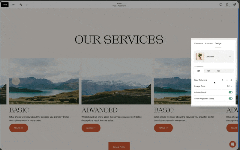
Customizing the Layout
Text Alignment and Columns
The text alignment is to the left.
The maximum number of columns is three, but we can explore changing this value.
Our image crop is set to a 1:1 ratio or a square.
I toggle on infinite scroll and show adjacent slides. Under style, I ensure the card style is toggled on for size and space.
We need to make sure that under media width, we set this to a value of 27%.
Card Style and Position
For our cards to have the same height, we use the last option for position.
Under elements, I prefer toggling off the buttons.
Under content, this is where we add the image for the testimonial, the corresponding alt text, the title (which is the name and company), and the description (where we add the testimonial).

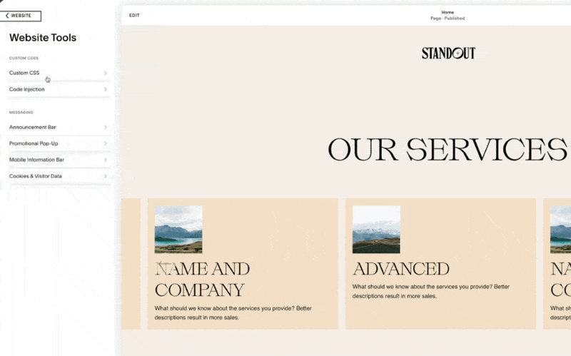
Adding Custom CSS
Now we just have to add the codes that come with this video. Please check out the description below for free access to the codes. Under website tools, find the custom CSS. If this tab has existing code, go to the very last line and paste the code that comes with our guide. And that's how easy it is to adapt this format.
Adjusting Content and Colors
Once you've added the content, this is how it'll look. We can easily change the order of our items and add content using the built-in editing feature of our list section. If you wish to change the color of the testimonial cards, go to the color theme of this section.
In my case, that is the slightest one. I'll scroll until I find the list section for carousel. Right here, we have the card color. I can change this to any existing color in my color palette or a custom color.


Smart Code Usage
Using a smart way to write codes, we will not affect other list sections unintentionally. We can still add carousel list sections anywhere on the site without unintentionally affecting their styles. We can easily reuse this section anywhere on our site by using the save section feature of Squarespace.
Saving and Reusing Sections
For example, if I have another testimonial slider section that I wish to add on another page, all I need to do is use this heart icon and save this as a saved section. Anywhere else on the site, we can access it by adding a section and accessing the saved section tab.
Once I add it, notice how all our coded customizations are seamlessly carried over. We can change the content of this particular section without affecting other instances of this coded section.
Further Customizations
There are a lot more style customizations that we can apply to this testimonial slider. For example, we can have a custom color per list item. This is achieved using additional code, and you'll find it in action when you visit Standout Squarespace. By using the exact same list section and a similar approach where we simply add a set of CSS, we can achieve this list card effect.
Learn More with Standout Squarespace
If you're interested in learning more about how to build Squarespace sites and create these unexpected sections in a smart and streamlined way, I invite you to check out my program, Standout Squarespace. We have a growing library of features that you can easily add to your Squarespace sites. More so, we have pre-recorded lessons that you can go through at your own pace. This is where you'll learn the fundamentals to help you upscale so that you can write your own codes and creatively combine techniques to create your own stylish coded sections in a smart and streamlined way.
Please check out Standout Squarespace for more details.