How to Create a Fixed Split Screen Layout in Squarespace
Creating a split-screen layout with sticky and scrolling elements in Squarespace just got easier! Thanks to the new Fluid Engine, you can now design this layout by maximizing built-in features, including the pinning function. Here's a step-by-step guide to help you achieve this fixed split section in Squarespace effect without any coding.
How to Create a Fixed Split Screen Layout in Squarespace
a.
Squarespace
b.
Video
Introduction
Creating a split-screen layout with sticky and scrolling elements in Squarespace just got easier! Thanks to the new Fluid Engine, you can now design this layout by maximizing built-in features, including the pinning function. Here's a step-by-step guide to help you achieve this fixed split section in Squarespace effect without any coding.
Split-screen designs are visually engaging especially for creatively presenting galleries and lists. Previously, this required extensive coding, but with Squarespace 7.1 and Fluid Engine, we can make it happen through the interface itself. Let’s dive into how to build this from scratch.
Step 1: Setting Up the Section and Grid
Add a Blank Section: Begin by adding a new section to your page. Choose the blank section to have full control over element placement.
Activate the Grid: For easy alignment, press the
Gkey to display the grid. This will help visualize where your elements will sit on the screen.Adjust Padding and Rows:
Turn off full-screen padding by deselecting the “Fill Screen” option in the section settings.
Adjust the row height to fit more elements as you progress.
Set the horizontal gap to zero to center-align your shape blocks later.
Step 2: Adding Blocks for the Left Screen
Image Block: Upload and insert your main image on the left side. If you've pre-uploaded assets, just select the image from your library.
Text Block: Anchor your left side with a text block. Drag it flush to the edge for a true split-screen look.
Style the Text Block:
Add padding around the text to keep it visually balanced across devices.
Align the text vertically to the center of the block for a cohesive appearance.
Vertical Centering: Center-align the text by using the layout options to ensure it remains in
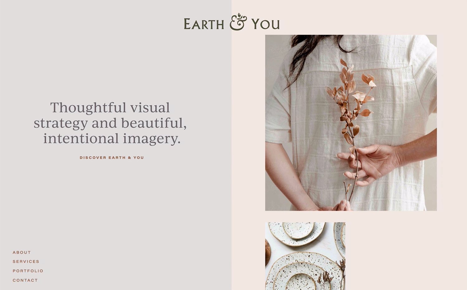
Change the way your visitors scroll through your digital home by splitting the screen into two—one section that sticks around with a captivating image or an accessible side navigation and another moving section that can hold as many Squarespace blocks as you need. Perfect for media-rich storytelling that engages your audience. No wonder this technique is considered a cult classic within our circle.
Support
Our free components are not eligible for installation support. If you need assistance, please consider hiring website design experts from our Standout program or purchase a Setup Support Pass.
Attribution
Our free components and licensed for use in unlimited websites. With every use, please credit us by tagging our account (@squarestylist) on social media or linking back to our site. Visit this page for more info.y.
Get Free Access
Step 3: Building the Right Side and Adding Decorative Elements
Shape Blocks: To create a colored background or decorative elements:
Insert a shape block and adjust its opacity and padding. Use overlapping elements for added visual depth.Make Adjustments: You may copy-paste additional elements by pressing
Command+CandCommand+Vto fill out the section.
Step 4: Implementing the Sticky Effect
Pin Text and Images: Select the element you want to stay fixed and click the pin icon.
For Centered Sticky Elements, choose the center option to keep the element at the screen's center as you scroll. For Top-Aligned Sticky Elements, pin at the top if you want images or text to remain at the top.Add Offset (Optional): For breathing room, add a slight offset (e.g., 32 pixels) to prevent elements from sticking directly to the screen's edge.
Step 5: Mobile Layout Adjustments
Fluid Engine allows independent adjustments for mobile views, so your design doesn’t have to match the desktop layout.
Reposition Elements for Mobile: Adjust each block’s placement to ensure the layout is clean and functional on smaller screens.
Skip Sticky Elements on Mobile: To optimize space, avoid using the pinning feature on mobile. Sticky elements can crowd the limited space available.
For more design tools and inspiration, visit our Creative Components Library for free and premium assets. And if you’re interested in learning how to code on Squarespace, check out our course on becoming a sought-after Squarespace designer, Standout Squarespace.


