Create a stylish Testimonial Slider
In this video, let's turn the built-in list section of Squarespace from this to a beautiful testimonial carousel like this. In a few simple steps, we'll transform your site.
Transform Your Squarespace List Section into a Testimonial Carousel
a.
Squarespace
b.
Video Walkthrough
INTRODUCTION
Hi, this is Rache of Squarestylist.
In this video, let's turn the built-in list section of Squarespace from this to a beautiful testimonial carousel like this. In a few simple steps, we'll transform your site.
Timestamped Overview
0:02 Transforming list section into a testimonial carousel.
00:23 Adding a list section from the catalog.
00:39 Changing layout to carousel.
00:44 Adjusting carousel settings.
01:14 Setting media width and adding content.
01:52 Applying custom CSS codes.
02:27 Saving and reusing sections.
04:10 Custom colors and advanced styles.
04:38 Standout Squarespace program
Resources
- Squarespace Design and Coding course
To access the codes referenced in the video, please sign-up to our vault mailing list: https://www.squarestylist.com/sqs-vault
Transform Your Squarespace List Section into a Testimonial Carousel
Hi, this is Rache of Squarestylist.
In this video, let's turn the built-in list section of Squarespace from this to a beautiful testimonial carousel like this. In a few simple steps, we'll transform your site.
Adding a List Section
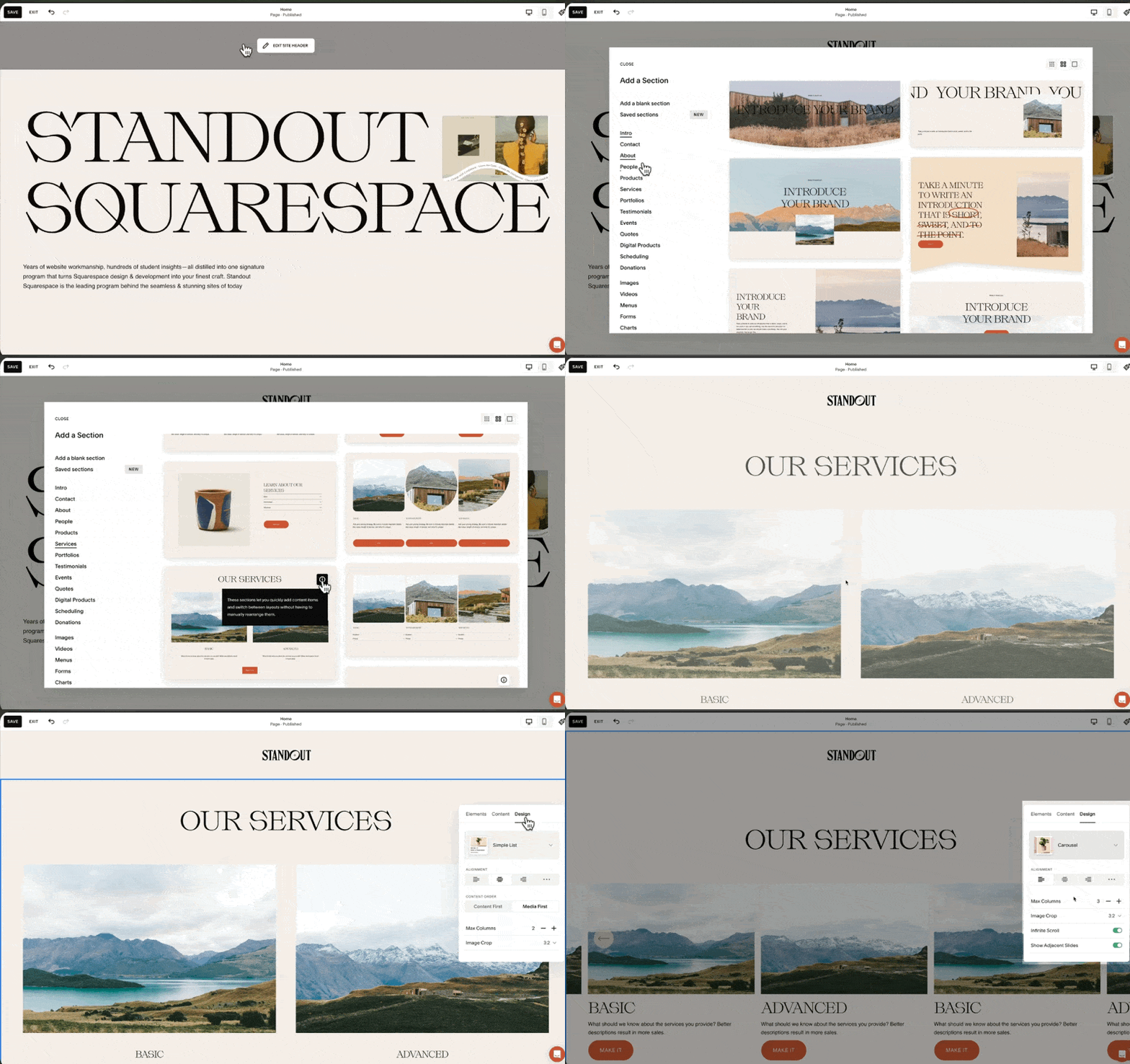
First, let's start by adding a list section. We can open our catalog and under services, find the option with the information icon. That's our list section. From here, we can switch to any layout. So from the design tab, let's switch from a simple list to a carousel.
Customizing the Layout
Text Alignment and Columns
The text alignment is to the left.
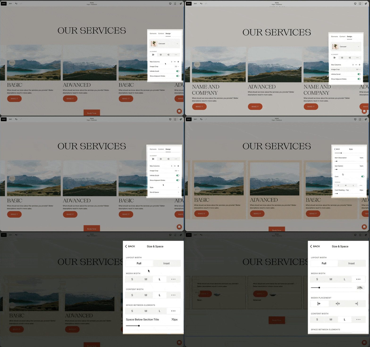
The maximum number of columns is three, but we can explore changing this value.
Our image crop is set to a 1:1 ratio or a square.
I toggle on infinite scroll and show adjacent slides. Under style, I ensure the card style is toggled on for size and space.
We need to make sure that under media width, we set this to a value of 27%.
Card Style and Position
For our cards to have the same height, we use the last option for position.
Under elements, I prefer toggling off the buttons.
Under content, this is where we add the image for the testimonial, the corresponding alt text, the title (which is the name and company), and the description (where we add the testimonial).
Adding Custom CSS
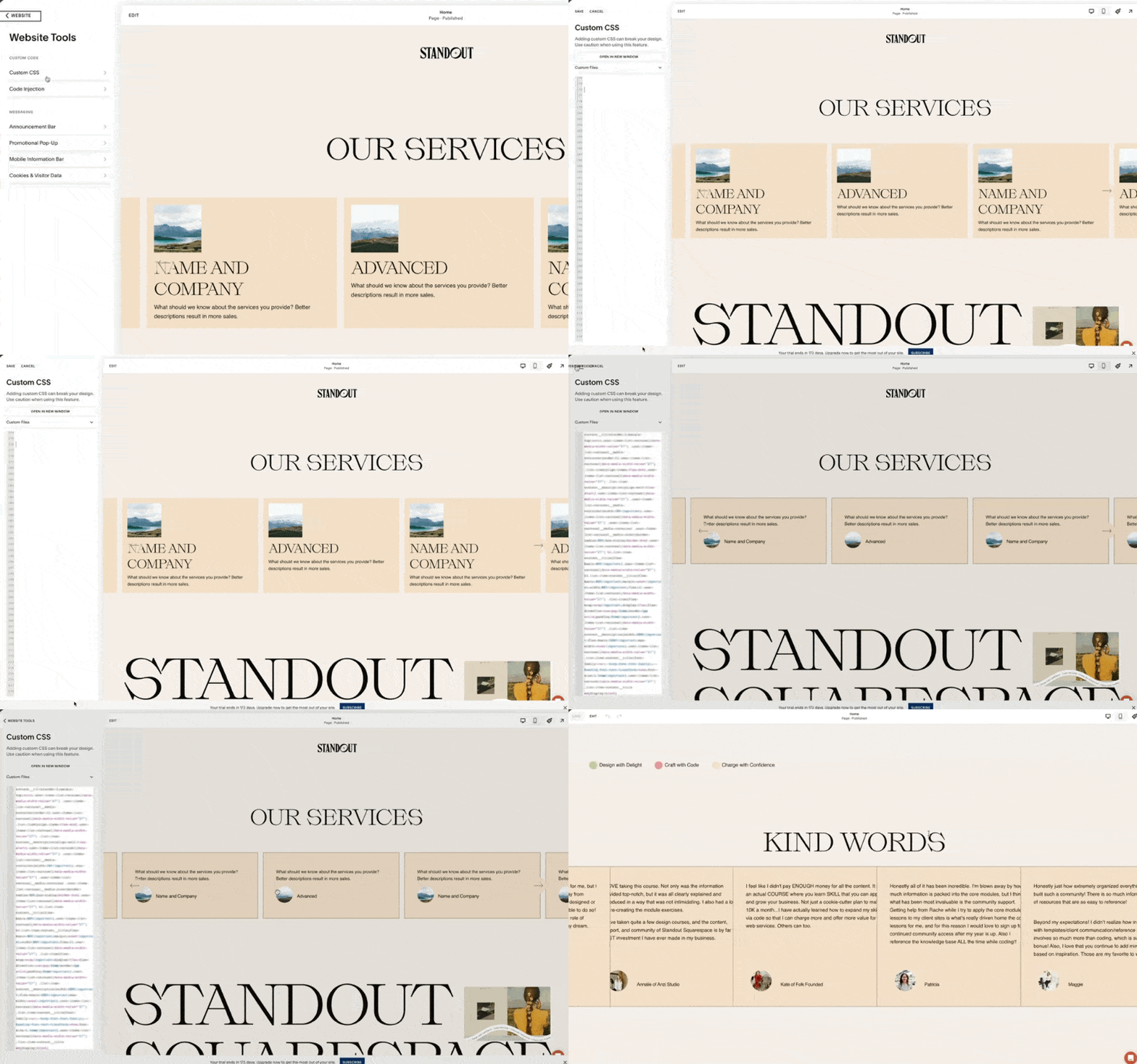
Now we just have to add the codes that come with this video. Please check out the description below for free access to the codes. Under website tools, find the custom CSS. If this tab has existing code, go to the very last line and paste the code that comes with our guide. And that's how easy it is to adapt this format.
Adjusting Content and Colors
Once you've added the content, this is how it'll look. We can easily change the order of our items and add content using the built-in editing feature of our list section. If you wish to change the color of the testimonial cards, go to the color theme of this section.
In my case, that is the slightest one. I'll scroll until I find the list section for carousel. Right here, we have the card color. I can change this to any existing color in my color palette or a custom color.
Smart Code Usage
Using a smart way to write codes, we will not affect other list sections unintentionally. We can still add carousel list sections anywhere on the site without unintentionally affecting their styles. We can easily reuse this section anywhere on our site by using the save section feature of Squarespace.
Saving and Reusing Sections
For example, if I have another testimonial slider section that I wish to add on another page, all I need to do is use this heart icon and save this as a saved section. Anywhere else on the site, we can access it by adding a section and accessing the saved section tab.
Once I add it, notice how all our coded customizations are seamlessly carried over. We can change the content of this particular section without affecting other instances of this coded section.
Further Customizations
There are a lot more style customizations that we can apply to this testimonial slider. For example, we can have a custom color per list item. This is achieved using additional code, and you'll find it in action when you visit Standout Squarespace. By using the exact same list section and a similar approach where we simply add a set of CSS, we can achieve this list card effect.
Learn More with Standout Squarespace
If you're interested in learning more about how to build Squarespace sites and create these unexpected sections in a smart and streamlined way, I invite you to check out my program, Standout Squarespace. We have a growing library of features that you can easily add to your Squarespace sites. More so, we have pre-recorded lessons that you can go through at your own pace. This is where you'll learn the fundamentals to help you upscale so that you can write your own codes and creatively combine techniques to create your own stylish coded sections in a smart and streamlined way.
Please check out Standout Squarespace for more details.


