Elegant font pairings in Squarespace: A Designer’s Guide
Working with Squarespace's native fonts, I've found these natural pairings that feel like quiet conversations on a page.
Elegant font pairings in Squarespace: A Designer’s Guide
a.
Squarespace
b.
Article
Typography has this subtle way of telling stories. Working with Squarespace's native fonts, I've found these natural pairings that feel like quiet conversations on a page. Each combination lives right there in your site settings — accessible, reliable, and ready to hand over creative control to your clients.
Why Native Fonts Matter
While it might be tempting to purchase the latest trending font for every project, Squarespace's built-in font library already offers an impressive collection of professional-grade typography that's optimized for web performance and accessibility. These fonts are carefully curated, professionally licensed for use within your Squarespace website, and thoroughly tested across different devices.
However, it's important to note: if you plan to use these fonts in other applications like print materials, logos, or external digital projects, you'll need to obtain additional licensing directly from the font foundries.
When to establish the type system
Ideally, typography choices should be established during the branding phase, before website development begins. For designers who handle both branding and web design, or business owners managing their own brand identity, consider these Squarespace font pairings during your brand development process. This ensures your website typography will seamlessly align with your overall brand strategy while maintaining the technical benefits of using Squarespace's native fonts
The Hidden Font Setting
While Squarespace appears to offer just two font choices — heading and paragraph, there's actually a hidden third option that can help us achieve an editorial look with more font styles. Check out this blog post to discover how to activate another font setting that can serve as our Deck/Intro font.
My Favorite Squarespace Font Pairings
Sofia Pro + Arial
Main Heading: Sofia Pro Condensed brings bold, modern impact
Intro Font: Sofia Pro (regular) adds a softer, welcoming touch that bridges the gap between the condensed headlines and body text
Body: Arial provides clean, reliable readability Perfect for lifestyle brands, food blogs, and creative businesses where approachability is key.
Ivy Presto + Fragment Mono
Main Heading: Ivy Presto commands attention with refined elegance
Intro Font: Fragment Mono brings an unexpected technical edge that creates intrigue
Body: Ivy Presto Text offers a more refined version optimized for shorter text blocks, maintaining the font's sophistication while improving readability.
Forma DJR Display + Forma DJR Text
Main Heading: Forma DJR Display offers bold, architectural presence
Intro Font: Freight Display's humanist details add a touch of elegance to supporting text
Body: Forma DJR Text, specially optimized for smaller sizes, maintains the font's geometric character while improving readability for shorter text blocks
This combination maintains excellent readability while feeling distinctly editorial. Works beautifully for lifestyle magazines and brand storytelling where visual hierarchy is crucial.
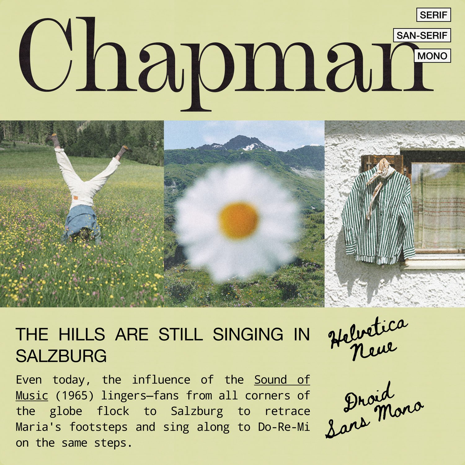
Chapman + Droid Sans Mono
Main Heading: Chapman brings classic editorial sophistication
Intro Font: Helvetica Neue acts as a versatile bridge between display and text
Body: Droid Sans Mono adds a contemporary technical touch when needed Perfect for editorial websites where you want to achieve that timeless magazine feel with modern functionality.
Mencken Standard + Archivo Narrow
Main Heading: Mencken Narrow creates striking, space-efficient headlines
Intro Font: Archivo Narrow offers a complementary sans-serif that maintains the editorial feel
Body: Mencken Standard is excellent for fashion, lifestyle, and editorial projects where space efficiency meets style.
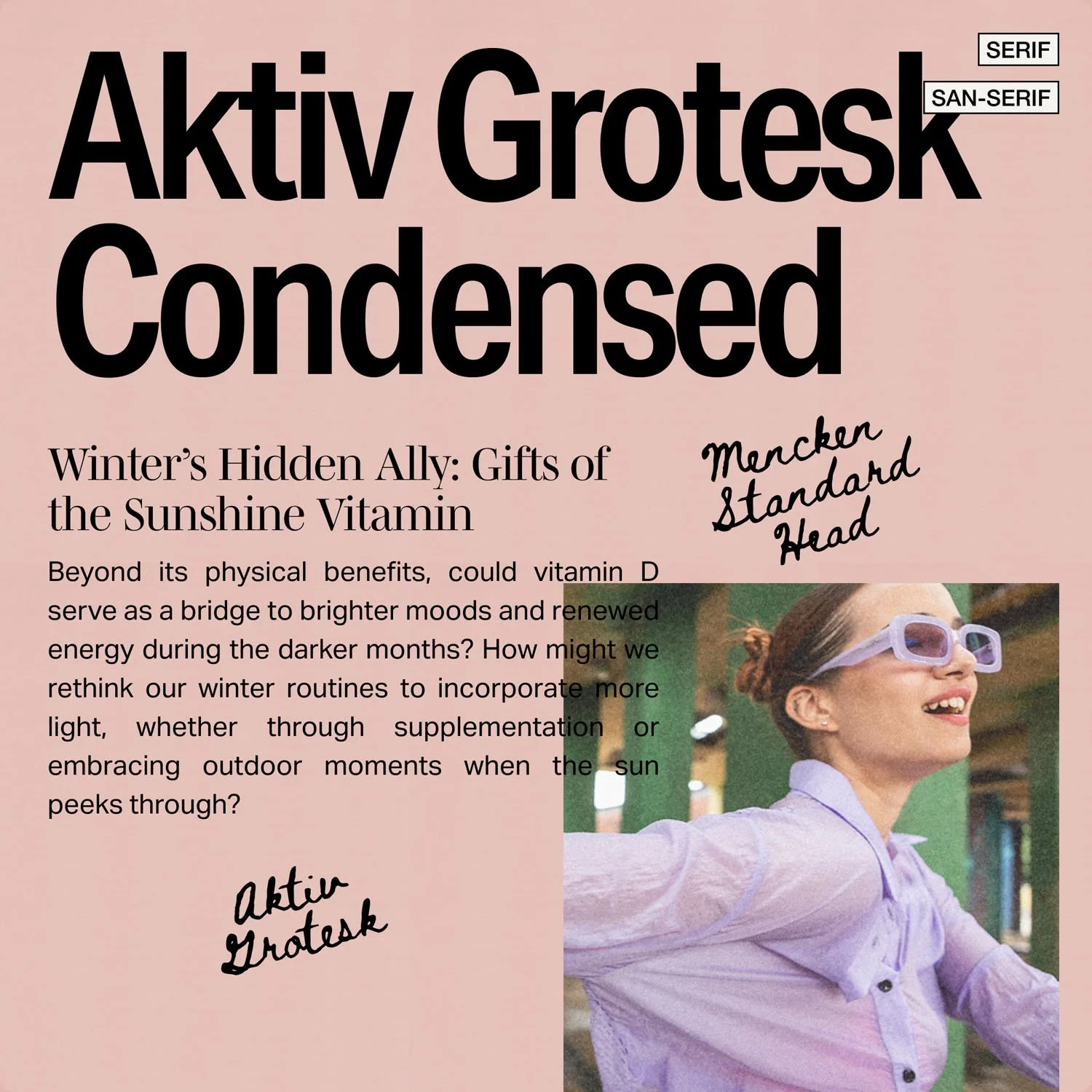
Aktiv Grotesk Condensed + Mencken Standard
Main Heading: Aktiv Grotesk Condensed provides a strong, contemporary presence
Intro Font: Mencken Standard Head brings editorial sophistication to the deck/intro text
Body: Aktiv Grotesk (regular) ensures crisp readability. This combination reverses the typical serif-sans hierarchy to create a modern editorial aesthetic that works particularly well for health, wellness, and lifestyle content where you want to balance contemporary design with editorial credibility.
For Template Designers
If you're creating templates for sale, here's why sticking to Squarespace's native fonts is crucial:
Client Empowerment: Built-in fonts allow your clients to easily modify typography through Squarespace's interface without touching code
Website-use Licensing: You'll avoid any licensing complications
Seamless Handoff: Clients can confidently make typography adjustments without breaking the design
You may still provide resources on how to install custom fonts but it’s best to use a native font for the template that you’ll redistribute.
If you wish to learn more about Selling Squarespace Templates, check out our workshop on selling templates →
Best Practices
When applying these pairings in your designs:
Maintain proper heading hierarchy for SEO and accessibility
Use the scale text feature for visual impact while preserving semantic structure
Leverage Squarespace's built-in spacing and sizing controls
Consider how your typography choices translate across mobile devices
Typography isn't just about choosing beautiful fonts — it's about creating experiences that resonate with your audience while maintaining functionality and accessibility. These pairings are just starting points. The beauty of working with Squarespace's native fonts is the freedom to experiment while maintaining a professional, cohesive look that works across all devices and platforms.


