
( RESOURCES ) Browse through our collection of tips & tricks for Squarespace, Shopify, web design, and business. It’s a digital trove of creative ideas right at your fingertips.


Squarespace Courses: Ultimate Guide
Learn the ins-and-out of the new Squarespace Courses feature.

In August 2023, Squarespace finally launched a native feature that allows us to create and sell online courses.
SQUARESPACE COURSES: Your complete guide
a.
Squarespace
b.
Video Walkthrough
Introduction
In this comprehensive video, you'll:
Learn the key highlights of this new Squarespace Courses feature e.g bundling, high-level video protection, progress bars, unlimited courses and more!
Watch a demo of how to create, host, and sell courses on Squarespace
Preview the student experience from purchase to course access
Be informed on website plans, add-ons, transaction fees and current limitations of this Courses feature
Learn how Squarespace compares with other popular course platforms such as Kajabi, Teachable, Thinkific, Podia, Thrivecart and Teachery
Why I decided to migrate all my courses to Squarespace after trying almost all course platforms and after years of using Teachable.
Timestamped Overview
0:45 Key features of Squarespace Courses
4:46 How to create the Course Content
10:43 How to customize the Course Overview page
12:15 Setting-up the pricing plans
17:05 How to make sign-up buttons available on the sales page and start selling courses
19:18 A Preview of the student experience in Squarespace courses including order notifications
20:08 How students access multiple courses
20:38 How to determine the correct product type: Digital Downloads or Courses or Member Sites?
24:36 Choosing the right website plan and digital product add-on
27:39 How Squarespace Courses compares with other course platforms such as Kajabi, Teachable and Thinkific
29:44 Current limitations of Squarespace Courses
33:00 Key Advantages of Squarespace Courses
Resources
Squarespace has finally launched an official feature that allows us to host and sell courses and memberships. This feature is packed with sought-after functionalities such as product bundling, progress tracking, and secured video hosting. In this video, I'd like to walk you through the highlights of this new Course and Memberships feature, share some key considerations, and explain how it compares with other learning management software.
Key Considerations Before the Launch of Squarespace Courses
Limitations of Member Areas
Before the launch of Squarespace courses, we had another way of creating paywalled or gated content using member areas. Using Member Areas, we had to do a lot of workarounds to host courses within Squarespace. However, there were some key limitations that prevented me from migrating my own courses to Squarespace:
We were limited to ten member areas only, which was restrictive for course creators with more than ten courses.
There was no course progress indicator, so students couldn't keep track of the lessons they had already completed.
There was no high-level video protection, which meant knowledgeable users could easily grab and download the video embed codes.
Video Protection Challenges
This limitation is not unique to Squarespace, though, because if you're simply hosting your videos on YouTube, even though they're unlisted, or if you're using Loom.com or the basic version of Vimeo, your videos are not highly protected. However, if you're using learning management systems such as Teachable or Kajabi, that means if you upload your videos through their video storage, your videos are highly protected. This high level of video protection is also present in higher plans of Vimeo.
No Bundling Options
Another limitation of Squarespace member areas was that there was no way for us to create bundles. For example, if you have three courses and you would like to sell them as a bundle, that was not possible.
The New Squarespace Courses Feature
Addressing Previous Limitations
Now, the great news is, with the launch of the new Squarespace courses, these main limitations have been addressed:
We can host and sell unlimited courses or gated content.
We have a built-in course progress indicator and side navigation.
The videos uploaded to Squarespace now have a high level of protection that's at par with the protection of videos in other learning management systems.
We can sell bundles and offer our courses in multiple pricing plans.
These improvements now make Squarespace a viable course platform option. There are a lot of features that other course platforms offer that are not yet available in Squarespace. But then I'd say there are aspects of Squarespace which make it superior to other course platforms, which is why I am migrating all my courses to Squarespace. Just imagine combining these powerful course features with the ease, simplicity, and beauty that naturally come with every Squarespace website. We can even apply simple code snippets to customize each course experience.
Ease of Use and Design Freedom
We won't be able to easily add these content-rich, beautiful, and branded layouts using any other course platform, even if we pay $400 monthly.
I've been running my education business for years now, and I've tried almost all course platforms. So I've weighed all the pros and cons and decided that I'll switch to Squarespace courses, and I'll get to the details in a while. For now, let me show how easy it is to add courses to your existing site.
Adding Courses to Your Existing Site
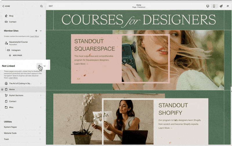
If you are on a business plan or above, then when you click this plus icon, whether in the Linked or Not Linked section of your navigation, this new course collection should show up. Clicking this collection option will prompt us to choose from any of these premade layouts.
You can choose any, and this will automatically generate a Course Collection page at the top of your Not Linked section. Note that this icon is an open book, so we can proceed with naming our course. I'll name it my course.

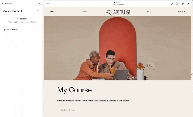
When we click this Collection page, we'll see three menu items: Pricing Plans, Course Overview, and Course Content. For now, let's look into Course Content. This is where we add the content of our course or organize them into chapters or units.
If we click on any of the lessons, we'll find that the editing experience is quite similar to portfolio items. That's because we can easily add any section, be it a fluid section, gallery section, or list section. We have a lot of design freedom regarding what content we can add to each lesson. I believe this ability to easily add content and beautifully lay them out in each lesson is what sets Squarespace apart from other platforms.
I can even save a section from another page on my site and easily pull it to be added to any of the lessons of this course. And I'm telling you, after trying almost all course platforms, creating something like this in popular learning management systems is close to impossible, even if you pay $400 per month.
Video Customization Options
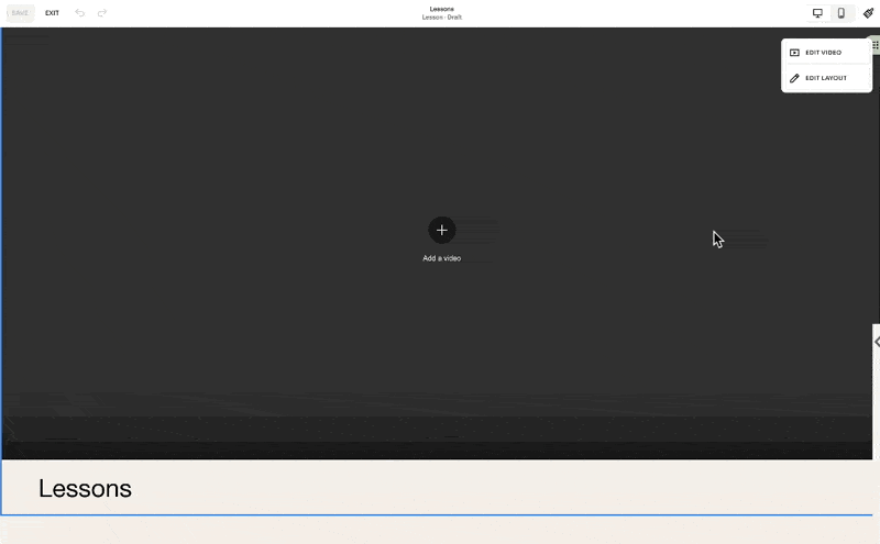
And because Squarespace acknowledges the fact that not all lessons may be video-based, if we go and edit the video at the top of this lesson, there is an option to toggle it off.
If you choose to show the lesson video, you may upload it directly to Squarespace, and as I mentioned, it has a high level of asset protection.

If you are hosting your video elsewhere, for example, Vimeo, then you can just simply add the link from here, and it will automatically pull the video. But make sure that you have the correct settings in Vimeo to ensure that the video is protected. Alternatively, you may also hide this lesson video and just add a section within the video block. You can easily pull the Vimeo or YouTube video while the student is viewing the lesson.
They can also access this pull-out menu, and this is how they can navigate to other lessons of the course.
From the side navigation, they can also click this progress circle, and it'll automatically adjust their progress indicator for this course.
The students may also click the Complete and Continue button at the bottom or top of the lesson, and the progress percentage will be updated too.
Managing Course Content
To add our course content, we start by deleting the placeholder content that was automatically generated. We can do so by clicking this ellipsis and clicking this Delete option.
Note that when we delete the entire chapter, all the lessons under it will also be deleted, and this cannot be undone. We don't have a backup of these, so we have to be careful. But because these are just placeholder content, we can proceed with deleting them all.

When we click this Add Content option, we have the option to either add a chapter or add a lesson. Note that we can definitely have a course without a chapter. So if you have a short course only, you can definitely just use lessons.
But if you'd like to organize your content into chapters or units, then you can use this chapter similarly to how we will use a folder to organize our content. Simply drag the lesson to the applicable chapter, and then we'll notice that the status of the lesson is still on draft. It won't show up in our course until we click Edit Lesson and set the status to published.
We'll notice that we also have the option to set the status to scheduled. This is applicable if you'd like to drip content based on dates. When we click the lesson item and click Edit at the top left of our screen, we now have the option to add any sort of sections applicable for this lesson. You may add more resources, more information, or highlight some key resources indicated or mentioned in the video.

Styling and Layout Options
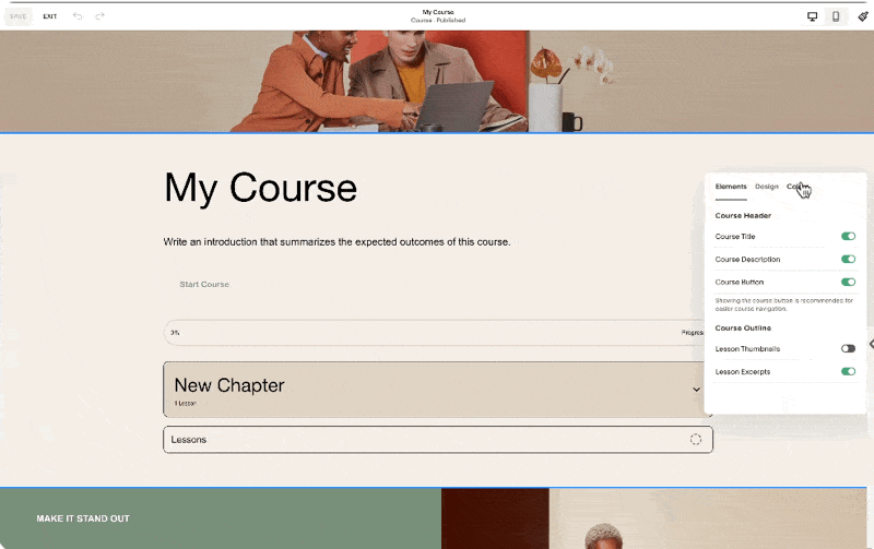
Under Edit Layout, we have styling options right here. We can also change the placement of our course navigation.
At the moment, the sidebar is aligned to the right, but we also have the option to align it to the left.
Note that we may add up to 250 lessons per course, and I personally think that's more than enough. Whatever lessons or chapters we add to the course content will be automatically reflected in the course overview. Notice in this section the new chapter and lesson that I added are reflected.
This course overview page may also house as many sections as you need. But of course, what we'd like to highlight are the course chapters and lessons. Because in some courses, you might want to send the students to this page so that they would have a better idea of the syllabus and the topics included in the course.
In this course overview section, when we click Edit Layout, we have the option to show or hide content, change the colors, and change some of the designs. I recommend you take time exploring how changing these settings will affect this section.
For the rest of the page, we can simply add sections the way we would on other pages. This course collection that we just created will have a dedicated URL. If you click this gear setting, you'll find that our custom URL is my course. You may change it as needed. And because we haven't added any pricing plans, this course collection will be available by visiting this URL. In my case, that's squarestylist.com/my-course.
Configuring Pricing Plans

However, if you'd like your course content to be gated, meaning you require the user to sign in with their account before accessing the course content, that's the time we will configure the pricing plans. To create a pricing plan, we simply click this button, and there will be an option for us to add a name, description, and benefits. Personally, I don't use this, but I just plug in the correct information. But when I am adding it to the sales page, I don't show this information.
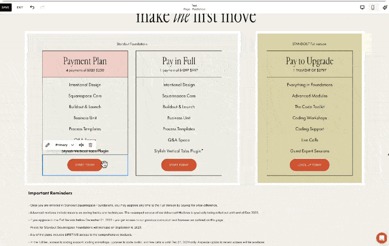
What I show is the pricing of the course and the applicable products included. We may offer the course in multiple pricing plans. It can be a fixed amount, split into payments, accessed through a subscription, or it can be a free course. For example, we may sell this course for $1,000 single payment or add an option to purchase it in a more accessible pricing plan of four payments of $250.
This is a preview of how these single payment and split payment options will show up on the homepage.
I personally don't find these toggles intuitive. What I typically do is have a specific button for each pricing plan. In my course, Standout Squarespace Foundations, I have this pricing plan section with options for four payments of $250, a pay-in-full option at $997, and a packaged option that bundles my foundations lessons and my advanced lessons. I'd like to demonstrate how I would set it up in Squarespace courses.
For clarity, I'll name this course as Foundations. Then I'll create this pricing plan to refer to my $997 single payment option. Under included products within this pricing plan, I can bundle another course, member area, or video collection here so that when a user avails of this pricing option, they will have access to the main course and a bonus course. For example, I'll add the Art of Coding in Squarespace as a bonus course. When I hit save, we'll have our first pricing plan. We can actually add up to 500 pricing plans per website.
For this course, I need another pricing option, which is the split payment of four payments of $250. I'll create a new pricing plan, still for the foundations course, and change this to a fixed amount tail, with the payment set to four payments of $250 for four months.
For this pricing plan, I can add another bonus course or make that exclusive to those who pay in full. Notice the error here because we have the same name for the pricing tier. So I should name this differently, like Foundations Split Payment.

Referring back to the pricing plans on my site, we have the payment plan option, the pay-in-full option, and now the bundled option. For this, I'll create a new pricing plan called Full Tier, a one-time payment of $2797. This will include all that's in the foundations lesson, the bonus lesson about the art of coding in Squarespace, and the advanced lesson of my Standout Squarespace program. Once created, we have all the pricing plans we need for our sales page.
Implementing Pricing Plans on the Sales Page
Now, to make these pricing plans available on our sales page, I'll demonstrate by accessing my saved section. I'll replace the button leading to Thrivecart with a digital product block. By searching for and adding the digital product block, we'll be asked to choose from the pricing plans we've created. I'll select the Foundations Split Payment plan, then adjust the design settings to match my desired layout. I'll do the same for the other pricing plans, ensuring consistency in presentation.
Student Checkout Experience
When students visit the sales page, they can sign up by clicking the digital product block button, creating an account, or signing into an existing one. After the user signs in or creates an account, they will be led to the checkout page to make the purchase. After a successful purchase, the user will receive an email based on the settings under Customer Notifications Digital Products. The account pop-out menu will show up, where they can view the purchased courses, update their profile, and access other purchases within the site. That's how straightforward the process is from creating to selling courses on Squarespace.

Considerations Before You Start
Product Types
Since the launch of Courses, there are now two main categories of products you can sell on Squarespace:
Store Products: Allow multiple items to be added to the cart, including physical products, services, gift cards, and downloads. Downloads are part of store products, allowing users to automatically download ebooks, PDFs, or audio files.
Digital Products: Customers cannot purchase multiple courses or digital products in one checkout, as each pricing plan has a dedicated checkout page.
Website Plan
Squarespace makes it easy to get started with selling courses or digital products if the website is on at least the business plan. However, there is a 9% transaction fee on top of the payment processor fees, and video storage is limited to 30 minutes.
This setup is designed to help people start selling courses. If you're starting out, you can host videos on platforms like YouTube or Vimeo and embed them in Squarespace to avoid the 30-minute limit. However, if you wish to scale, consider the digital product add-on to increase video storage and reduce transaction fees.
Plan Options
To summarize plan options:
On a typical website plan, either business or commerce, there's no add-on fee, but a 9% transaction fee per digital product sold, and video storage is limited to 30 minutes.
To extend video storage and reduce transaction fees, consider subscribing to the digital product add-on.
Here are the add-on fees per month if paid annually, increasing if paid monthly. The Pro add-on is $149 per month, a significant investment, but for course creators with high sales volumes, it makes sense to invest in a tier with 0% transaction fees.


Comparison with Other Course Platforms
Comparing with other course platforms, Squarespace's pricing is quite reasonable. For instance, Kajabi charges a premium for removing branding and adding custom code, and there are limits on the number of active customers. While Kajabi offers many features that Squarespace does not, not all education businesses need those features.
Teachable's Pro Plan, which I currently use, has a maximum of 50 published products, potentially limiting for some creators. Thinkific's Grow Plan is most comparable with Squarespace, as it allows removing Thinkific branding.
Conclusion
Each platform has its pros and cons, and it boils down to your specific needs. Do you value delightful editing and branded experiences, or are affiliate programs and bulk enrollments more important? For me, design is crucial, so I use workarounds for automations to benefit from the beautifully branded and content-rich experience now possible with Squarespace Courses.
I hope this walkthrough of Squarespace Courses has been helpful. I know you might have more questions, like how to migrate from another platform to Squarespace Courses or how to configure advanced automations. I've devised workarounds to address these needs, and I'd love to hear via the comments which topic you'd like me to tackle next. While I may not be able to respond to all comments, I offer personalized coaching and support within my program, Standout Squarespace. So if you'd like personalized support, check out Standout Squarespace.

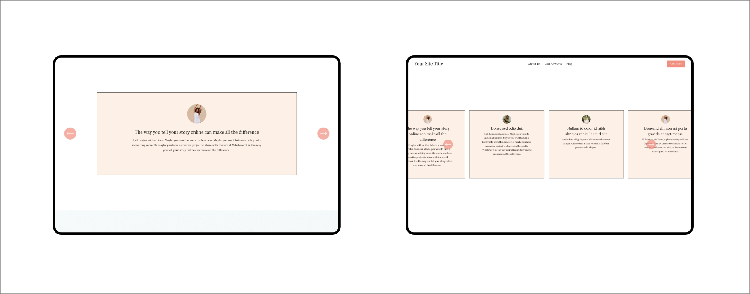
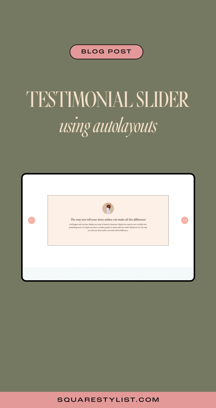
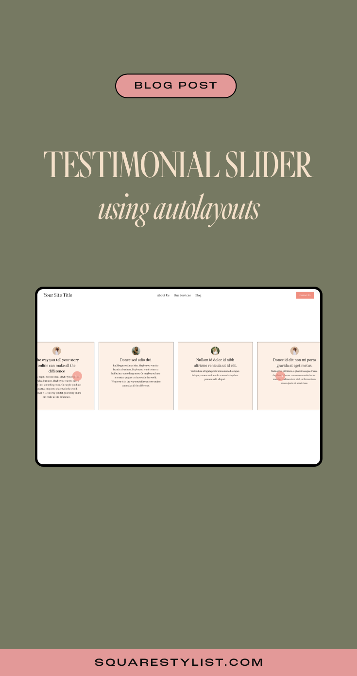
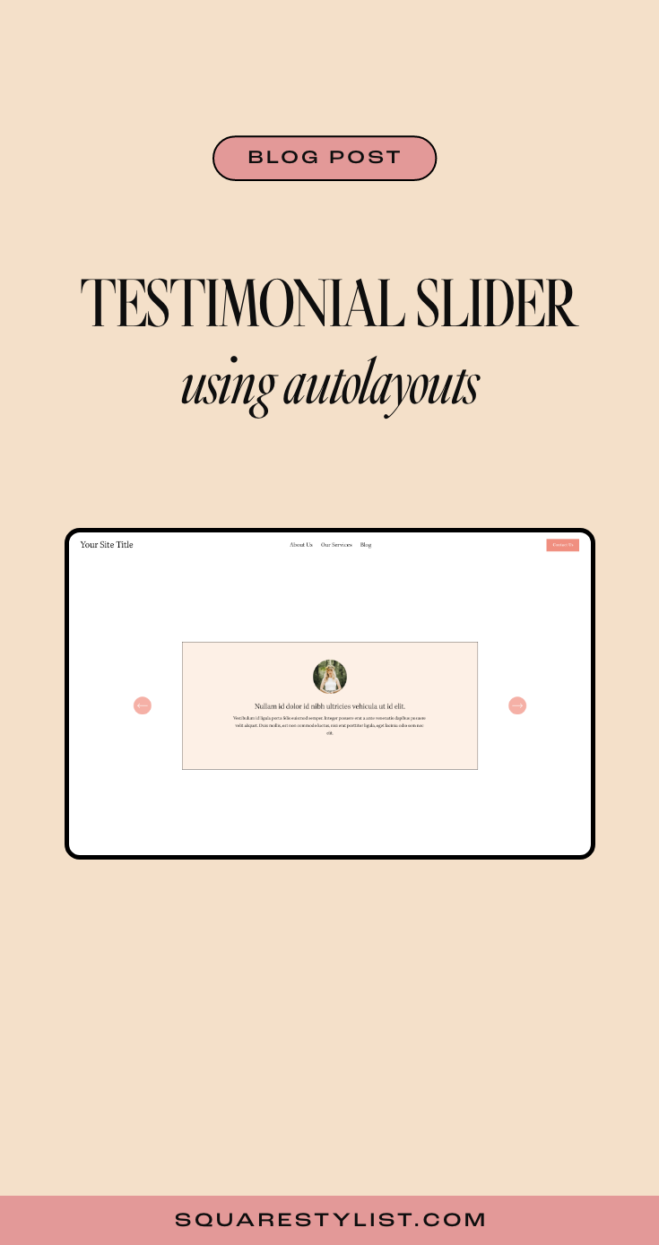
How to build testimonial carousels in Squarespace 7.1
Sharing an easy way to create a beautiful testimonial slider using thew Auto-Layout list feature of Squarespace.
As a Squarespace designer, you've probably know the feeling of adding content block by block. While this gives you a lot of freedom within the website builder, sometimes it can get a bit tedious having to manually arrange the elements for more complex layouts.
Good thing there's a new Squarespace 7.1 feature on the block—the auto-layout sections. This means that we're now able to arrange text and media automatically based on a specified setting.
There are three auto-layout categories to choose from: list, people, and headlines. Now it's easier than ever to showcase testimonials, banners, galleries, and many more.
Wondering how to make the most out of this new feature? Let's deep dive into customizing testimonial carousels using CSS.
If you're interested in learning more about how to code unexpected websites, you can check out my signature course Standout Squarespace. It's where I teach you everything you need to know to become a web designer & developer.
Section properties
To start, add a section and go to Headlines > Banner Slideshow, then click Edit Content > Design to switch to the carousel layout.
Under the Elements tab, make sure that the image, title, and body are all shown. You can leave the button turned off for this use case.
Add all the testimonials—photo, title, and description—you want to feature under the Content tab.
Back to the Design tab, we need to make sure to set the alignment to center and the max columns to 1. Image crop is set to 1:1 ratio so we could round the corners later. Don't forget to turn off "show adjacent slides" but enable infinite scroll.
Let's go to Size & Space under the Design tab to configure more details for the slider. Toggle media width to around 10%, though this could vary depending on your design. Content width can be set to medium, while media placement should be centered.
The space between elements can be set to 1-2%. Note that the space between sliders would not matter when we have a max column of 1.
Set the vertical padding to large, with the position being either top or center—I personally prefer the top alignment.
Click on the Style tab under Design and activate the card and add background color to the testimonials.
Main CSS codes
If you sign up to access the codes, you'll see in the Notion document that I added snippets to customize the carousel.
All you need to do is to replace the placeholders in these snippets with the correct Section ID using the Squarespace ID Finder extension.
You probably notice that the navigation arrows are hidden, and that's because we made the image thumbnail small. We'll need to use CSS to reposition the arrows and make them visible again.
The next one is what creates the rounded image thumbnails for this carousel. Removing the border-radius property will turn your photo back into a square. If you need a border outline, just specify its width, type, and color (using hex code) in the values.
The card border & background snippet will allow you to tweak the border outline, type, and color in the same manner. You can define the background-color of the card using any hex code.
Last but not least, the content maximum width will manage the size of your cards depending on your design. Adjust your navigation offset via Edit Content > Design > Style depending on this value.
Optional CSS codes
To keep your testimonial cards of uniform size, you can add a code snippet for equal height items. Make sure that you add this at the very bottom of the code snippets you just added.
This will be handy if you'd like to feature several testimonial cards per slide. Just don't forget to add some space in between slides by going back to Edit Content > Design > Size & Space.
Mobile View
Look 👀at how the mobile view should look like.

Want your site to automatically play through your auto-layout testimonials?
Check out my mini-course to learn how with the help of JavaScript. Hope this quick tutorial helps!

PIN THIS POST

Add Multilingual Translator to Squarespace: Powered by Google Translate
Easily add a multi language translator to your Squarespace website powered by Google Translate.
In this blog post, I will share how to easily add a free language translator powered by Google Translate to any Squarespace website.
There are quite a few options to create a multilingual Squarespace website.
If you need more control over the translations, I recommend checking out Weglot. They have a smart technology to create an SEO-friendly version of your website on any language. They provide automatic translations per language but you also have controls to edit the translations.
However, if you are looking for a free option - I created a tutorial based on this codepen entry.
Please note that the translations are machine-generated using Google Translate’s technology. The beauty of this is it’s simple, easy-to-install and supports multiple languages.

Kindly watch the video below for a walkthrough.
To access the codes mentioned on the video, please click the button below
Want to add stylish and unexpected features in your Squarespace site?
Easily Create this stylish vertical tab feature.


Showcase a Scrollable Website page
Create a scrollable page by just using an image block and a couple of CSS Codes.
How can you best feature your website design portfolio? Here’s a great option using CSS. Create a scrollable page by just using an image block and a couple of CSS Codes. Please watch the video below to view the guided tutorial.

Kindly watch the video below for a walkthrough.
Please refer to the codes below as mentioned in the video above.
Paste the code below toDesign > Custom CSS
#PASTE-BLOCK-ID {
  height: 500px;
  max-width: 80%;
  margin:auto;
  width: 100%;
  overflow-y:scroll;
  overflow-x:hidden;
  filter: drop-shadow(2px 22px 40px rgba(0,0,0,.3));

  @media screen and (max-width:767px) {
   height:200px;
  }
}
To customize the scrollbar
::scrollbar { width: 3px; /* Scrollbar Thickness */ height:15px; } ::scrollbar-thumb { background: #22514A; } ::scrollbar-track { background: white; /* Background Color */ }
Want to add stylish and unexpected features in your Squarespace site?
Easily Create this stylish vertical tab feature.

Easy Workarounds for Squarespace Member Area
In this blog post, I share helpful workarounds on how to address limitations of the Squarespace Member Area Feature. From how to avoid transactional fees to how to create a custom navigation,
This is the Part Two of my series on the brand new Member Areas in Squarespace. Click here to read Part One, which is all about its features and setup.
In the previous blog post, we talked about how the Squarespace Member Areas and its basic features. It's a good match for you if you're looking for a simpler option to handle your exclusive content within your very own site.
While this add-on isn't as robust as other LMS like Teachable or Kajabi, it doesn't have to be. Let's talk about these limitations, along with some of my secret hacks for (1) transaction fees, (2) affiliate marketing and bundling, and (3) sidebar navigation.
Kindly watch the video below for a STEP bY STEP walkthrough ON
HOW TO Address known member area limitations.
What are the limitations of Squarespace Member Areas?
1. Fewer LMS functions
Admittedly, this first item on our list is the one thing that doesn't have a workaround for now. All users, regardless of plan, would be limited to 10 member areas at most. That means if you're offering a lot more courses than that, then this might not be the option for you.
It also has no video hosting feature, so your videos would have to be hosted elsewhere. I recommend Vimeo, which allows for high-quality videos and various embed options, but that comes with an additional cost of $20 per month.
Squarespace doesn't provide a progress tracker and other similar analytics, either. Then again, this won't be too much of a letdown if your focus is on community-building.
To hide the join button, add the snippet below to Settings> Code Injection > Footer
2. Less flexible checkout options
Using the native Squarespace checkout has its downsides as well.
For one, each transaction made through this checkout comes with a 1% commission fee on top of the Stripe and PayPal fees, even if we subscribe to the Pro plan. If you're offering a high-ticket program or expecting a lot of transactions soon, this could be a significant chunk of your income.
We can't offer installment payment plans via Squarespace checkout, either. Customers would only be able to choose between one-time payment and subscription.
Bundling is not yet possible here, since each member area corresponds to only one fee structure. And while discounts are available, then can only be applied site-wide.
Not to worry, though—we'll discuss how to work around these limitations later.
3. Limited workflow automation
The Squarespace API is not yet publicly available as of now, so it's not yet possible to create automations using Zapier. We'd have to manually upload members to our email extension, unless we're using Squarespace Email Campaigns.
The affiliate system is also not built-in, so there's no way to automate this using the Squarespace checkout. But again, there's a way to bypass these limitations.
4. Default navigation styles
Though we did discuss how we'd have a lot of control over the branding of Member Areas, this unfortunately doesn't extend to our navigation. The only styles available for this purpose are automatically generated by Squarespace.
However, using CSS and JavaScript could help us create and customize a custom side navigation if we want to make our design stand out.
Payment gateway workaround
Majority of the limitations of Member Areas center around the lack of functions in their native checkout feature. That means we can effectively overcome these problems by working with a third-party payment gateway.
To set up your third-party payment gateway, here are the simple steps you can follow:
1. Set up a free member area... and hide the join button
If you're going to use the Squarespace Member Areas, it's best to set up a free membership space so that you won't have to use its native checkout feature. Still, we'd have to work on safeguarding your premium content by adjusting the settings.
Whenever a person clicks on your member area without an account, they'll be redirected to an Access Denied screen, where they'd be prompted to join if they haven't yet. You'd have to hide this default member sign-up block using CSS and JavaScript so they can't bypass the payment gateway.
All you have to do is add the snippet below to Settings> Code Injection > Footer.
<!--Squarestylist Snippet to Hide Join Button-->
<script>

var sqelem= document.querySelector('#sqs-member-access-page-root .sqs-editable-button');
sqelem.remove();

</script>
<!--END SQSTYLIST JOIN BUTTON-->
Also, don't forget add this code snippet to Custom CSS. Press Cmd+Ctrl + ↓ to immediately get to the very end of your panel.
#sqs-member-access-page-root .sqs-editable-button {
display:none;
}
2. Create a post-purchase page
Next, we need to build out a post-purchase page where we could place the member sign-up block for new members. Just add a blank page under the Not Linked section of your Squarespace site.
You can briefly thank the user for purchasing your course before adding your member sign-up block below it. "Create a new account" could be a good call to action for the button.
Head to Page Settings > SEO to hide this page from search results. This is very important.
In addition, make sure that your URL slug is complicated enough so that people won't be able to guess your post-purchase page. You can insert a random string of alphanumeric characters for this purpose.
3. Set up a third-party payment gateway
You can use Samcart or Dubsado for this step, but I do recommend Thrivecart, which is what I use for my own digital products. I've been using their product for months now, and I really love how powerful and promising its features are.
Split payments
More recurring fee options
No transaction fees
Integrated with Authorize.net
Great affiliate program
Upsell/downsell options
Bundling option available
Most importantly, their customer support is truly superb. If you're interested, you can start using Thrivecart after making a one-time payment through my affiliate link.
Once you're in, you can create a new digital product (a.k.a. your course or membership), choose pricing options (even calculate sales tax), add a bump offer to upsell, then set up your affiliate system. Make sure you add your support email and send them to your post-purchase page via URL.
Please note that membership cancellations won't be automatically processed. Inform your customers that they'd have to email you to cancel their membership.
Watch the video above if you'd like to see a more comprehensive walkthrough of this process.
Navigation style workaround
Want to learn how to create the custom sidebar per member area?
To elevate your membership site, you have the option to recreate this custom side navigation, which your members can open or close anytime. Click the button below to check out this stylish section designed for Squarespace Member Areas.

Pin this post
