Cecily Carlyle
Cecily Carlyle
Toronto / Canada
Visual Designer
Services
Squarespace Design and Dev, Brand Design
Course Taken
Standout Squarespace, Standout Shopify
Selected Work
01
Hi! My name is Cecily Carlyle and I’m a Visual Designer based in Toronto, Canada.
02
Outside work you will often find me walking around the city getting coffee with friends, going on hikes, and checking out new art exhibits.(VIEW)
03
But on a typical workday, I am usually at home working away at my desk listening to DJ Cinthie to get into a flow state.
04
My day usually starts with COFFEE
05
Most of the time I am working on emails and iterating on designs.
“The end result was a site with a visual style that was unique to me and which told my story in an innovative and one-of-a-kind way.”
06
What are your first memories of the Internet?
Angel Fire which was a website builder I used back in 2000 to upload as many pixelated Spice Girl and Sailor Moon images, as I possibly could haha.
07
What is the best part about the process of building websites for you?
Figuring out how the visual identity will translate over to the web experience and putting the puzzle pieces together so the content flows well.
08
What is your favorite stretch or pastime in between coding?
Stretching and recaffeinating.
09
How would you describe your Standout Style in 2-3 words? Minimalist. Editorial. Modern. Brutalist.
10
Which Standout workshops do you find yourself incorporating most often on your website projects?
-Stacked List Cards
-Split Gallery
-Overflow Elements to Adjacent Sections
11
What makes your work standout?
With my background in fashion design, I incorporate a European, minimalistic sensibility in my work. I gravitate towards clean lines, grids, textures, black accents, and an overall minimalistic design aesthetic.
12
What are some of your proudest works you've worked on?
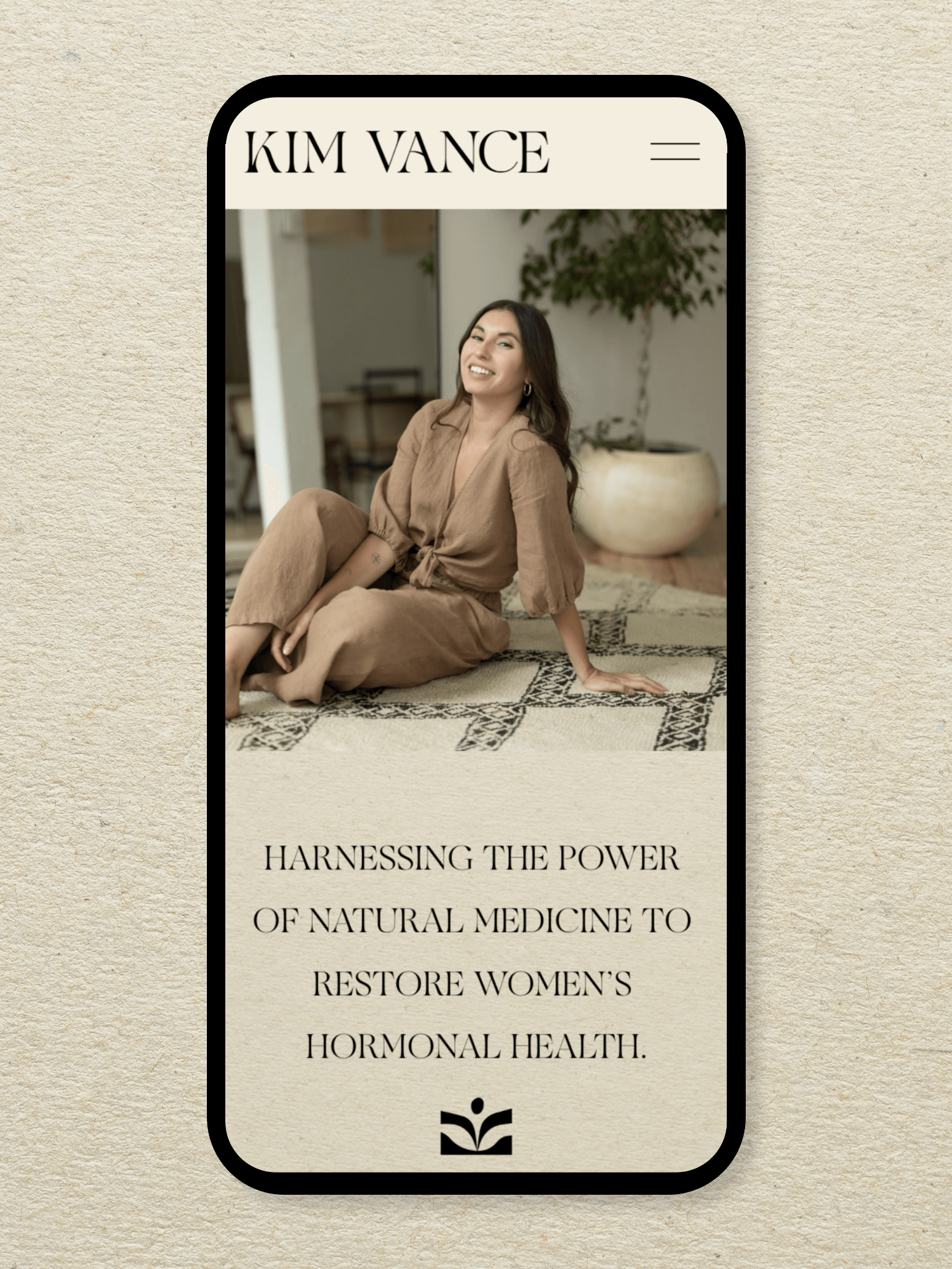
Kim Vance ND
Website →The client completed an in depth questionnaire relating to their business, industry competitors, content requirements, and desired styles. I distilled all of the information into a visual identity concept. Once approved by the client we moved into the web design process which consists of designing a high-fidelity prototype of the homepage. Once the homepage is approved the remaining pages are designed and the site is built out with minor tweaks via client feedback.
Workshops used:
-Fluid Tab Grids for Blog section on Home page
-Stacked List Cards on Services page
Throughout this project build I learnt that "less is more". I always start out wanting to include a lot of cool features, but I am reminded to ask: what is the purpose, and will it hinder the user's experience?
13
What are the biggest takeaways from the Standout programs?
Don't be afraid to try and get messy. Use the amazing community to your advantage. If you're struggling to understand a concept—practice is key. This can come in the form a concept project for your portfolio if you don't have a client. Keep going and it will get easier and you will get quicker!
14
What is your dream website project?
An e-commerce site for a brand in the beauty space that requires high-quality, elevated packaging and brand photos.


