( RESOURCES ) Browse through our collection of tips & tricks for Squarespace, Shopify, web design, and business. It’s a digital trove of creative ideas right at your fingertips.
Add Wavy Marquee to any Shopify Theme
Ever wondered how you can add those catchy scrolling wavy text statements to your Shopify site? Learn how to add a stylish wavy marquee for free in this video.
In this video, I'll walk you through how to easily add the Wavy Marquee feature to any Shopify site.
How to Add a Wavy Marquee Feature to Any Shopify Site
a.
Squarespace
b.
Video Walkthrough
Introduction
Wanting to add those catchy scrolling wavy text statements to your Shopify site? Learn how to add a stylish wavy marquee for free in this video. And don't worry if you're new to coding in Shopify, because I'll guide you through the process step by step.
Hi there! I'm Rache, the founder of Square Stylist and the creator behind programs for web designers, namely Standout Shopify and Standout Squarespace.
Timestamped Overview
0:01 Overview of adding the Wavy Marquee feature to Shopify
0:08 Feature Applicability: Can be added to any Shopify theme; step-by-step guide.
0:29 Instructions for accessing tutorial codes via the Resource Vault.
00:51 Steps to duplicate the Shopify site and create a staging theme.
01:26 Detailed guide on adding and editing the new section in the code.
02:12 Process of adding the Wavy Marquee section in the Shopify theme.
02:59 Customization options for text, background, and positioning.
04:58 Instructions for adding the Wavy Marquee to various pages and adjusting padding.
05:30 Encouragement to share creations and info on personalized support and programs.
Resources
To access the codes, please subscribe to our Shopify Resource vault for free
Access more workshops and personalized support through our Standout Shopify Program.
Preparing Your Shopify Site
Duplicating Your Theme
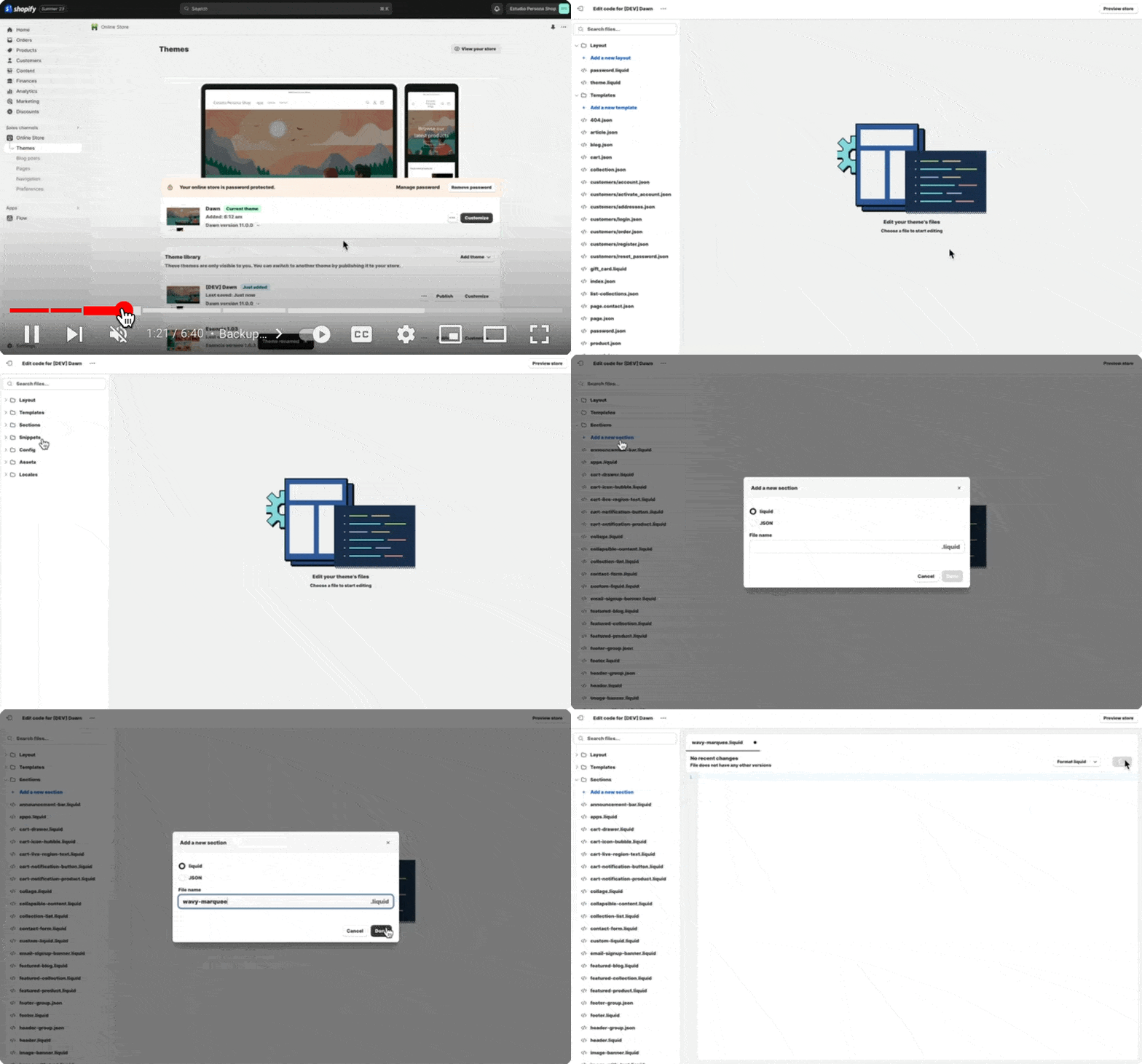
If your current Shopify site is live, I recommend duplicating it first, so we can work on a staging theme before publishing it live. To do that, click the three dotted icon under themes, and duplicate the current theme you have.
You may rename this staging theme—I typically add "dev" initials, so I would be able to differentiate it from all the other staging themes. Then, we'll click the three-dot icon again and hit edit code.
Navigating the Code
And I know some of you might be intimidated by the code, but don't worry, I'll walk you through the process. Our next step is to add a new section. In our code, we'll find folders here called layout, template, section, snippets, and so on.
What we'd like is to add a section, so we'll open this section by clicking this toggle, and then I'll create a new section by clicking the "add a new section" option, and then I'll start typing the file name, and I'll call it wavy-marquee, and hit done.
Setting Up the Wavy-Marquee
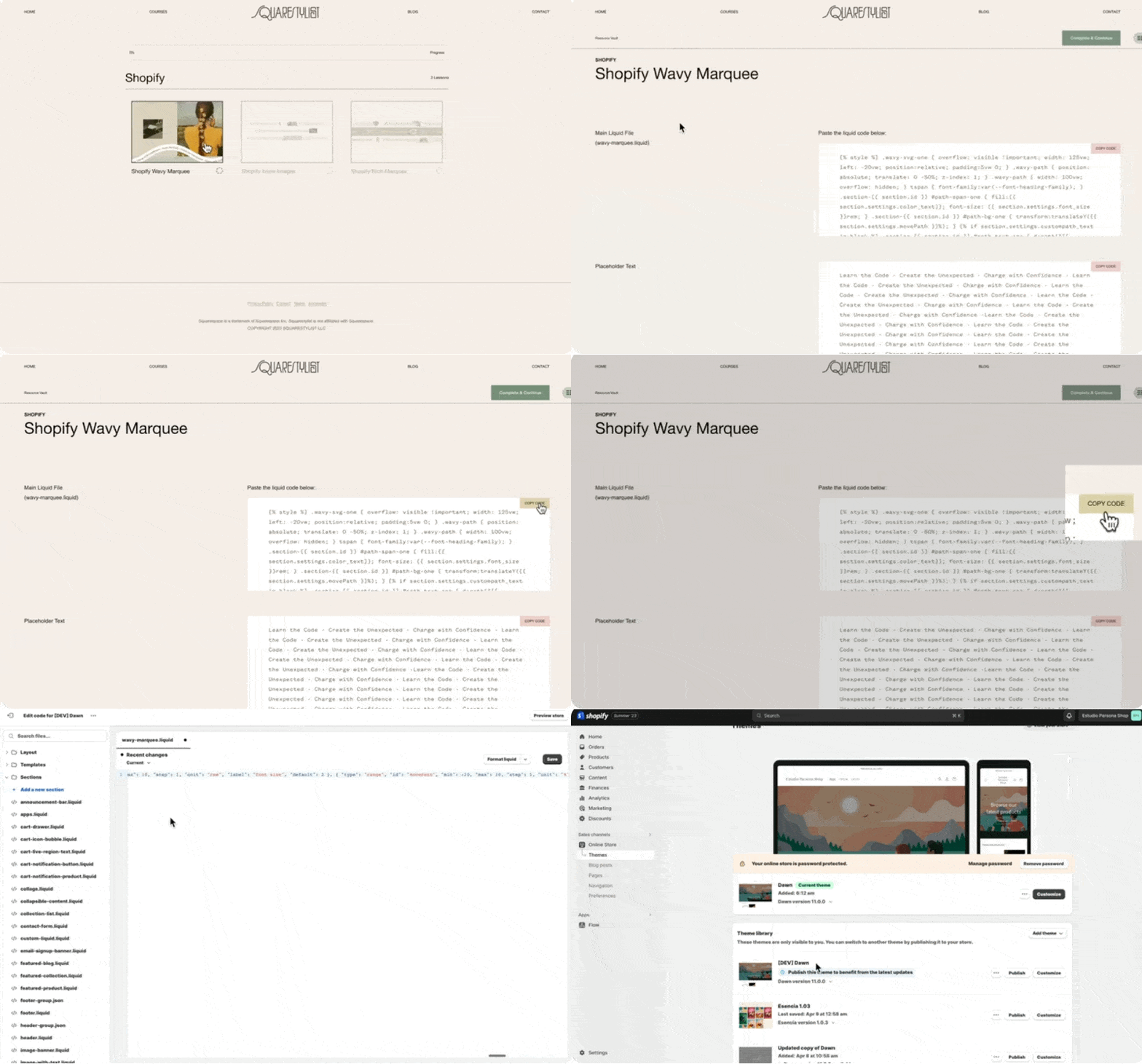
Some default content will be automatically loaded. We have to delete this by hitting command A or control A on your keyboard, and then deleting everything. Hit save, you may then click the Shopify wavy-marquee entry in our resource vault, and then opposite this main liquid file title, please copy this code by clicking the "copy code" button.
Then we paste all the codes in our liquid file. After that, we hit save, then we go back to our staging theme.
Customizing Your Shopify Scrolling Text
Adding the Wavy-Marquee Section
Again, this is the one with the initial dev, and I'll hit customize right here so that we can build the page. When we click "add a section," there will now be an option for us to add the wavy-marquee, so we can start typing wavy, and then this section will show up. Now once the wavy-marquee section is loaded, we can click here.
Configuring the Marquee Text
Under the settings of the wavy-marquee section, we'll find that we're prompted to add the marquee text. We may refer back to our resource vault entry, and opposite placeholder text, we'll find this placeholder text that you can copy, and then paste it right here. Now you'll find that we now have this wavy-marquee installed, and we can add some customizations.
Personalizing Appearance
For example, at the moment it has a transparent background, so if we'd like to add a background color to it, let's toggle off this transparent background and assign a background color of our choice. So for example, I can use any of these colors, and the text color can be adjusted as well, and the font size can be adjusted too, for example, if I'd like this to be bigger, and if you'd like to adjust the position of the background, we can use this background movement option.
So because I'd like this to move up the background color of green, I'll use a negative percentage value. So for example, negative 3%, so notice how this is a way for us to center the background relative to the text.
Extending the Marquee to Other Pages
And then once we have this installed, we can now place it anywhere within the page. So each page can have a wavy-marquee, so if you'd like this to show up on other pages as well, like a contact page or about page, it's totally possible to add this as well. So I recommend that on the section that is below this wavy-marquee, we can add some padding. Most of the themes will have this top and bottom padding option.
So for the second section, I'll just add some more padding. Of course, you'd want to replace this with your own statement. So all you need to do is add the statement right here and copy and paste it multiple times, similar to the length that you're not seeing in our more key text field.
Finalizing Your Design
Also, you'll find that there are some more options available for us, like custom path for text and custom path for the background. I'm not able to discuss these advanced options in this video, but I discussed this in more detail in my standout Shopify program. And as soon as you're happy with the changes that you've made, you may go ahead and publish this version of the theme.
We'd love to see what you create using our resources. Please tag us on Instagram via @squarestylist with your creations. And I'd like to note that while I would love to support you in implementing these section templates in your Shopify sites, each Shopify theme would have different existing codes. So I'm not able to provide personalized support via the comments below. But if you are looking for more high-touch support, I provide that inside my program, Standout Shopify.
Inside the program, I regularly share more creative layouts that you can easily add to your Shopify sites. And I personally attend to questions such that you can customize these sections to your branding or to the needs of your projects along with the fundamental lessons such that you'll learn more about how to maximize built-in features in Shopify such as metafields and meta objects.
And if aside from Shopify you're also creating Squarespace websites, please check out our video about adding a wavy marquee to Squarespace via the description box below or anywhere on this video.
How to add a file upload option to Squarespace and Shopify Forms
Video Walkthrough
Timestamped Overview
Ever wondered how to add a file upload feature to Squarespace and Shopify Forms? Look no further! In this video, I share a step-by-step guide on how I use Tally Forms to create free, beautiful, and robust forms that you may add to your web platform of choice.
0:00 Intro
3:50 Creating a free Tally Account
4:16 Adding form fields and labels
7:00 Add a file upload block
12:25 Publishing form and generating the embed link
13:16 Integrating Tally Form to Squarespace
15:43 Adding Tally Form to Shopify
Squarespace Courses: Ultimate Guide
Learn the ins-and-out of the new Squarespace Courses feature.
In August 2023, Squarespace finally launched a native feature that allows us to create and sell online courses.
SQUARESPACE COURSES: Your complete guide
a.
Squarespace
b.
Video Walkthrough
Introduction
In this comprehensive video, you'll:
Learn the key highlights of this new Squarespace Courses feature e.g bundling, high-level video protection, progress bars, unlimited courses and more!
Watch a demo of how to create, host, and sell courses on Squarespace
Preview the student experience from purchase to course access
Be informed on website plans, add-ons, transaction fees and current limitations of this Courses feature
Learn how Squarespace compares with other popular course platforms such as Kajabi, Teachable, Thinkific, Podia, Thrivecart and Teachery
Why I decided to migrate all my courses to Squarespace after trying almost all course platforms and after years of using Teachable.
Timestamped Overview
0:45 Key features of Squarespace Courses
4:46 How to create the Course Content
10:43 How to customize the Course Overview page
12:15 Setting-up the pricing plans
17:05 How to make sign-up buttons available on the sales page and start selling courses
19:18 A Preview of the student experience in Squarespace courses including order notifications
20:08 How students access multiple courses
20:38 How to determine the correct product type: Digital Downloads or Courses or Member Sites?
24:36 Choosing the right website plan and digital product add-on
27:39 How Squarespace Courses compares with other course platforms such as Kajabi, Teachable and Thinkific
29:44 Current limitations of Squarespace Courses
33:00 Key Advantages of Squarespace Courses
Resources
Squarespace has finally launched an official feature that allows us to host and sell courses and memberships. This feature is packed with sought-after functionalities such as product bundling, progress tracking, and secured video hosting. In this video, I'd like to walk you through the highlights of this new Course and Memberships feature, share some key considerations, and explain how it compares with other learning management software.
Key Considerations Before the Launch of Squarespace Courses
Limitations of Member Areas
Before the launch of Squarespace courses, we had another way of creating paywalled or gated content using member areas. Using Member Areas, we had to do a lot of workarounds to host courses within Squarespace. However, there were some key limitations that prevented me from migrating my own courses to Squarespace:
We were limited to ten member areas only, which was restrictive for course creators with more than ten courses.
There was no course progress indicator, so students couldn't keep track of the lessons they had already completed.
There was no high-level video protection, which meant knowledgeable users could easily grab and download the video embed codes.
Video Protection Challenges
This limitation is not unique to Squarespace, though, because if you're simply hosting your videos on YouTube, even though they're unlisted, or if you're using Loom.com or the basic version of Vimeo, your videos are not highly protected. However, if you're using learning management systems such as Teachable or Kajabi, that means if you upload your videos through their video storage, your videos are highly protected. This high level of video protection is also present in higher plans of Vimeo.
No Bundling Options
Another limitation of Squarespace member areas was that there was no way for us to create bundles. For example, if you have three courses and you would like to sell them as a bundle, that was not possible.
The New Squarespace Courses Feature
Addressing Previous Limitations
Now, the great news is, with the launch of the new Squarespace courses, these main limitations have been addressed:
We can host and sell unlimited courses or gated content.
We have a built-in course progress indicator and side navigation.
The videos uploaded to Squarespace now have a high level of protection that's at par with the protection of videos in other learning management systems.
We can sell bundles and offer our courses in multiple pricing plans.
These improvements now make Squarespace a viable course platform option. There are a lot of features that other course platforms offer that are not yet available in Squarespace. But then I'd say there are aspects of Squarespace which make it superior to other course platforms, which is why I am migrating all my courses to Squarespace. Just imagine combining these powerful course features with the ease, simplicity, and beauty that naturally come with every Squarespace website. We can even apply simple code snippets to customize each course experience.
Ease of Use and Design Freedom
We won't be able to easily add these content-rich, beautiful, and branded layouts using any other course platform, even if we pay $400 monthly.
I've been running my education business for years now, and I've tried almost all course platforms. So I've weighed all the pros and cons and decided that I'll switch to Squarespace courses, and I'll get to the details in a while. For now, let me show how easy it is to add courses to your existing site.
Adding Courses to Your Existing Site
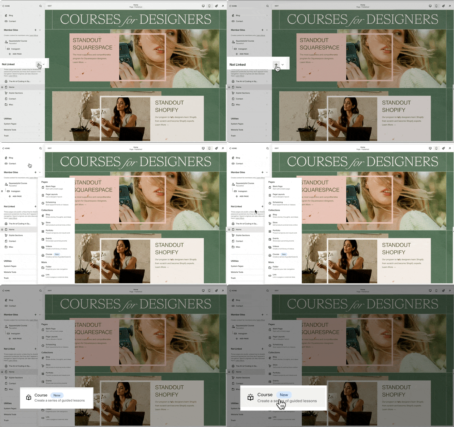
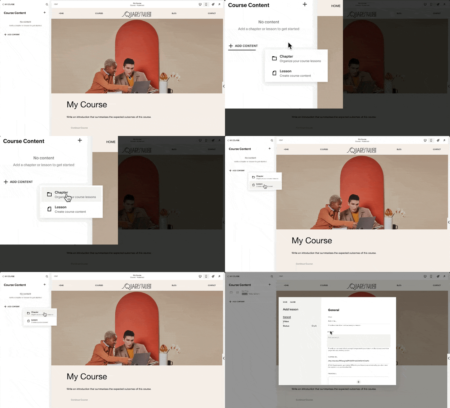
If you are on a business plan or above, then when you click this plus icon, whether in the Linked or Not Linked section of your navigation, this new course collection should show up. Clicking this collection option will prompt us to choose from any of these premade layouts.
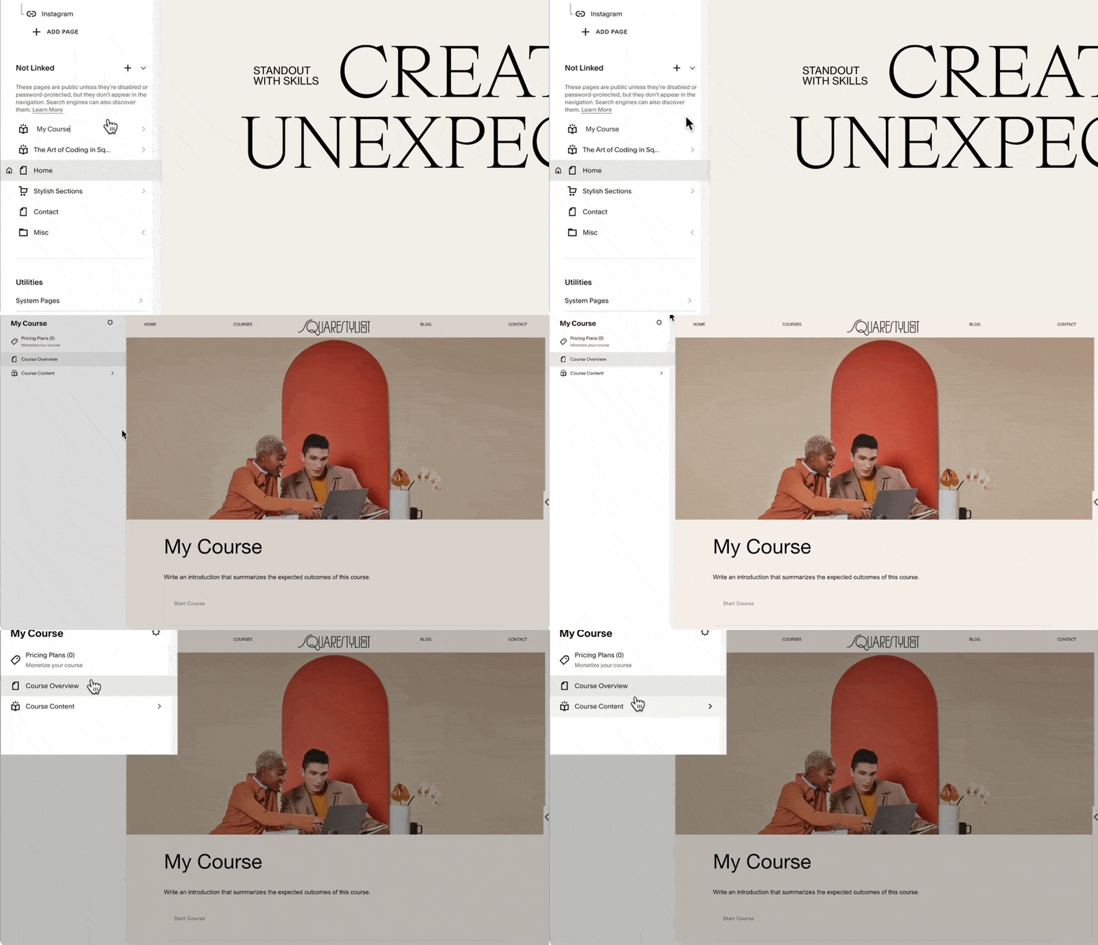
You can choose any, and this will automatically generate a Course Collection page at the top of your Not Linked section. Note that this icon is an open book, so we can proceed with naming our course. I'll name it my course.
When we click this Collection page, we'll see three menu items: Pricing Plans, Course Overview, and Course Content. For now, let's look into Course Content. This is where we add the content of our course or organize them into chapters or units.
If we click on any of the lessons, we'll find that the editing experience is quite similar to portfolio items. That's because we can easily add any section, be it a fluid section, gallery section, or list section. We have a lot of design freedom regarding what content we can add to each lesson. I believe this ability to easily add content and beautifully lay them out in each lesson is what sets Squarespace apart from other platforms.
I can even save a section from another page on my site and easily pull it to be added to any of the lessons of this course. And I'm telling you, after trying almost all course platforms, creating something like this in popular learning management systems is close to impossible, even if you pay $400 per month.
Video Customization Options
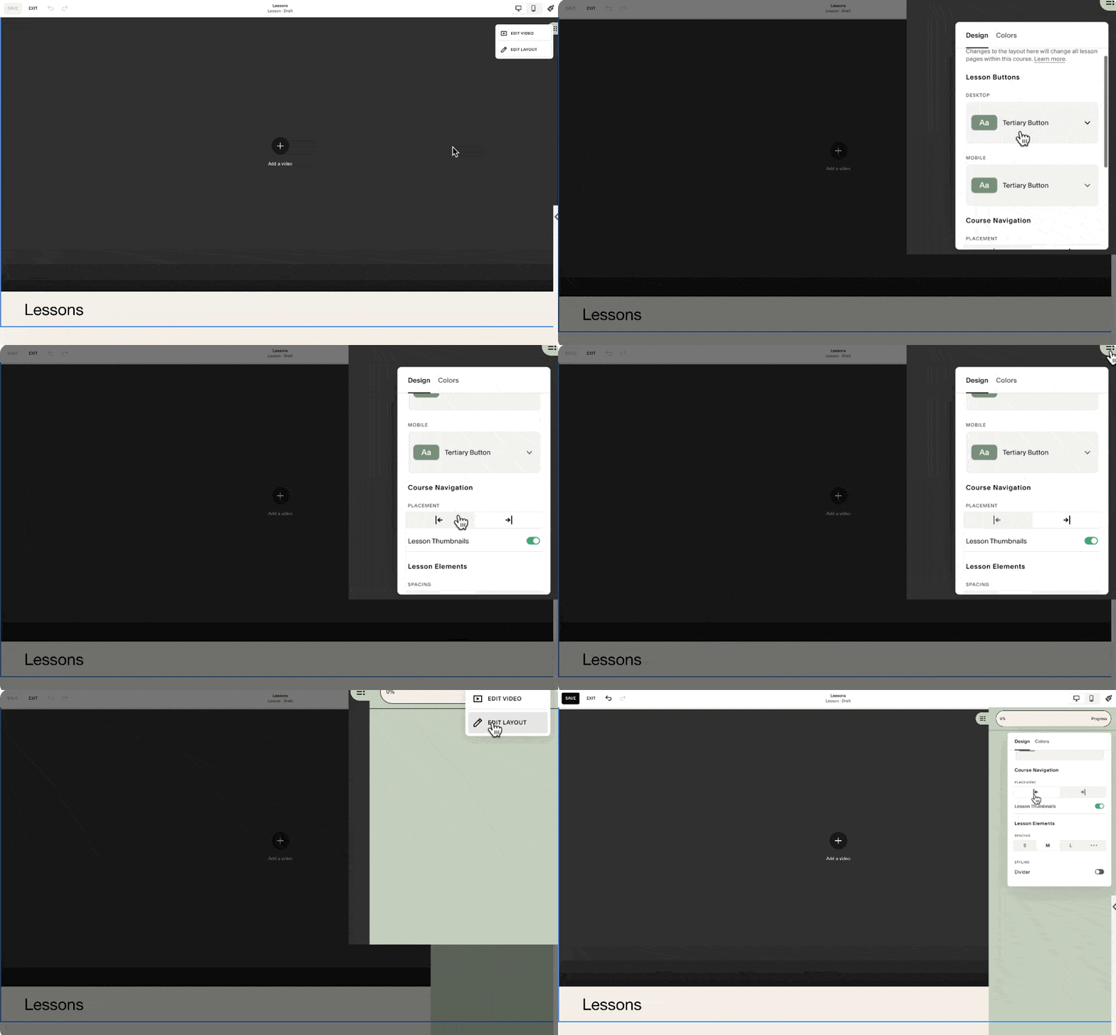
And because Squarespace acknowledges the fact that not all lessons may be video-based, if we go and edit the video at the top of this lesson, there is an option to toggle it off.
If you choose to show the lesson video, you may upload it directly to Squarespace, and as I mentioned, it has a high level of asset protection.
If you are hosting your video elsewhere, for example, Vimeo, then you can just simply add the link from here, and it will automatically pull the video. But make sure that you have the correct settings in Vimeo to ensure that the video is protected. Alternatively, you may also hide this lesson video and just add a section within the video block. You can easily pull the Vimeo or YouTube video while the student is viewing the lesson.
They can also access this pull-out menu, and this is how they can navigate to other lessons of the course.
From the side navigation, they can also click this progress circle, and it'll automatically adjust their progress indicator for this course.
The students may also click the Complete and Continue button at the bottom or top of the lesson, and the progress percentage will be updated too.
Managing Course Content
To add our course content, we start by deleting the placeholder content that was automatically generated. We can do so by clicking this ellipsis and clicking this Delete option.
Note that when we delete the entire chapter, all the lessons under it will also be deleted, and this cannot be undone. We don't have a backup of these, so we have to be careful. But because these are just placeholder content, we can proceed with deleting them all.
When we click this Add Content option, we have the option to either add a chapter or add a lesson. Note that we can definitely have a course without a chapter. So if you have a short course only, you can definitely just use lessons.
But if you'd like to organize your content into chapters or units, then you can use this chapter similarly to how we will use a folder to organize our content. Simply drag the lesson to the applicable chapter, and then we'll notice that the status of the lesson is still on draft. It won't show up in our course until we click Edit Lesson and set the status to published.
We'll notice that we also have the option to set the status to scheduled. This is applicable if you'd like to drip content based on dates. When we click the lesson item and click Edit at the top left of our screen, we now have the option to add any sort of sections applicable for this lesson. You may add more resources, more information, or highlight some key resources indicated or mentioned in the video.
Styling and Layout Options
Under Edit Layout, we have styling options right here. We can also change the placement of our course navigation.
At the moment, the sidebar is aligned to the right, but we also have the option to align it to the left.
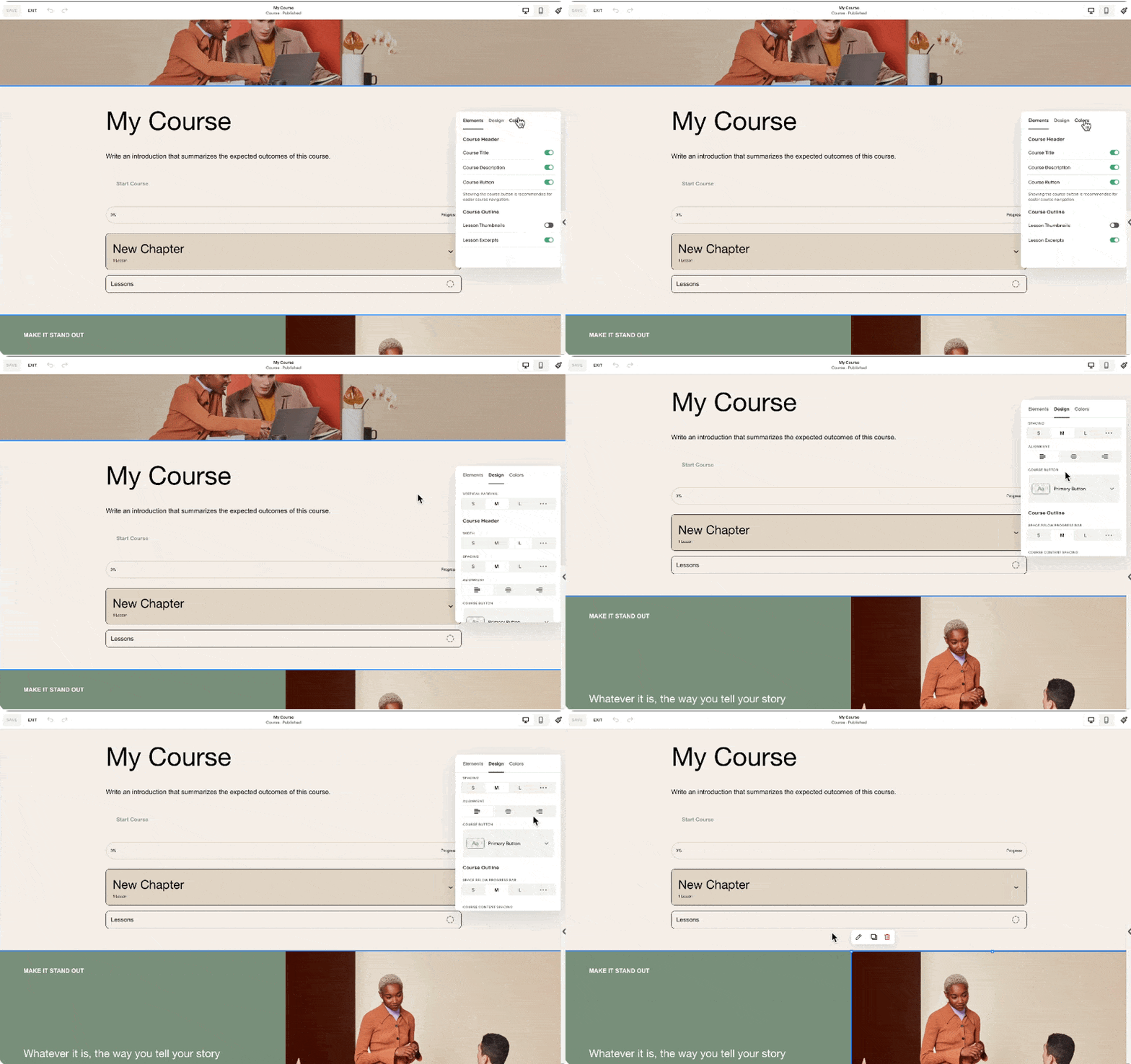
Note that we may add up to 250 lessons per course, and I personally think that's more than enough. Whatever lessons or chapters we add to the course content will be automatically reflected in the course overview. Notice in this section the new chapter and lesson that I added are reflected.
This course overview page may also house as many sections as you need. But of course, what we'd like to highlight are the course chapters and lessons. Because in some courses, you might want to send the students to this page so that they would have a better idea of the syllabus and the topics included in the course.
In this course overview section, when we click Edit Layout, we have the option to show or hide content, change the colors, and change some of the designs. I recommend you take time exploring how changing these settings will affect this section.
For the rest of the page, we can simply add sections the way we would on other pages. This course collection that we just created will have a dedicated URL. If you click this gear setting, you'll find that our custom URL is my course. You may change it as needed. And because we haven't added any pricing plans, this course collection will be available by visiting this URL. In my case, that's squarestylist.com/my-course.
Configuring Pricing Plans
However, if you'd like your course content to be gated, meaning you require the user to sign in with their account before accessing the course content, that's the time we will configure the pricing plans. To create a pricing plan, we simply click this button, and there will be an option for us to add a name, description, and benefits. Personally, I don't use this, but I just plug in the correct information. But when I am adding it to the sales page, I don't show this information.
What I show is the pricing of the course and the applicable products included. We may offer the course in multiple pricing plans. It can be a fixed amount, split into payments, accessed through a subscription, or it can be a free course. For example, we may sell this course for $1,000 single payment or add an option to purchase it in a more accessible pricing plan of four payments of $250.
This is a preview of how these single payment and split payment options will show up on the homepage.
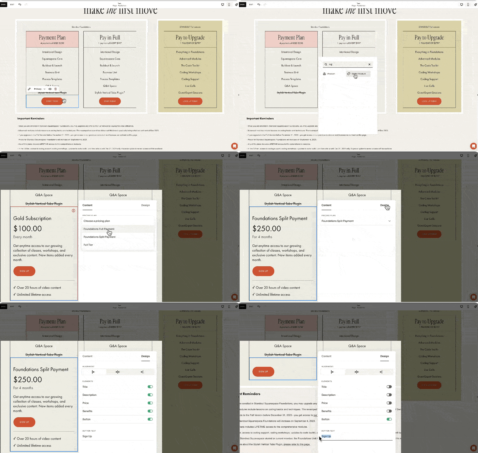
I personally don't find these toggles intuitive. What I typically do is have a specific button for each pricing plan. In my course, Standout Squarespace Foundations, I have this pricing plan section with options for four payments of $250, a pay-in-full option at $997, and a packaged option that bundles my foundations lessons and my advanced lessons. I'd like to demonstrate how I would set it up in Squarespace courses.
For clarity, I'll name this course as Foundations. Then I'll create this pricing plan to refer to my $997 single payment option. Under included products within this pricing plan, I can bundle another course, member area, or video collection here so that when a user avails of this pricing option, they will have access to the main course and a bonus course. For example, I'll add the Art of Coding in Squarespace as a bonus course. When I hit save, we'll have our first pricing plan. We can actually add up to 500 pricing plans per website.
For this course, I need another pricing option, which is the split payment of four payments of $250. I'll create a new pricing plan, still for the foundations course, and change this to a fixed amount tail, with the payment set to four payments of $250 for four months.
For this pricing plan, I can add another bonus course or make that exclusive to those who pay in full. Notice the error here because we have the same name for the pricing tier. So I should name this differently, like Foundations Split Payment.
Referring back to the pricing plans on my site, we have the payment plan option, the pay-in-full option, and now the bundled option. For this, I'll create a new pricing plan called Full Tier, a one-time payment of $2797. This will include all that's in the foundations lesson, the bonus lesson about the art of coding in Squarespace, and the advanced lesson of my Standout Squarespace program. Once created, we have all the pricing plans we need for our sales page.
Implementing Pricing Plans on the Sales Page
Now, to make these pricing plans available on our sales page, I'll demonstrate by accessing my saved section. I'll replace the button leading to Thrivecart with a digital product block. By searching for and adding the digital product block, we'll be asked to choose from the pricing plans we've created. I'll select the Foundations Split Payment plan, then adjust the design settings to match my desired layout. I'll do the same for the other pricing plans, ensuring consistency in presentation.
Student Checkout Experience
When students visit the sales page, they can sign up by clicking the digital product block button, creating an account, or signing into an existing one. After the user signs in or creates an account, they will be led to the checkout page to make the purchase. After a successful purchase, the user will receive an email based on the settings under Customer Notifications Digital Products. The account pop-out menu will show up, where they can view the purchased courses, update their profile, and access other purchases within the site. That's how straightforward the process is from creating to selling courses on Squarespace.
Considerations Before You Start
Product Types
Since the launch of Courses, there are now two main categories of products you can sell on Squarespace:
Store Products: Allow multiple items to be added to the cart, including physical products, services, gift cards, and downloads. Downloads are part of store products, allowing users to automatically download ebooks, PDFs, or audio files.
Digital Products: Customers cannot purchase multiple courses or digital products in one checkout, as each pricing plan has a dedicated checkout page.
Website Plan
Squarespace makes it easy to get started with selling courses or digital products if the website is on at least the business plan. However, there is a 9% transaction fee on top of the payment processor fees, and video storage is limited to 30 minutes.
This setup is designed to help people start selling courses. If you're starting out, you can host videos on platforms like YouTube or Vimeo and embed them in Squarespace to avoid the 30-minute limit. However, if you wish to scale, consider the digital product add-on to increase video storage and reduce transaction fees.
Plan Options
To summarize plan options:
On a typical website plan, either business or commerce, there's no add-on fee, but a 9% transaction fee per digital product sold, and video storage is limited to 30 minutes.
To extend video storage and reduce transaction fees, consider subscribing to the digital product add-on.
Here are the add-on fees per month if paid annually, increasing if paid monthly. The Pro add-on is $149 per month, a significant investment, but for course creators with high sales volumes, it makes sense to invest in a tier with 0% transaction fees.
Comparison with Other Course Platforms
Comparing with other course platforms, Squarespace's pricing is quite reasonable. For instance, Kajabi charges a premium for removing branding and adding custom code, and there are limits on the number of active customers. While Kajabi offers many features that Squarespace does not, not all education businesses need those features.
Teachable's Pro Plan, which I currently use, has a maximum of 50 published products, potentially limiting for some creators. Thinkific's Grow Plan is most comparable with Squarespace, as it allows removing Thinkific branding.
Conclusion
Each platform has its pros and cons, and it boils down to your specific needs. Do you value delightful editing and branded experiences, or are affiliate programs and bulk enrollments more important? For me, design is crucial, so I use workarounds for automations to benefit from the beautifully branded and content-rich experience now possible with Squarespace Courses.
I hope this walkthrough of Squarespace Courses has been helpful. I know you might have more questions, like how to migrate from another platform to Squarespace Courses or how to configure advanced automations. I've devised workarounds to address these needs, and I'd love to hear via the comments which topic you'd like me to tackle next. While I may not be able to respond to all comments, I offer personalized coaching and support within my program, Standout Squarespace. So if you'd like personalized support, check out Standout Squarespace.
Notion Project Tracker and Designer Portral
Learn how to use Notion as a Project Tracker and Client portal
In this video, I'm sharing a walkthrough of my Notion Project Tracker and Client Portal. The Project Tracker immensely helps me in keeping track of my branding and web design projects. While the Client Portal serves as a central place where I communicate with clients.
Notion for designers: project tracker and client portal
a.
Business
b.
Video Walkthrough
INTRO
In this video, I'm sharing a walkthrough of my Notion Project Tracker and Client Portal. The Project Tracker immensely helps me in keeping track of my branding and web design projects. While the Client Portal serves as a central place where I communicate with clients.
Timestamped Overview
2:39 Key Features of Notion Project Tracker and Client Portal for Brand and Web Designers
5:45 How to share the Client Portal with clients
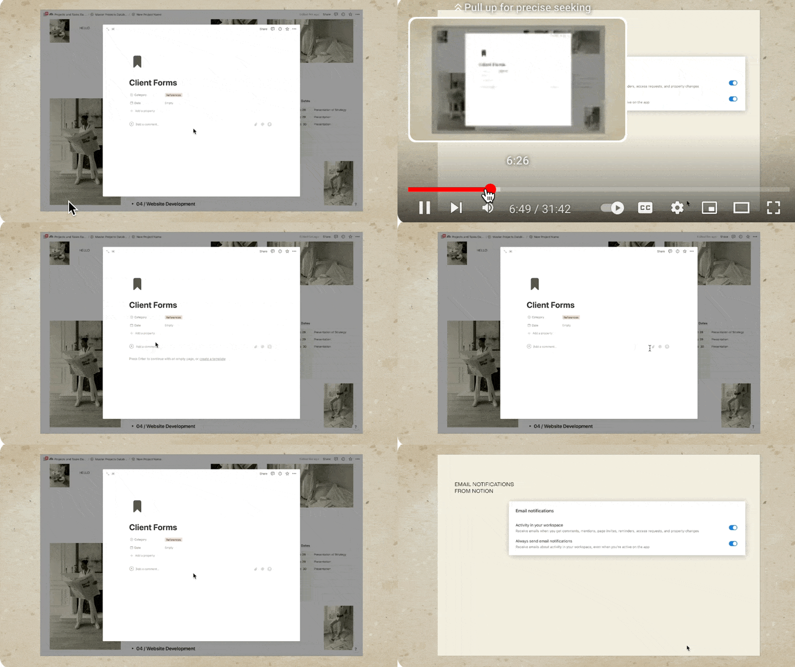
6:43 How to make sure that clients receive notifications in Notion
9:54 How to share questionnaires and content guide for clients to complete
11:04 How to consolidate view of all tasks across projects
14:05 How to use an customize the Notion Template from Squarestylist
21:18 How to add Notion buttons that opens a specific page
22:41 How to set automatic reminders for clients
28:00 Setting up dependencies in Notion so schedules automatically move depending on schedule
I know, I know, you've probably watched a lot of Notion setups and tours by now, but do you know you can take your Notion client portal from this to this?
Hi, I'm Rache from Square Stylist, and today we'll personalize your Notion project dashboard in a simple and stylish way without overwhelming you or your clients.
Why Notion?
There are no shortages of client portals available online. There are a lot of off-the-shelf options, like Dubsado or Honeybook, but they are less flexible in terms of design. On the other hand, you can go with Notion, an all-in-one workspace with building blocks for limitless possibilities. But if you've used it before, you know that Notion can get out of hand real quick. Just take a look at my project dashboard from last year.
Issues with My Previous Dashboard
This portal is pretty comprehensive, but there were a few drawbacks:
Overwhelming Layout: Clients found that there was too much to take in all at once, and they needed to click through too many pages to navigate.
Ordinary Design: If your Notion client portal ends up looking like every other template, it kind of defeats the purpose of going for Notion's versatile platform, doesn't it?
Confusing Questionnaires: Since clients were given full edit access on the Notion page, they tended to delete the entire questions by mistake.
Scattered Tasks: Getting a high-level overview of all tasks was difficult due to permission issues, and we had to create a separate calendar per project, making it hard to merge calendars and obtain a clearer view of tasks needed across projects.
Redesigned Notion Project Dashboard
With all that in mind, I went back to the drawing board and redesigned my entire Notion project dashboard while also incorporating new Notion features. This time, I made sure to feature checklists of what clients need to know. They can access only relevant information at a glance. Not to mention the overall look and feel is more on-brand, thanks to a few design choices I've made by playing around with the settings.
Key Features of Our Notion Project Tracker
Client Portal Layout
First, we have a simple yet stylish and inspiring layout for the client portal. You may easily swap the images to match your own brand. Our Notion client portal template looks great in both light mode and dark mode. We share this dashboard with a client so they know exactly what to expect in the course of our collaboration. But we also want this to be an engaging space for them to look forward to and to be excited about.
Checklist Format
In this client portal, we adopted a new checklist format, laying out what the client can expect from us and what we expect from them at every project phase.
To make it easy to digest, I used toggles and checkboxes highlighting how each phase is dependent on both client and designer inputs.
Previously, I used a Kanban board format, which you'll find in most Notion client portal templates as well. But while this Kanban board view makes sense to me, some clients and designers brought up that this Kanban view looks overwhelming for the following reasons:
Clients get confused about which card to click and where to add their feedback.
It takes a few clicks and navigating to get to a certain document.
They get overwhelmed seeing other tasks that are not relevant to them.
Laying out the stages and tasks in a checklist format while highlighting key dates makes it less overwhelming. We also have a project status block that highlights the most important task at the moment. For example, if we just initiated the project, then most likely we'll be asking for the client's answers to our questionnaires or our content guide. Hence the call to action here is to view the client forms, and if they click on it, they will be automatically led to that particular document where they can click the link to answer the questionnaire as well as provide the content.
Centralized Feedback and Conversations
We made client feedback and conversations more centralized and straightforward. When we book a new project, all we need to do is click this "Add a Project" button, and all the content of the project client portal template will be automatically generated. We simply need to populate this with details that are particular to this project, such as the project name, dates, and references.
We share this Notion client portal with a client so we can communicate right in Notion. All we need to do is share this entire dashboard but make sure that when we invite them, we only give them "can comment" permission.
This way, the client won't be able to mistakenly delete any of the elements within our portal, but they can view any of our presentations or briefs or videos and questionnaires and then comment right in the comment section of that Notion page, giving us context on what the conversation is about.
Robust Comment Features
Notion's comment features are actually quite robust because we can easily attach files. We may use the Mention option to notify our clients via email, and we may also add reminders. Contrary to popular misconceptions, Notion's email notifications are actually quite reliable. But it's important to make sure that in the welcome video where we introduce our Notion client portal to our client, we remind the client to ensure that under Settings, the option to always send email notifications is toggled on.
In the same video, we encourage them to always tag us or mention us in the comments when they leave feedback. Because every time we tag our clients, or every time they tag us, we receive these email notifications. To trigger reminders to someone else like the client, we simply need to mention them again, followed by the reminder.
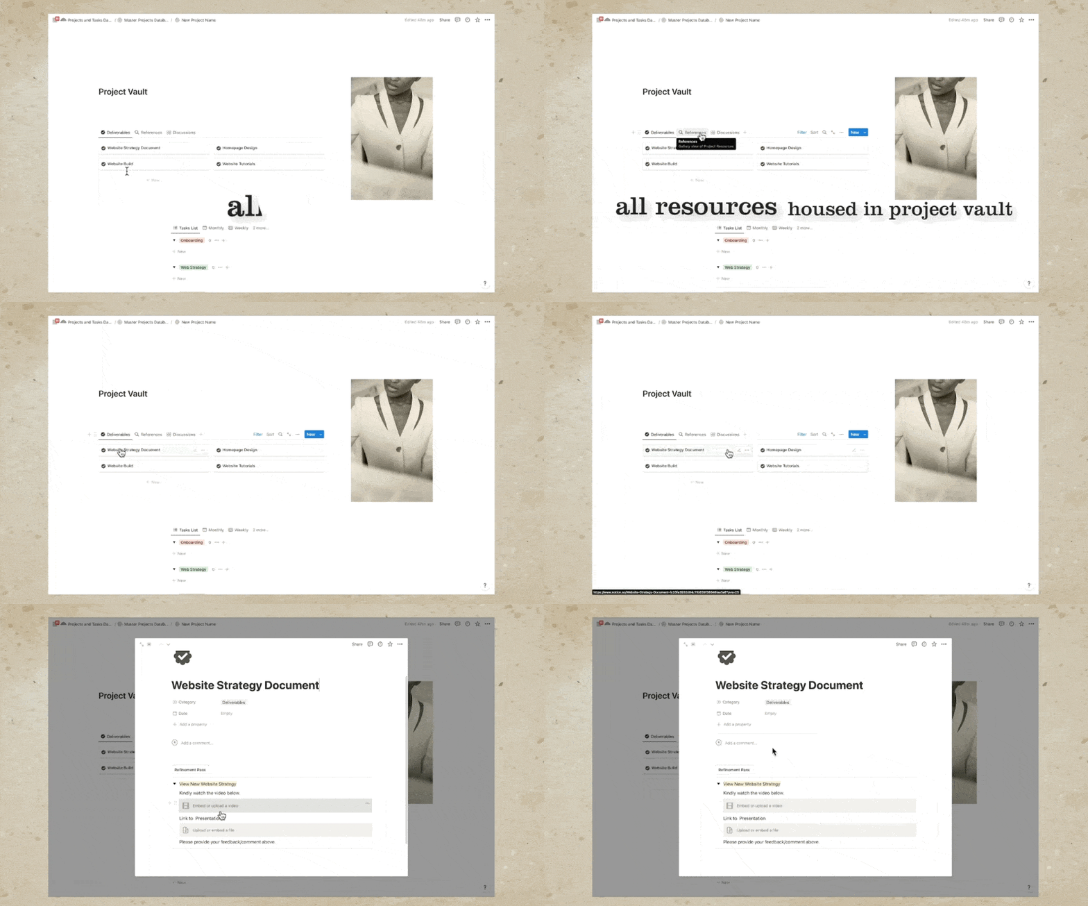
Project Vault
We are able to house all important deliverables, references, and discussions in our project vault. For example, all our deliverables and conversations are accessible by clicking these cards. For example, under Website Strategy Document, this is where we embed the video and the link to the presentation, and this is where we invite our clients to share their comments. The same is true when we are presenting other deliverables such as homepage design.
For example, we can add the video to walk them through our design for the homepage and an option for them to view the design. Our clients can approve the designs via the comments or, if you'd like to formalize it, they can signify their approval by signing a sign-off or approval form where they can affix their signature and submit this so we can finalize this specific phase of the project.
We also use the Project Vault to house all references such as contract invoices, brand guidelines, and more. Feel free to add more references so you won't find it hard to find relevant files for a particular project. We may also house relevant links and inspirations here so it's easy to find them. Personally, I love adding my checklists under References because my web development process involves a lot of tasks, and to make sure that I am as accurate and thorough as possible, I have a comprehensive checklist of all the steps involved in my website design and development process.
Client Questionnaires
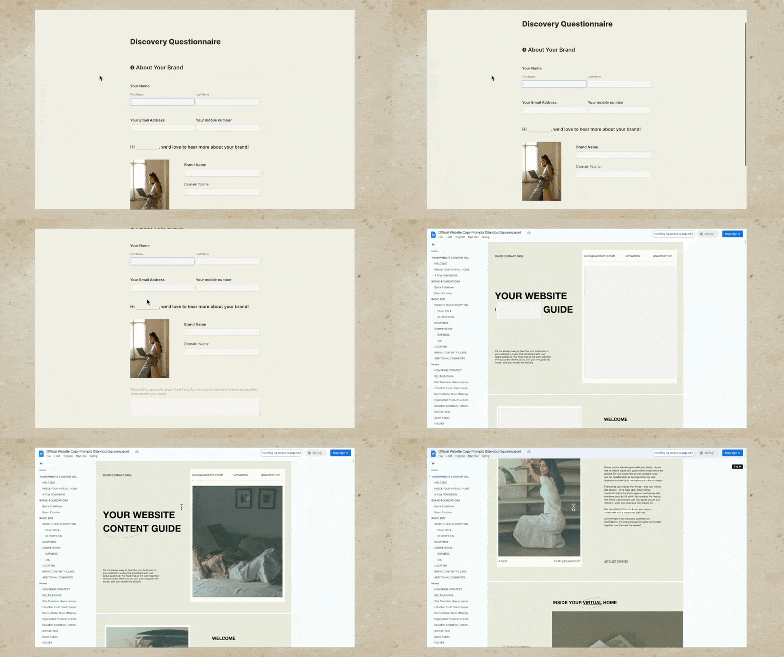
I used to use Notion to create questionnaires, but recently I started adapting other software. For example, for my questionnaire, I use this form so the client can easily submit it without mistakenly editing the questions. For my copy prompts where I ask the clients to provide the copy for their project, I use Google Docs, and this is a preview of my Google Docs content guide.
In this video, you'll learn that you can have access to this Notion client portal template and dashboard. However, the template won't include my client forms and my process checklist, but if you wish to have access to these, I share these forms and checklists within my flagship programs Standout Squarespace and Standout Shopify. The links are in the description below, or you may subscribe to this channel. Because I'll keep creating videos about these form builders and checklists that I create.
Notion's New Project and Sprint Features
Another key feature of this designer project tracker is that it is now powered by Notion's new project and sprint features. We are now able to consolidate all tasks across projects in just a single view. Notice how we have a project dashboard at the top, where we have different views of how our projects are overlapping or where in the process these projects are. We also have the option to view all projects.
This project dashboard is typical to most Notion client portal templates. But what's new with our designer project tracker is that we now have a master tasks dashboard reflecting what's due today, what's due next week. We also have a calendar view of the tasks due across multiple projects. And if we'd like to just view the tasks for a certain project only, then we have a filter right here. For example, if I only want to see the tasks for our essential project, then I can choose this filter, and it will only show the tasks for our essential project.
And if you have advanced project management needs, there is an option for you to add more properties to each task and even adapt sprints because this is now powered by the new Sprint feature of Notion.
In my previous project dashboard, and this is also what you'll find in most Notion templates, we had to click through each project before we were able to view the tasks that are due for each project. This consolidated view of all tasks across multiple projects is now possible because this list of tasks that we'll find when we open any of our client portals, at the very bottom, you'll find a list of the tasks related to this particular project only.
It's important to remember that this table or database is not visible to the client. This is only visible to us, the owner of the Notion workspace. We may also collaborate with our team members using this database. We don't need to hesitate because the notes and details right here won't be visible to our clients. Clients don't need access to all of these tasks and steps. What they actually just need is a simple and straightforward view of the current project status. Hence, this checklist format is more than sufficient.
Setting Up Your Own Notion Project Tracker
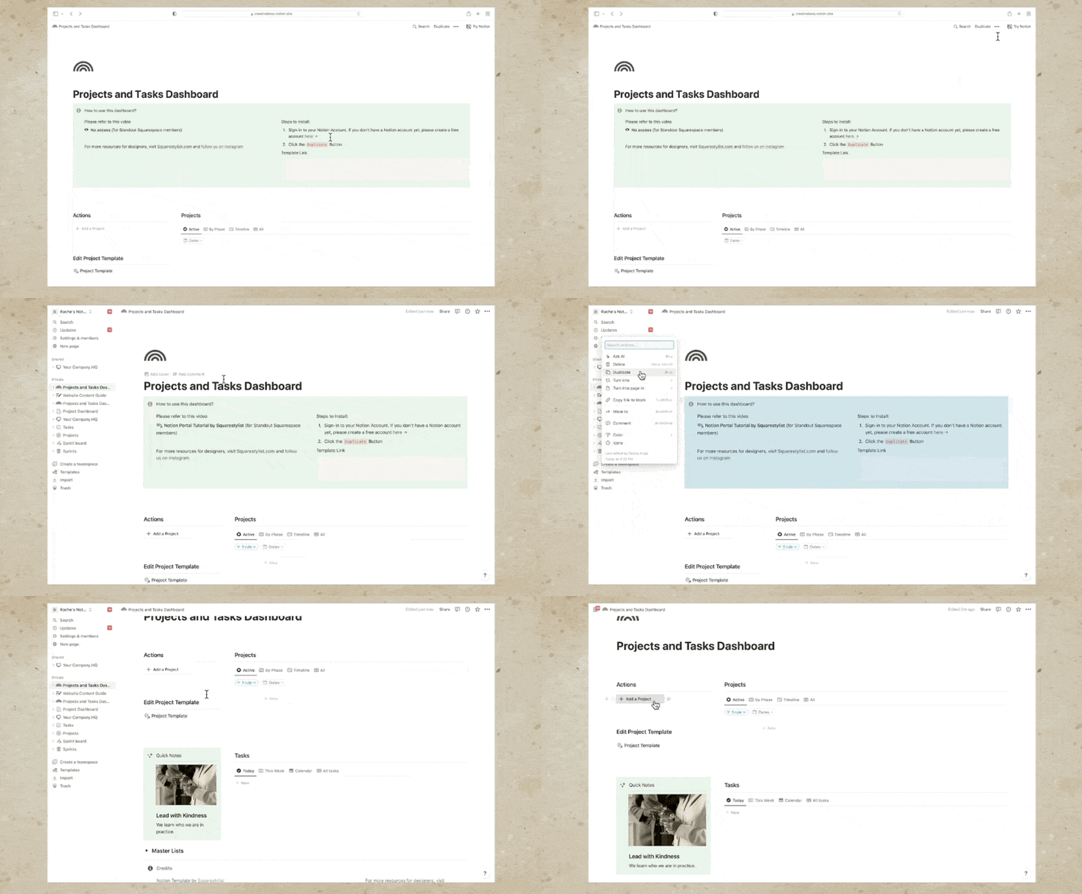
Let's walk through how you can set up something similar for your studio, step by step. I have great news for you, because you don't have to build this designer project tracker and client portal from scratch. Using the link in the description below, you'll have access to this exact Notion template. The template link will lead you to this screen.
Steps to Install the Template
1. Sign in to your Notion account: If you don't have a Notion account yet, don't worry, you may create a free account using the link provided here.
2. Duplicate the template: Click the "Duplicate" button at the top right corner.This will now be duplicated to your own Notion account, and you may now edit it to your heart's content.
You may change the title, remove the call-out for the instructions, and start editing the project template. This template contains the default content when we hit the "Add a project" button, so it's best to customize it based on how you typically run your projects. For example, if you'd like to change the images, simply click the ellipses icon and hit the replace button.
Welcome Video
I recommend creating a welcome video walking the client through how we can make use of this client portal. First, remind them that they would need to set their notifications to always receive emails.
They can do so under Settings and Members, My Notifications, and toggle on the option to always send email notifications. In that welcome video, let them know that we will guide them on how to provide feedback to our presentations. It's as simple as clicking this button and adding a comment right here. Just make sure that they mention us every time they comment.
In the video, I also mentioned that if they have any general questions that are not related to the presentation that we are currently reviewing, they may simply toggle on this chat button and hit the "Send Message" option.
You may use the same welcome video across all your clients. Hence, we're adding that welcome video in our template. To add that welcome video, simply toggle on this "How to use this dashboard" and paste the video link right here. Alternatively, you may hit forward slash on your keyboard, start typing Video, and then this is where you'll add any YouTube or Vimeo links. You may choose to edit parts of this template.
Again, this will be applied to succeeding projects that you'll create using this project tracker.
Process Steps
At the moment, I added stages of my process from onboarding up until offboarding. But if you have any other main phases of your project, feel free to just add a process step by clicking this button. For example, if you have a brand strategy happening after onboarding, then this will be our brand strategy phase, and we can simply move this using the six-dot icon to the proper place within your process.
We may also make changes to this Project Vault content, keeping in mind that whatever we add here will be applied across all projects. This task list must be kept empty while we're editing the template. We will populate it when we are editing the client-specific project dashboard.
Creating New Project
Once you're happy with the content of our project template, we may now use it as a template for our succeeding projects. Once a client books, that means they have signed the contract and paid the initial invoice. I create a project for them in this dashboard by hitting the "Add a Project" button.
Once we hit the button, all we need to do is change the new project name placeholder with the name of the project. For example, Project Solena. Then we can populate the dates for this project. For example, it's from August 1 until August 31. So we can include the end date by toggling this option on so we can choose this end date of August 31 by hitting Shift. Notice how our default project template content has been automatically added.
Finalizing the Portal
Our dashboard is best viewed on full screen. Hence, I click this "open in full page" icon. We may now populate this portal with the details that are specific to this project. For example, you can mention the name of the client here. Also, we need to make sure that the buttons are led to the correct pages. The welcome video is automatically led to a page for the video. The chat is also automatically led to the discussions page. The button to view client forms is also automatically connected to our client forms references. So we can just add the links to our client forms, both the questionnaire and the content guide. At any point in our project, we will also change the content of this project status block.
For example, if it is our time to present the website strategy, once we're ready with the website strategy, we can let the client know that the website strategy is ready for review. We also need to make sure that we update this call to action. Right now it says view client forms.
We then have to change this to view website strategy, and we also have to make sure this leads to the correct reference file. So instead of client forms, we'd need to select the website strategy document because this is our presentation at the moment. If I hit Share for this website strategy document, I can copy the link, and that is the link that we will indicate when we click this page option. I'll paste that link, and it will then confirm that we are connecting this button to the website strategy document.
Adding Custom Buttons
If you'd like to create your own buttons, it's quite easy to add by hitting forward slash on your keyboard, start typing button, and then, for example, this button is to view other guides. Then I can add a step, and that is to open a page. Similar to what we did earlier, we can just use any reference, copy the link, paste that right here when we select a page, and then we are able to use this button to open any references inside this client portal.
Customizing Tasks
Feel free to change the placeholder tasks that I added to each of these phases. We may also indicate some reminders. For example, if I need to remind a client about a date, I can just mention them anywhere and then follow it with a date. We can do that by hitting the add symbol and start choosing a date. Then just change this date to the relevant date and ensure that the reminder is toggled on on the day of the event or one day before the event. Typically, though, I prefer minimizing the number of reminders.
So whenever I present a website strategy or homepage design, for example, I simply add the reminder within the comment thread. For example, I'll say, "Hi @name of the client," and then I'll just let them know that this strategy is ready. Of course, feel free to add more details, but within the same line, we can add a date, and they will be automatically reminded on the date that we indicate right here as long as their name and the date are within the same comment.
Sharing the Dashboard
Once I've tracked all the buttons and details specific to this client, I share this dashboard with the client by using the Share button. I add their name or email address, and I make sure that this permission is set to "can comment" only. I hit Invite, and you may also add a message to give them more context about what this invitation is about. They will be receiving an email on how to create a Notion account and access this dashboard.
Managing Tasks
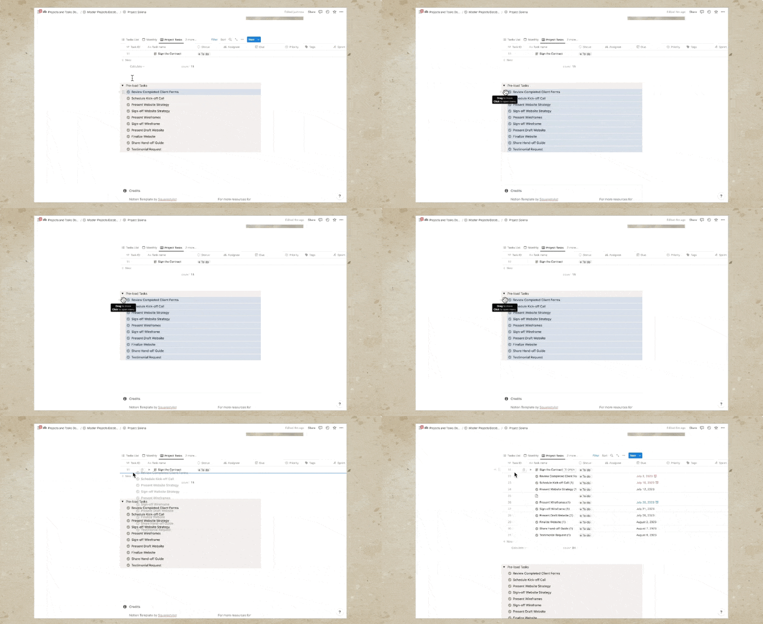
Now we'll proceed with the task list at the bottom of our client portal. Again, I'd like to remind you that this task list is not visible to the client. We may now start adding the tasks that are related to each of these phases by hitting this button to add new tasks. For example, if under onboarding, we need to send the invoice or sign the contract, we can add that right here and add the due date. Alternatively, you may use preloaded tasks at the bottom based on typical steps involved in a design project, but first you’ll have to hit the option to use the Project Tasks View.
Then we can preload this task by making sure that we select the first task, hold Shift on my keyboard, and select the other tasks using the arrow-down key on my keyboard as well. We'll copy all these tasks to this table by grabbing the six-dot icon while all of them are selected and holding the option key on our keyboard (or Alt key on Windows). I'll hold my option key and drag that to this database, and this is how we'll preload the tasks to this table.
Once these tasks are preloaded, we can switch back to the TASKS LIST and make changes to each of these tasks. Notice that there is a parenthesis "one" automatically added to each because we've copied it from our main tasks, but we can easily remove it. We may also edit each of these tasks, change the due date, change the week number, and of course, make changes to these properties and values. For example, if you have more phases than what I've initially added right here, we may add more phases or stages to your process. Simply add another one, for example, "brand design," and we may change its color using this ellipses icon. And of course, you have the option to add more properties.
Since this list of tasks is not visible to the client, I add personal notes right here, some things to remind myself regarding this particular task. If the tasks are not arranged chronologically, you may hit this option to sort. We can sort by due date and make sure that this is ascending. We also have the option to view this database in multiple ways, any way that makes sense to you and that will help you be productive.
Again, this is not visible to the client. So we have a monthly view, and we also have a weekly one. Notice that these weeks are week numbers that I manually added. These are not connected to the weeks of our calendar, but I like categorizing my tasks based on the week numbers because I typically keep my design and development projects from anywhere between four to eight weeks. Then I like assigning the week number for each task.
Timeline View and Dependencies
We also have a timeline view, which is particularly helpful if you'd like to set up dependencies. Dependencies are when we connect one task to the other, especially if a task is highly dependent on a preceding task. For example, we won't be able to schedule any kickoff call if the client forms haven't been completed. So I most of the time set up the dependencies for each of these by connecting them. For example, if we move the deadline of one task, there will be a red visual indicator that there have been changes in the schedule.
There is a cool feature where if we click this dependencies option, we have these options to shift and maintain time between tasks. That means all the other dates will move depending on the movement of the blocker or the essential task. Notice if I choose this option to shift and maintain time between tasks, if I try to move the due date of one task, then all the other dependent tasks will also move in terms of schedule.
Task Reflection Across Projects
Now what's beautiful with this project template is that all the tasks that we added in this project, Project Solena, will also be reflected in our tasks list. Notice how under Project Solena, we have all these tasks. If we create a new project by hitting this "Add a Project" button, for instance, I can name this Project Linea and assign a different icon so it's visually distinct. I can use this orange color. If I add tasks to this project, again using our preloaded tasks, notice that when we view this in our Tasks Dashboard, all the projects for Project Linea and Project Solena are distinct from each other. We can also see that under our calendar view. If you'd like to reflect the project property here, we can use this Properties option and ensure that the project name is shown in the calendar as well, or any views that you'd like.
In this Tasks Dashboard, I also use the same project tracker to manage my personal projects. I love working on personal projects, for example, a Squarespace or Shopify template. Once I've checked all the buttons and details that are specific to this client, I share this dashboard with the client by using the Share button. I add their name or email address and ensure that this permission is set to "can comment" only. I hit Invite, and you may also add a message to give them more context about what this invitation is about. They will receive an email on how to create a Notion account and access this dashboard.
Conclusion
Hope you found this resource helpful. If you'd like to learn more about Notion or other tools for web designers, please subscribe below or check out our courses, Standout Squarespace and Standout Shopify. The links are in the description below. See you in the next video.
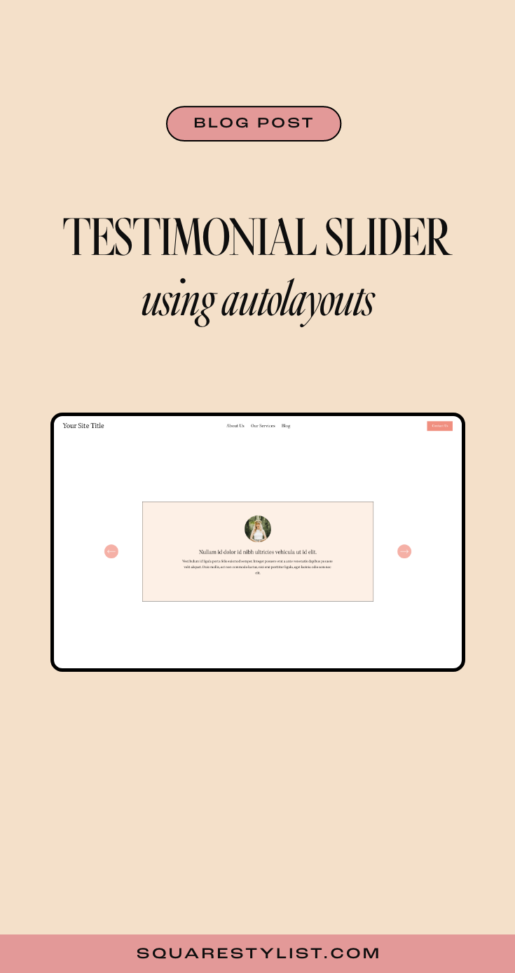
How to build testimonial carousels in Squarespace 7.1
Sharing an easy way to create a beautiful testimonial slider using thew Auto-Layout list feature of Squarespace.
As a Squarespace designer, you've probably know the feeling of adding content block by block. While this gives you a lot of freedom within the website builder, sometimes it can get a bit tedious having to manually arrange the elements for more complex layouts.
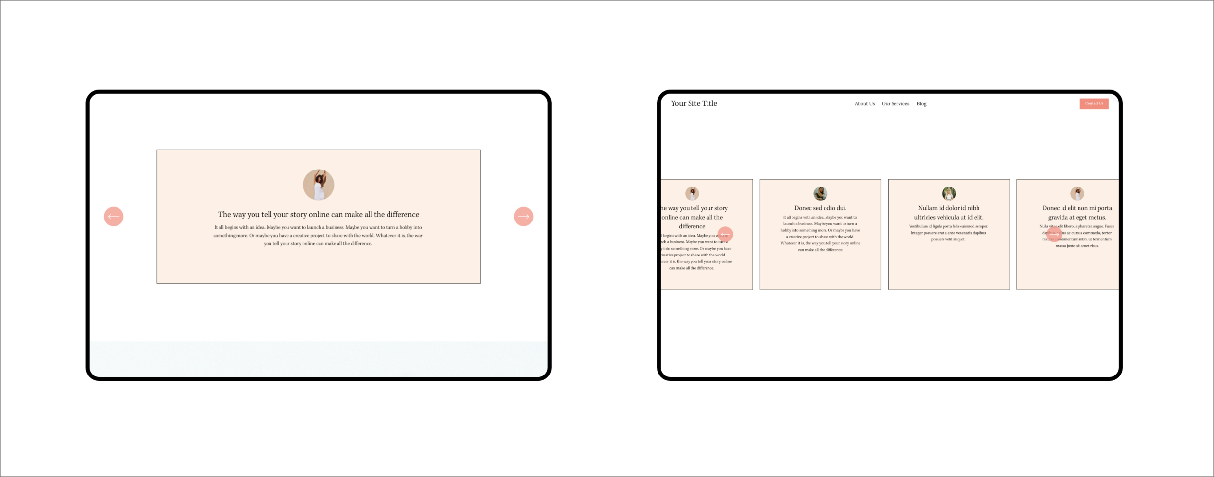
Good thing there's a new Squarespace 7.1 feature on the block—the auto-layout sections. This means that we're now able to arrange text and media automatically based on a specified setting.
There are three auto-layout categories to choose from: list, people, and headlines. Now it's easier than ever to showcase testimonials, banners, galleries, and many more.
Wondering how to make the most out of this new feature? Let's deep dive into customizing testimonial carousels using CSS.
If you're interested in learning more about how to code unexpected websites, you can check out my signature course Standout Squarespace. It's where I teach you everything you need to know to become a web designer & developer.
Section properties
To start, add a section and go to Headlines > Banner Slideshow, then click Edit Content > Design to switch to the carousel layout.
Under the Elements tab, make sure that the image, title, and body are all shown. You can leave the button turned off for this use case.
Add all the testimonials—photo, title, and description—you want to feature under the Content tab.
Back to the Design tab, we need to make sure to set the alignment to center and the max columns to 1. Image crop is set to 1:1 ratio so we could round the corners later. Don't forget to turn off "show adjacent slides" but enable infinite scroll.
Let's go to Size & Space under the Design tab to configure more details for the slider. Toggle media width to around 10%, though this could vary depending on your design. Content width can be set to medium, while media placement should be centered.
The space between elements can be set to 1-2%. Note that the space between sliders would not matter when we have a max column of 1.
Set the vertical padding to large, with the position being either top or center—I personally prefer the top alignment.
Click on the Style tab under Design and activate the card and add background color to the testimonials.
Main CSS codes
If you sign up to access the codes, you'll see in the Notion document that I added snippets to customize the carousel.
All you need to do is to replace the placeholders in these snippets with the correct Section ID using the Squarespace ID Finder extension.
You probably notice that the navigation arrows are hidden, and that's because we made the image thumbnail small. We'll need to use CSS to reposition the arrows and make them visible again.
The next one is what creates the rounded image thumbnails for this carousel. Removing the border-radius property will turn your photo back into a square. If you need a border outline, just specify its width, type, and color (using hex code) in the values.
The card border & background snippet will allow you to tweak the border outline, type, and color in the same manner. You can define the background-color of the card using any hex code.
Last but not least, the content maximum width will manage the size of your cards depending on your design. Adjust your navigation offset via Edit Content > Design > Style depending on this value.
Optional CSS codes
To keep your testimonial cards of uniform size, you can add a code snippet for equal height items. Make sure that you add this at the very bottom of the code snippets you just added.
This will be handy if you'd like to feature several testimonial cards per slide. Just don't forget to add some space in between slides by going back to Edit Content > Design > Size & Space.
Mobile View
Look 👀at how the mobile view should look like.
Want your site to automatically play through your auto-layout testimonials?
Check out my mini-course to learn how with the help of JavaScript. Hope this quick tutorial helps!
PIN THIS POST
Add Multilingual Translator to Squarespace: Powered by Google Translate
Easily add a multi language translator to your Squarespace website powered by Google Translate.
In this blog post, I will share how to easily add a free language translator powered by Google Translate to any Squarespace website.
There are quite a few options to create a multilingual Squarespace website.
If you need more control over the translations, I recommend checking out Weglot. They have a smart technology to create an SEO-friendly version of your website on any language. They provide automatic translations per language but you also have controls to edit the translations.
However, if you are looking for a free option - I created a tutorial based on this codepen entry.
Please note that the translations are machine-generated using Google Translate’s technology. The beauty of this is it’s simple, easy-to-install and supports multiple languages.
Kindly watch the video below for a walkthrough.
To access the codes mentioned on the video, please click the button below
Want to add stylish and unexpected features in your Squarespace site?
Easily Create this stylish vertical tab feature.
Showcase a Scrollable Website page
Create a scrollable page by just using an image block and a couple of CSS Codes.
How can you best feature your website design portfolio? Here’s a great option using CSS. Create a scrollable page by just using an image block and a couple of CSS Codes. Please watch the video below to view the guided tutorial.
Kindly watch the video below for a walkthrough.
Please refer to the codes below as mentioned in the video above.
Paste the code below toDesign > Custom CSS
#PASTE-BLOCK-ID {
  height: 500px;
  max-width: 80%;
  margin:auto;
  width: 100%;
  overflow-y:scroll;
  overflow-x:hidden;
  filter: drop-shadow(2px 22px 40px rgba(0,0,0,.3));

  @media screen and (max-width:767px) {
   height:200px;
  }
}
To customize the scrollbar
::scrollbar { width: 3px; /* Scrollbar Thickness */ height:15px; } ::scrollbar-thumb { background: #22514A; } ::scrollbar-track { background: white; /* Background Color */ }
Want to add stylish and unexpected features in your Squarespace site?
Easily Create this stylish vertical tab feature.
Easy Workarounds for Squarespace Member Area
In this blog post, I share helpful workarounds on how to address limitations of the Squarespace Member Area Feature. From how to avoid transactional fees to how to create a custom navigation,
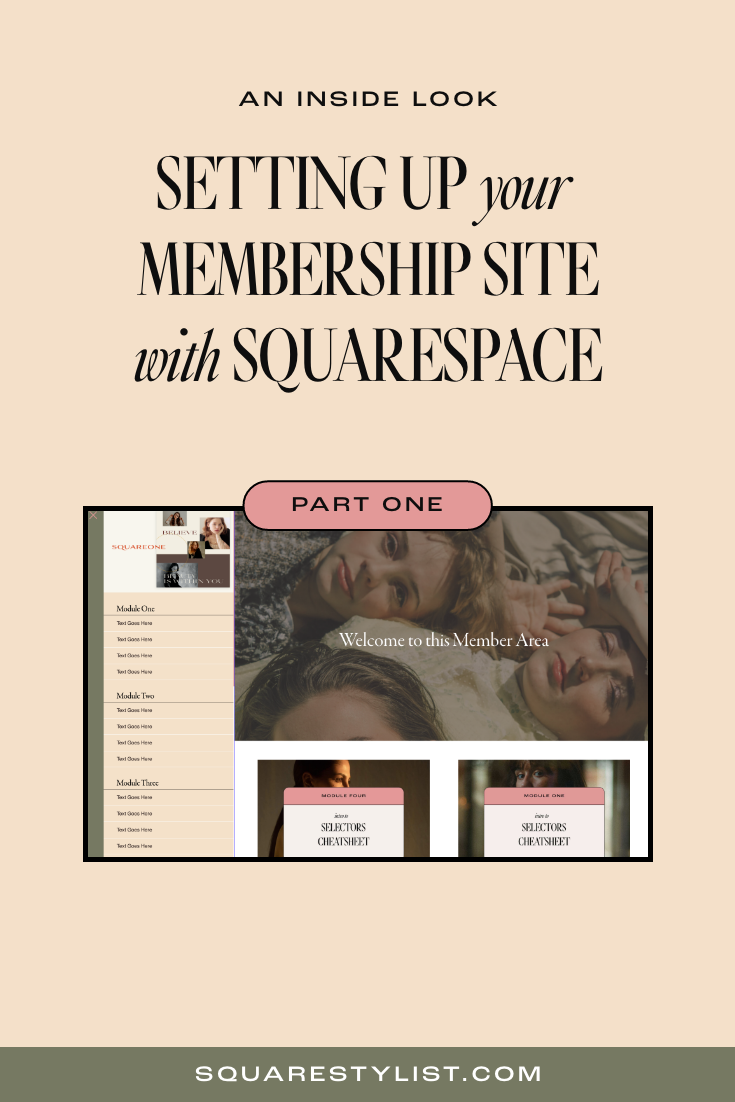
This is the Part Two of my series on the brand new Member Areas in Squarespace. Click here to read Part One, which is all about its features and setup.
In the previous blog post, we talked about how the Squarespace Member Areas and its basic features. It's a good match for you if you're looking for a simpler option to handle your exclusive content within your very own site.
While this add-on isn't as robust as other LMS like Teachable or Kajabi, it doesn't have to be. Let's talk about these limitations, along with some of my secret hacks for (1) transaction fees, (2) affiliate marketing and bundling, and (3) sidebar navigation.
Kindly watch the video below for a STEP bY STEP walkthrough ON
HOW TO Address known member area limitations.
What are the limitations of Squarespace Member Areas?
1. Fewer LMS functions
Admittedly, this first item on our list is the one thing that doesn't have a workaround for now. All users, regardless of plan, would be limited to 10 member areas at most. That means if you're offering a lot more courses than that, then this might not be the option for you.
It also has no video hosting feature, so your videos would have to be hosted elsewhere. I recommend Vimeo, which allows for high-quality videos and various embed options, but that comes with an additional cost of $20 per month.
Squarespace doesn't provide a progress tracker and other similar analytics, either. Then again, this won't be too much of a letdown if your focus is on community-building.
To hide the join button, add the snippet below to Settings> Code Injection > Footer
2. Less flexible checkout options
Using the native Squarespace checkout has its downsides as well.
For one, each transaction made through this checkout comes with a 1% commission fee on top of the Stripe and PayPal fees, even if we subscribe to the Pro plan. If you're offering a high-ticket program or expecting a lot of transactions soon, this could be a significant chunk of your income.
We can't offer installment payment plans via Squarespace checkout, either. Customers would only be able to choose between one-time payment and subscription.
Bundling is not yet possible here, since each member area corresponds to only one fee structure. And while discounts are available, then can only be applied site-wide.
Not to worry, though—we'll discuss how to work around these limitations later.
3. Limited workflow automation
The Squarespace API is not yet publicly available as of now, so it's not yet possible to create automations using Zapier. We'd have to manually upload members to our email extension, unless we're using Squarespace Email Campaigns.
The affiliate system is also not built-in, so there's no way to automate this using the Squarespace checkout. But again, there's a way to bypass these limitations.
4. Default navigation styles
Though we did discuss how we'd have a lot of control over the branding of Member Areas, this unfortunately doesn't extend to our navigation. The only styles available for this purpose are automatically generated by Squarespace.
However, using CSS and JavaScript could help us create and customize a custom side navigation if we want to make our design stand out.
Payment gateway workaround
Majority of the limitations of Member Areas center around the lack of functions in their native checkout feature. That means we can effectively overcome these problems by working with a third-party payment gateway.
To set up your third-party payment gateway, here are the simple steps you can follow:
1. Set up a free member area... and hide the join button
If you're going to use the Squarespace Member Areas, it's best to set up a free membership space so that you won't have to use its native checkout feature. Still, we'd have to work on safeguarding your premium content by adjusting the settings.
Whenever a person clicks on your member area without an account, they'll be redirected to an Access Denied screen, where they'd be prompted to join if they haven't yet. You'd have to hide this default member sign-up block using CSS and JavaScript so they can't bypass the payment gateway.
All you have to do is add the snippet below to Settings> Code Injection > Footer.
<!--Squarestylist Snippet to Hide Join Button-->
<script>

var sqelem= document.querySelector('#sqs-member-access-page-root .sqs-editable-button');
sqelem.remove();

</script>
<!--END SQSTYLIST JOIN BUTTON-->
Also, don't forget add this code snippet to Custom CSS. Press Cmd+Ctrl + ↓ to immediately get to the very end of your panel.
#sqs-member-access-page-root .sqs-editable-button {
display:none;
}
2. Create a post-purchase page
Next, we need to build out a post-purchase page where we could place the member sign-up block for new members. Just add a blank page under the Not Linked section of your Squarespace site.
You can briefly thank the user for purchasing your course before adding your member sign-up block below it. "Create a new account" could be a good call to action for the button.
Head to Page Settings > SEO to hide this page from search results. This is very important.
In addition, make sure that your URL slug is complicated enough so that people won't be able to guess your post-purchase page. You can insert a random string of alphanumeric characters for this purpose.
3. Set up a third-party payment gateway
You can use Samcart or Dubsado for this step, but I do recommend Thrivecart, which is what I use for my own digital products. I've been using their product for months now, and I really love how powerful and promising its features are.
Split payments
More recurring fee options
No transaction fees
Integrated with Authorize.net
Great affiliate program
Upsell/downsell options
Bundling option available
Most importantly, their customer support is truly superb. If you're interested, you can start using Thrivecart after making a one-time payment through my affiliate link.
Once you're in, you can create a new digital product (a.k.a. your course or membership), choose pricing options (even calculate sales tax), add a bump offer to upsell, then set up your affiliate system. Make sure you add your support email and send them to your post-purchase page via URL.
Please note that membership cancellations won't be automatically processed. Inform your customers that they'd have to email you to cancel their membership.
Watch the video above if you'd like to see a more comprehensive walkthrough of this process.
Navigation style workaround
Want to learn how to create the custom sidebar per member area?
To elevate your membership site, you have the option to recreate this custom side navigation, which your members can open or close anytime. Click the button below to check out this stylish section designed for Squarespace Member Areas.
Pin this post
An Inside look at the new Squarespace Member Area
Here's an inside look at Squarespace Member Area, an add-on feature that allows us to gate premium content in any Squarespace Website. I walk you through how to set-up the pages, navigation, customer notifications and more. I also list down the limitations & advantages of using the platform to help you assess how it compares with other learning platforms like Teachable, Kartra, Kajabi et al.
I'm sure this is a promising upgrade for many Squarespace users who have been eager to have all your stuff in one place. But you might be wondering: Is it a good option for you (or your clients)?
Read on to learn more about how Member Areas work, especially in comparison to other existing third-party platforms.
Kindly watch the video below for a STEP by STEP walkthrough
on how to set-up this feature.
What can I do in Member Areas?
1. Provide exclusive content
Member Areas allow us to share our knowledge to many eager learners, no matter their skill level. We're also not limited to video tutorials alone. We can provide content in other engaging formats like virtual workshops, 1:1 coaching, podcasts, or even newsletters.
This new feature will definitely help you create a worthwhile learning experience in a simple and user-friendly way. As a course creator myself, I find it exciting that we can already choose to build our online community within the website platform that we have grown to love.
To learn more about my recommended way on how to set-up and style your content, please watch the video above.
2. Choose fee structure
When you're setting up your members-only content, you'll be able to determine how you charge your subscribers in three ways: one-time, recurring, and free.
Member Areas can collect payments through credit card or PayPal, depending on your current payment methods for Squarespace commerce. But of course, you can also use it to host free resources as an opt-in for visitors before they're ready to invest in your other offerings. Please watch the video above to see exactly how to set this up.
3. Integrate everything seamlessly
You can think of Member Areas as an online lounge within your digital home. That means whatever tools you already have in Squarespace would also apply there just as well as the rest of your site.
For one, you can look forward to adding different pages and page collections, such as blogs or portfolios. It's even possible to offer exclusive products or discounts to your members alone. All these you can manage nicely with your other existing content.
If you're also using Squarespace to manage your email campaigns, then it would also be easier for you to manage your newsletters. Member Areas can connect to your mailing lists with ease, so you can take care of everything within Squarespace.
While your members would be automatically subscribed to their respective list, they can always opt out of it by clicking unsubscribe in the footer of your email.
The best part? All your insights could be observable in one place, whether you choose to view them in your native Squarespace dashboard or use Google Analytics.
4. Customize with style
When you have all of your content in one place, it's easier to be consistent with your branding and design. And while most learning platforms have come a long way in terms of how their UI looks, they're still not as customizable as website builders.
That's why if you're looking for more streamlined styling options, then you'll probably love the simplicity and elegance of Squarespace. It certainly goes a long way in making your premium content look less generic and more branded.
You can, for example, create a special homepage for members so they could explore your content more easily. The feature also comes with two primary navigation options depending on which version of Squarespace you are using.
Member Area notifications are customizable, which means you can definitely give your onboarding messages a more personal touch. As for those who aren't members yet, they'd be redirected to an Access Denied page that you can turn into an encouragement for them to join the fun.
5. Protect your business
Not only will the member experience be seamless—Squarespace has also seen to it that your content is 100% secure on your own website. That means no shady figure will be able to bypass your paywalls or hijack your online transactions.
Since this platform also has 24/7 customer support, you'll be able to contact them whenever you have any concerns.
6. Build your community
Lastly, Member Areas would have the basic tools you'll need to strengthen your online community. The new native feature allows you to host virtual Q&As and workshops, all while using email updates and shared event calendars to spread the word.
As someone who has both joined courses and created my own, I can say that this has personally been the most important part of my learning experience: being able to connect with like-minded individuals around the world.
How does it compare to other membership platforms?
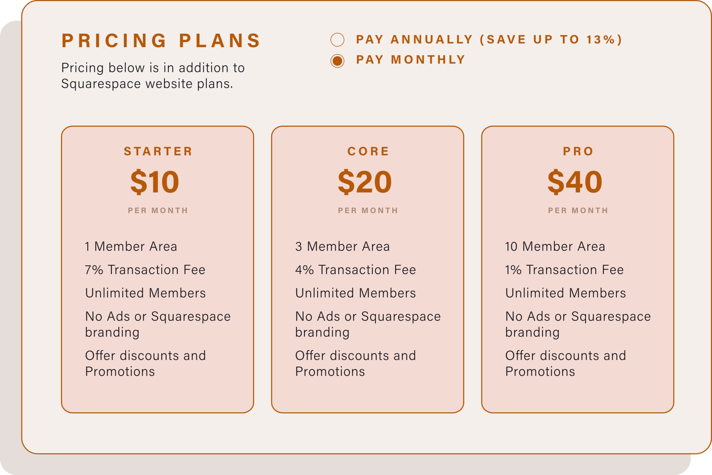
Squarespace Member Areas have a separate pricing plan, so this means you can combine it with any Squarespace website plan. Overall, it's a straightforward way to handle a membership program on your site itself without having to rely on third-party integrations.
This isn't to say that you'd never have to consider other options for your own business any longer. Squarespace's membership add-on is still fairly basic at this time, so while it's more convenient in terms of styling and integration, it has yet to offer more advanced functions.
If you're looking for more specific tools like progress trackers, video hosting, or in-depth analytics, you might want to look into Teachable, Kajabi, or MemberSpace for a more robust set-up.
But if you're only searching for a simple yet elegant way to engage your community through your exclusive content, then you might not need to look any further than Squarespace.
If you are keen to learn more on how to avoid transaction fees or how to offer split payment options, please refer to this blog post about Workarounds for Squarespace Member Area.
Keen to learn how to address payment and style limitations of the Member Area Feature?
I have another blog post/video that walks you through my workarounds.
Pin this Post
Secondary Navigation for Squarespace 7.1
Adding secondary navigation to Squarespace 7.1 Header
Kindly watch the video below for a walkthrough.
Please refer to the codes below as mentioned in the video above.
Place the code below to the Footer Code Injection
<script src="//ajax.googleapis.com/ajax/libs/jquery/3.4.1/jquery.min.js"></script>


<script type="text/javascript">
   $(function() {
   $(".header-display-desktop .header-nav-item:nth-child(n+3)") .prependTo (".header-actions--right");
});
</script>
Paste the code below toDesign > Custom CSS
.header-actions .header-nav-item { padding-right:2.1vw !important; /**change as needed**/ } .header-nav-list { display:box; display:flexbox; display:flex; box-pack:end !important; flex-pack:end !important; justify-content:flex-end !important; .header-nav-item { padding-right:2.1vw !important; /**change as needed**/ } } .header-actions--right { display:box; display:flexbox; display:flex; box-pack:justify; flex-pack:justify; justify-content:space-between; } .header-actions .header-nav-item { padding-right:2.1vw !important;//change as needed } .header-nav-list { display:flex; justify-content:flex-end !important; .header-nav-item { padding-right:2.1vw !important; //change as needed } } .header-actions--right { display:flex; justify-content:space-between; } .header-display-mobile .header-nav-item.header-nav-item--collection { display:none; }
If you are using Folders in your menu, you may need to add the code below to make sure folder content only shows up on hover
.header-nav-folder-content {
    opacity: 0;
    pointer-events: none;
    position: absolute;
    top: auto;
   margin-left:-1em;
    padding: .5em 1em;
    text-align: left;
    width: 200px !important;
    z-index: 10;
}

 .header-nav-item--folder:hover .header-nav-folder-content, .header-nav-item--folder .header-nav-folder-content.focus-within {
    opacity: 1;
    pointer-events: auto;
}
Want to add stylish and unexpected features in your Squarespace site?
Easily Create this stylish vertical tab feature.
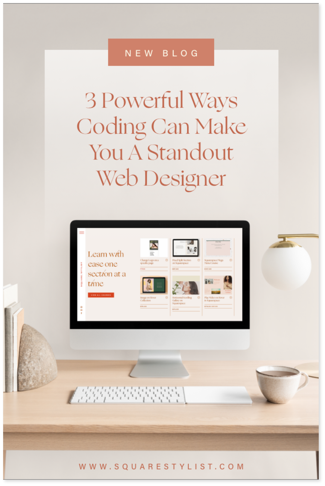
3 powerful ways coding can make you a standout web designer
3 powerful ways coding can make you a standout web designer
Should web designers know how to code? That’s one question you’d hear a lot in our creative industry. It’s also probably something you’ve considered yourself, whether you’re still learning the ropes or you’re already more experienced.
Some people believe that focusing on web design alone as your core skill would allow you to carve out your niche more quickly. Others feel that taking on something new to add to your skillset would make you more in demand as a versatile, multi-passionate creator.
My thoughts? Honestly, you don’t have to know a single line of code to get started as a web designer. We all know how Squarespace, like other web builders, makes it easy for us to create a simple website without ever touching the Custom CSS Editor, let alone the Code Injection.
But for your design to truly stand out… that’s another story. There comes a point when the available settings in your Site Styles just won’t cut it anymore. You’d have to get a little more creative.
Here are three reasons why coding actually empowers you to create the unexpected:
1. Coding widens your perspective in design
Whenever we’re building out any site in Squarespace—adding blocks, dragging and dropping elements—it’s almost too easy to forget the technological wonder that makes this possible. Though you might be blissfully unaware of it, every website is actually composed of lines and lines of code. Your website builder of choice is simply good at handling that work for you so you don’t have to type them all yourself.
When you learn to code, you essentially learn to speak the language of your web browser. This shifts your perspective, allowing you to think about your design elements more intently.
You’d feel less frustrated about seemingly stubborn layout glitches since you’re able to “tell” the browser exactly how you want your page to be displayed. You would know why certain ideas are easy to implement while some would take more time. Having this skill allows you to work with the builder rather than against it. It’s no different from an artist with an innate understanding of paints, brushes, and surfaces. With knowledge of coding, your craft becomes a lot less confusing and a whole lot more dynamic.
2. Coding allows you to collaborate with developers
If you ever find yourself in a more complex project, chances are it’s not just the computer you’d be talking to. You’d also have to discuss with a web developer, whose main role is to build custom plugins based on your design. Granted, you won’t have to be as good as them, but don’t get stuck in the “it’s their job” mindset. Gaining technical know-how would still come in handy if you want to articulate your ideas well. This is especially true when you want to include more advanced features in the site.
Your shared understanding of how the process works will help you gain a more realistic expectation of what the rest of your team can deliver.
And the best part? You won’t have to cross your fingers every time you pass along your mockup, hoping that the final product wouldn’t look drastically different. Instead, you can be more closely involved in the actual website building process.
3. Coding enables you to bring more value to your clients
It’s true that web designers don’t really need to learn to code. But as service providers, what we do need is a strong willingness to provide more value to our clients. Taking up web development—HTML, CSS, and even the JavaScript basics—is a brilliant way to deliver beyond expectations. As creatives, we’re constantly seeking ways to improve our craft so that we can better fulfill customer needs. Not to mention, there would always be a high demand for multi-passionate minds with a flexible skillset.
So perhaps it’s time for you to consider coding less as some vague, techy job and more as a natural extension of your creative profession.
This way, you’d be able to create standout Squarespace sites with ease and charge with confidence in the long run. Eager to upskill, but don’t know where to begin? I know how intimidating CSS can be, even when you’ve already brushed up on the fundamentals. But you don’t have to push yourself into building out sophisticated features right away—it helps to the start with small but useful code fixes first. I sincerely believe that getting started doesn’t have to be the hardest part. That’s why I made a free Code Toolkit Lite for designers like you. It’s a library of my go-to code snippets (all the way from image blocks to blog pages) that you can implement in 15 minutes or less. I hope that you find this resource valuable the way I did when I started learning this stuff on my own. Looking forward to see what you’ll create!
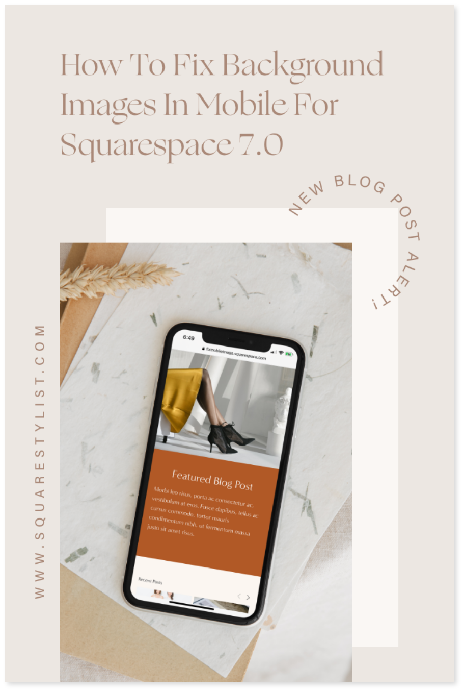
How to fix background images in mobile for Squarespace 7.0
What if you’d like to keep the entire background photo within your user’s line of sight in mobile? There’s an alternative solution that works better for both me and my clients, though it does require a little bit of CSS and JavaScript.
As a web designer who’s tried a lot of website builders, I keep on going back to Squarespace for many reasons. One of them is how easily flexible and responsive your site can be across devices—the platform even allows you to switch from one screen view to another.
But that’s not to say that Squarespace is perfect. If anything, one of the most common problems in responsiveness is how it deals with most cases of layout issues on its own without giving us other options.
We, for instance, often have little control over how background images display on mobile. The landscape photos are often cropped into portraits by default, taking away from the original design that we've envisioned for a certain page.
Specifying the focal point
There’s an easy, code-free fix for this, one that you might have already heard before. So I’d like to offer you this and get it out of the way, just in case this one will do for your case.
For this option, all you need to do is head to the Page Settings > Media. There you’ll see the background image you’ve set with a small circle hovering above it. Simply reposition this circle to an area that you’d like to designate as the photo’s focal point.
Squarespace will automatically crop your image around that area in mobile. Unfortunately, this isn’t your best bet if you don’t want the photo cropped in the first place, or if you fear that the section text won’t be as readable that way.
Customizing the mobile layout
What if you’d like to keep the entire photo within your user’s line of sight? There’s an alternative solution that works better for both me and my clients, though it does require a little bit of CSS and JavaScript.
The landscape image will be above your section text, which is displayed above a solid background color of your choice. This is easy to implement once you have the code, and I’ll even explain how it works so that you can customize it when necessary.
Watch the Walkthrough Video Below
1. Turn off parallax scrolling site-wide or only for a certain page
I strongly advise you to turn off parallax scrolling before anything else.
There are two ways to go about this. First is by going to Design > Site Styles then typing in “Enable Parallax” (it’s under the “Main: Overlay” section) to turn it off. This will be applied to all the pages in your website.
However, you can also opt to turn it off only for a certain page by using Code Injection. Head to Pages > Index Settings of the page > Advanced, then add the following script I’ve prepared:
<script>
  Static.SQUARESPACE_CONTEXT.tweakJSON[“tweak-overlay-parallax-enabled”] = false;
</script>
2. Specify the media breakpoint
Next, you’d have to head over to Design > Custom CSS and paste the code snippet below. Don’t worry, the remaining steps will explain in simple terms how this works, as well as what you can tweak to your liking.
@media screen and (max-width:767px) { #sectionID { min-height:initial !important; display:box; display:flexbox; display:flex; background-color:#B25A27; //change as needed box-orient:vertical; box-direction:reverse; flex-direction:column-reverse; flex-direction:column-reverse; .Index-page-image { position:relative; height:40vh; } .Index-page-content { min-height:initial !important; padding-top:10px; } h1,h2, h3,p { color:white; } } }
That entire block of code is called a media query, which means that it’ll only apply if a certain condition is true. More specifically, it’s checking if the user’s screen meets a given range of dimensions.
The @media screen and (max-width:767px) part ensures that everything in here will only be applicable to screen widths smaller than 767px, which is called the breakpoint.
Feel free to edit this if you’re going by a different rule, but make sure it’s the same as what’s defined for the entire website. Go to Design > Site Styles and type in “Mobile Breakpoint” to double-check.
3. Get the specific section ID
The #sectionID part indicates where you should plug in your section’s unique location. You can easily find this by going to Page Settings > General > URL Slug. Just make sure it’s preceded by a hash sign (#).
No need for you to think too much into the next few lines, since these are just meant to set the mobile display property to flex. You’ll see that these help make your section more responsive to the screen size as soon as you run the custom code.
4. Change the colors
Some properties are free for you to customize based on your site’s needs, though. For instance, you can change both the background color (find background-color below the display property) and font color (that’s color under h1, h2, h3, p).
All modern browsers support 140 standard color names, including the common ones like white, red, or yellow. You can also use RGB color values, as in rgb(255,0,0), but I often use hexadecimal color values since they’re shorter and more specific.
5. Adjust the height and padding
The .Index-page-image specifies your background image in the new mobile layout, only this time it serves as a photo above your text. You can change its height as needed, but I recommend that you set it at 40vh to maintain the ratio of your landscape image.
On the other hand, the .Index-page-content refers to the section text. It’s now shown in a new container with a background color of your choice, but you can adjust the padding as well. Just change the value of padding-top as you deem fit.
Remember to view the layout in the mobile version to make sure your custom code reflects the changes you want to make in your site.
Hope it helps!
Checkout The Ultimate Carousel Mini Course
Checkout The Ultimate Carousel Mini Course
Learn how to create flexible carousel sliders in your Squarespace website. You may add any block (summary block, image block, social links et al)
Pin it on Pinterest!
Everything you need to know about Squarespace version 7.1
If you’ve been using Squarespace for some time now, you probably know the user interface of its 7.0 version like the back of your hand. After all, 7.0 has been there for you since 2014. It’s become second nature to embrace its strengths and work around the challenges it posed through the years.
That is, until Squarespace rolled out version 7.1 earlier this year. It still shares many features with its predecessor, but the update also implemented *crucial* changes to how stuff works in the platform.
This new system can get a bit confusing for someone who’s too familiar with the “usual” way of doing things. And often, learning something different from what we’re used to can also seem scary.
But read on and you’ll find out soon enough that using Squarespace 7.1 has its own perks, too.
All templates are structured the same way
In Squarespace 7.0, your template choice could heavily influence how your final website design could look like. That’s because every template family comes with a distinct set of features and style rules, like site layouts and navigation. You’d have to switch templates if the one you’re using turns out not to be a good fit for the specific look & feel you want. You’ll learn from my courses that my go-to template is Rally from the Brine family. But there are tons of other templates under more than 20 template families, and that can make for a serious case of decision paralysis.
That’s not the case for version 7.1.
In fact, you’d no longer see the switch template function here, since all of them—from Alameda to Zorayda—belong to a single template family with access to all the design features. Any template will be a good starting point to customize a website.
2. Page layouts are easier to organize
When it comes to adding and editing pages to the site, version 7.1 remains to be the convenient drag-and-drop builder that you love. You’ll still be able to work with blocks in the same way, so you can carry on selecting and moving them with ease.
But one thing that did change is the way you’re able to interact with the page content. In 7.1, you’ll be able to streamline your process by implementing changes to the entire page, header and footer included.
And if you’ve been frustrated about the limited options for some collection pages, you’d be pleased to know that 7.1 provides more flexible layouts. All 7.1 templates give you the freedom to add more sections (even on your footer) than previously possible. Plus, you can now add a banner image to any page by creating a section with a background image.
3. The new design panel is more universal
Squarespace 7.1 provides you another, more efficient way to make site-wide changes through global styles. Similar to page editing, you'll have greater control over multiple site elements without forgetting about any part of your site.
Think of the design panel as a useful way to implement your client’s brand book, all the way from the curated color palette and bespoke font packs to even your buttons and spacing.
On the other hand, section styles would allow you to zoom in on any part of the site that you’d want to stand out. Clicking the pencil icon will override your global styles only when necessary, unlike before when you’d have no choice but to toggle the settings one by one.
You wouldn’t be missing out on your options from 7.0, either. Your ability to edit your favicon, logo, checkout page, 404 page, custom CSS, and more will be here to stay. Overall, I’d say the global fonts & styles are my favorite features in 7.1.
4. Your e-commerce gets a huge upgrade
If you’re working with a Squarespace Commerce Plan, expect a total overhaul of your shop as you know it. The Product Collections 2.0 packs some serious punch with multiple store pages that can accommodate up to 10,000 products and 1,000 categories.
That’s not to say that you’ll need to set up an additional store page just yet. In version 7.1, you’ll be able to manually order both the products & categories in any way you like. Plus, you can nest categories and assign SEO-friendly URLs to create the system that ultimately works for you.
This new change is certainly something that larger merchants with a multitude of product offerings can look forward to.
5. Version 7.1 only gets better from here
Rest assured that Squarespace developers are working to build a better 7.1 interface, even as you’re reading this article. You can count on their team to always respond to feedback from users. It’s this back-and-forth communication with their web designers that helps address the problems for a more holistic experience.
No doubt, Squarespace 7.1 will be getting more support than 7.0 from here on out. That’s not to say that the founders are abandoning the older version altogether. Still, there’s one thing we can’t deny:
Whenever another new feature is just around the corner, you bet the new kid on the Squarespace block will be the first to see it.
Which features aren’t in 7.1 yet?
Squarespace 7.1 is still in development, so the platform is actively adding and improving its features. That being said, there are some functions that you can’t use in this version as of now.
For instance, you can’t use parallax scrolling to create an illusion of depth for your photos or videos. Version 7.1 also switches out gallery blocks in favor of gallery sections, which work a little differently. I wouldn’t say these are deal-breakers for me, but these are something you can keep in mind when you’re considering 7.1.
Should I switch from 7.0 to 7.1?
If you have an existing website in Squarespace 7.0, I’d say that switching to 7.1 doesn’t need to be high up on your list of priorities for now. Squarespace assures its users that despite launching the new version, they’ll be making 7.0 available indefinitely for everyone to enjoy.
What I do highly recommend is offering Squarespace 7.1 for building out new sites, since this is future-proof tech that would surely not miss out on new features.
Besides, I think your clients have a lot to gain from the more streamlined design & layout options, thanks to the global styles. They’ll be able to tweak their site on their own, even long after you’ve turned over the final output.
If you are looking for an easier way to learn and launch in Squarespace 7.1. Check out our new template.
Have you tried out Squarespace 7.1 yet? If your answer is yes, how did your experience go? Feel free to let me know what you think!
Pin It on Pinterest!
How to find & customize a single section with CSS in Squarespace 7.1
Even if you’ve been designing in Squarespace for a while now, working with Squarespace 7.1 can be a little confusing especially when you’re so familiar with its 7.0 version. All 7.1 templates are structured the same, the user interface works differently, and some features are not yet available.
If you’ve taken any of my courses here in Squarestylist, you’ll know that I make them compatible for both Squarespace 7.0 and 7.1 to keep your options open.
And that includes tools you can use to streamline your workflow.
For instance, I often recommend identifying the class or ID of a block, section, or collection page if you want to limit the effect of your CSS code to that specific part without affecting the rest of your site. Google Chrome’s Developer Tools could do all that and more with a simple Cmd/Ctrl + Shift + I. But let’s face it—the inspector panel looks a little too much to take in at times, and figuring it out can be too time-consuming.
I previously used the Squarespace Collection/Block Identifier extension, which was pretty useful. However, I found out soon enough that it doesn’t show the section ID in 7.1 for some reason. That’s when I started looking for a better alternative.
Using the Squarespace ID Finder
Luckily while I’ve been working on Mosaic, my new Squarespace 7.1 template, I discovered a really great tool that will make it easy for us to determine the section ID. It’s called the Squarespace ID Finder by Heather Tovey. And personally, it’s been an absolute game-changer for how I work with custom code.
Not only is it built to show us the selector that we need for our CSS code, but it’s also color-coded for our convenience. You’ll be seeing Block IDs in red, Section IDs in blue, and Collection IDs in yellow.
This is why I highly encourage you to download this extension in Google Chrome. It’s free, and it only takes a minute!
Applying the ID to your Custom CSS panel
1. Click on the icon next to your search toolbar
Upon installing this Chrome extension, you’d usually find it easily on the top-right portion of your browser. You might have to click on the Extensions settings (i.e. the “puzzle piece” icon) if it doesn’t immediately show up.
Make sure to have your Squarespace 7.1 site on-screen so you can see the IDs pop up right away.
2. Select the ID of the part you want to customize
Once you get to block, section, or collection where you want your CSS code to apply, all you have to do is click on its ID. The extension will immediately confirm that it’s been copied to your clipboard for you.
3. Nest your code snippet within the ID selector
Now what’s left for you to do is to open your Custom CSS panel, paste the Squarespace ID as is, then type in curly brackets. In a process called nesting, you’ll be typing in the customizations you want to designate for that section within those brackets. Here’s how that would look like when you want to, say, change the font color of a single `Heading 1` in your new webpage section:
The Squarespace ID in this instance is `section[data-section-id=“5f20b1f0a264f45262266121”]` so be sure to replace the entire thing with your own ID if you want to apply this to the Squarespace 7.1 site that you’re working on. Please don’t forget the closing bracket at the bottom as well, or else the code won’t work properly. Want to see the Squarespace ID Finder in action? Watch me walk you through the process below, and you’ll even get a sneak peek of the Mosaic template. 😍
Pin it on Pinterest!
Five reasons why Squarespace Is the Right website builder for You
As a web designer, one of the trickiest choices you’d probably have to make is deciding on your tools of the trade.
This often doesn’t come off as a one-time decision. You’ll find that as you go further along your journey, you’re going to take one path only to switch tracks in the future.
For me, it was the matter of choosing the website builder that suits my needs.
I’ve explored various platforms throughout my career as a web designer and developer. To teach myself the fundamentals, I tried out Webflow, Showit, Shopify, and of course, WordPress.
So you might be wondering how Squarespace ultimately became my website builder of choice. (And no, it’s not because they paid me to write this article.) Let me give you five reasons to use Squarespace if you haven’t yet:
1. Squarespace is built to be simple
This is often the best selling point of Squarespace for everyone who’s familiar with the brand. And as someone who’s been using it for years, I can attest to how easy it is to find your way around the user interface. In fact, it’s so intuitive that even someone without a background in design—your client, that is—can make small changes on the fly.
It may not be the most robust option out there, but for most smaller enterprises, it provides just enough for their own website.
Why overwhelm your clients with too many widgets they don’t need? Squarespace reassures them that they can run and update their site on their own after you’ve customized their design for them.
2. Squarespace puts a premium on design
Of course, Squarespace is known for its modern, sophisticated feel. From its building blocks all the way to its versatile templates (hello, Brine), I am still in awe about how much it enables me to create sites with a stylish, editorial aesthetic.
With its curated functions in site styles, you can always toggle your way to a well-crafted website for your clients. And your eyes don’t have to bleed while doing it at all! It’s hard to go wrong with a beautifully streamlined builder like this.
3. Squarespace is closed-source and secure
Curious about why Squarespace doesn’t have as many bells and whistles as WordPress in particular? That has a lot to do about how Squarespace is a closed-source platform, while WordPress is open-source.
In simple terms, any open-source software makes their code publicly available for everyone to modify, which allows programmers to modify that code through widgets. And while it gives users a multitude of apps to choose from, that can also mean that some third parties can take advantage of this by sneaking into your site and stealing personal data.
That doesn’t happen in a closed-source software like Squarespace since only in-house developers get access to the code and run the updates for you. Part of their job is to ensure your website is 100% secure by taking care of the security loopholes. Sure, that means we don’t get as many widgets, but does that really matter if we already have what we need?
4. Squarespace is made to be flexible
Just because Squarespace is easy to use doesn’t mean you can’t apply the more advanced customizations. It might come as a surprise to many, but its backend interface also offers a suite of tools for those who want to tinker with custom code.
I may not have formal coding knowledge, but the premium CSS Editor and Code Injection features in particular have helped me learn the fundamentals by applying them directly to my projects. That meant that I could constantly push the boundaries of design by bringing something new.
5. Squarespace has a streamlined e-commerce
It may not be explicitly marketed as such, but Squarespace is also an impressive option when it comes to e-commerce.
Whether your client is offering physical products or digital downloads, this website builder will make it easier for them to manage their online storefront here. And did I mention that if you have a Stripe account, you can even host your courses and memberships in Squarespace?
Click Here to learn more about it and get rid of monthly or transaction fees from third-party apps.
Thanks to all these great features, Squarespace has become my creative outlet to craft contemporary chic designs and showcase new possibilities. Don’t get me wrong. I still recommend Shopify, Wordpress, Webflow, and Showit in some occasions… but Squarespace is still my favorite. I hope this post encourages you to try it out as well.
Any questions about Squarespace? Send me a short & sweet email or even slide into my DMs—I’d love to know what you think.
Pin it on Pinterest!
Five reasons you should learn the CSS basics today
So what if you want to make your Squarespace site more dynamic and responsive… more like you (or your client)? That’s where the CSS Editor comes in.
So what if you want to make your site more dynamic and responsive… more like you (or your client)? That’s where the CSS Editor comes in.
We all know Squarespace is a drag-and-drop builder, which makes it easier to create and design your website. But while they look clean and presentable, templates rarely look unique—without a lot of tweaking, your brand will look like every other business that uses the same layout.
CSS, which stands for Cascading Style Sheets, is the programming language used to style web pages in ways that the Site Styles settings cannot. These include more options in terms of fonts, colors, margins, and even animations.
Still, it’s not enough for you to just copy-and-paste random code snippets from various sources without knowing what any of them mean. To make your designs truly stand out, it’s best for you to begin with the creative foundation when it comes to adding custom code.
To make your designs truly stand out, it’s best for you to begin with the creative
foundation when it comes to adding custom code.
These are just some of the benefits of using CSS for Squarespace designs:
CSS solves layout issues
Ever been frustrated with how elements don’t seem to align on the page despite your best efforts? Maybe you end up relying on those spacer blocks to do the trick. At least until you realize your little hack doesn’t work on smaller screens, where the text ends up being crammed in the middle. Knowing your CSS will allow you to address these common alignment and spacing problems, so you wouldn’t have to spend the whole day looking for answers in Google.
2. CSS creates flexible & beautiful mobile sites
Speaking of smaller screens, CSS can make it so much easier for you to make your site design more responsive. That means the elements in your page would change depending on whatever space is available in your user’s device.
Just think of your design like water being transferred from one container to another—you can expect a well-crafted website to act fluidly that way. It’ll be easier for you to work with elements from then on.
3. CSS makes the site easier to update
Learning CSS allows you to make changes fairly quickly, even for more advanced customizations.
For example, clipping images in a gallery into uniform dimensions would allow your client to upload any photo with ease, without having to worry about the size and shape. Just imagine if they’d have to depend too much on editing programs just to change every single photo!
4. CSS boosts your SEO
If you’ve ever thought about, say, rotating your headings by 90 degrees for a more editorial aesthetic, you’ve probably considered uploading them as images in your site instead. But that doesn’t bode very well for your website’s Search Engine Optimization (SEO).
You might be missing out on those crucial keywords that could have ranked your latest blog post higher up the Google results page.
5. CSS creates more elevated sites
Because it gives you more control over what your website looks like, CSS will allow you to modify designs to make them look the way you intend them to.
No need to work around your original mockup or compromise on features that you want to place in every webpage. It’s important for the final output to reflect the brand’s personality, and using code with your design expertise can help you accomplish just that.
Convinced that you need to go back to square one
and learn how CSS actually works?
Lucky for you, I’ve created a free foundational course, SQUAREONE: CSS in Squarespace, that you might want to check out. It’s a project-based approach, so you’ll be joining me in recreating a simple but stylish homepage layout through code.
And since we’d be discussing the basics and best practices, it’s the perfect place to start learning the concepts you need for both Squarespace 7.0 and 7.1. All you have to do is click here and use the discount code “FREE” at checkout!
Any other new features you’d like to see in Squarespace sites? I’m open to ideas, so feel free to send me an email and let’s make it happen.
Pin it on Pinterest!
Custom Social Icon
An easy hack to add a custom social icon like TikTok to your Squarespace Social Icons Block.
Kindly watch the video below for a walkthrough.
Want to add stylish and unexpected features in your Squarespace site?
Easily Create this stylish vertical tab feature.
Center Grid Summary Block
A Squarespace CSS tutorial to center grid summary block.
Here’s a quick fix to horizontally center grid summary block
Grid summary blocks in Squarespace are laid out based on minimum width. Hence, it becomes difficult to center the content especially in larger screens. This snippet of code should solve itt.
Paste this code under
Designs>Custom CSS
.sqs-block-summary-v2 .summary-item-list {
 display:flex;
flex-wrap:wrap;
 justify-content:center;
}
Want to add stylish and unexpected features in your Squarespace site?
Easily Create this stylish vertical tab feature.
Newsletter Block: Hide the Last Name Field
A Squarespace CSS tutorial to customize footer sections. Create full width footer and customize background colors through this tutorial.
First Step: Add the JQUERY Library
The JQUERY Library is the most popular JQUERY Library. If you are using other plugins , it is likely that you’ve added this library already. Please make sure to just reference this one in your Code Injection.
Paste this code under Settings>Advanced>Code Injection>Footer
Ideally in the first line
<script src="https://ajax.googleapis.com/ajax/libs/jquery/3.4.1/jquery.min.js"></script>
Second Step: Add the script that hides the last name field
Paste this code under Settings>Advanced>Code Injection>Footer
Please note that the last name will still be recorded in the backed but it will have the value “-”.
IMPORTANT:
This will also alter the last name fields in other forms across the site. I suggest using a simple text field if you wish to collect both first name and last name in contact forms.
<script>
 const lnames = document.querySelectorAll('.last-name input')
   const lnameFields = document.querySelectorAll('.last-name')
  $(document).ready(function(){

     lnames.forEach(lname => {
   lname.value = "-"
  })

     lnameFields.forEach(lnameField => {
     lnameField.style.display = "none"
  })


 });
</script>
Join the mailing list to stay in the know and check out our quick courses on CSS hacks and stylish sections.
Easily Create this Split Scrolling section in Squarespace
Adobe XD: My Favorite Tool in Creating Social Media Templates (Free Templates & Tutorial)
Why I swear by Adobe XD in creating social media templates. Free Templates and Tutorials inside.
As a brand designer, my main dilemma before in taking on branding clients is how to handover brand-consistent templates that they can easily edit and update on their own.
Adobe Photoshop or InDesign weren't options because I didn't want them to pay for Creative Cloud subscription just to edit their social media templates. Canva, while accessible, has limitations too. And then, I discovered ADOBE XD and it made all the difference.
Here’s why I prefer Adobe XD over other tools:
Adobe XD is Free
You may download Adobe XD starter plan for free. Just sign-up for an Adobe account and download the software. On the download page, there’s a disclaimer that “unlimited sharing and collaboration is until April 2020” only. Don’t worry about it, we don’t need this PREMIUM feature. ANYONE can download it anytime and it is FREE even after April 2020. Only the premium features (typically needed for web design) will be gone.
It seamless integrates with Adobe Illustrator
I can easily copy and paste graphics from Adobe Illustrator to Adobe XD. More so, the colors of the graphics are editable via Adobe XD.
You may use any of your desktop fonts
While Canva is free, uploading your custom font would require a Premium Paid Plan. With Adobe XD, you can use any font that’s installed on your website.
It is very easy to edit
Adobe XD is such a breeze to edit. Please download the free template below and watch the tutorial on how you can easily edit and customize the templates using Adobe XD.
Download the Free
Template Kit
This free social media template kit by Squarestylist comes with the following:
Nine (9) Instagram Feed Templates
Six (6) Pinterest Templates
Three (3) Instagram Stories Templates
Watch this tutorial on how easily you can customize this template kit using Adobe XD
Hope this is helpful! Please let me know of your thoughts via the comment below. If you have requests for other resources, feel free to let me know as well.
PIN TO PINTEREST
Squarestylist Courses
Join the mailing list to stay in the know and check out our quick courses on CSS hacks and stylish sections.


